I am actually very curious about this. AFAIK there should be a performance penalty to sampling meshes with emissive material compared to simple analytic shapes. So I would asssume it would be desirable to have an option to have at least basic analytic shapes, and to be able to render them directly visible.
Yes, there absolutely is, and if you have analytical shapes you can also use specialised sampling methods that sample the solid angle of the object and therefore reduce nose.
However, it’s a question of whether the added complexity is worth it - I guess it could be here, but the usefulness per work required to implement it definitely is lower than it is for disk/ellipse.
I guess I personally could easily live without the cylinder shape, but sphere shape is elementary area light type used very often in pretty much any renderer. Of course, as you said, it would require to have a correct implementation of directly visible representation of the light source (visibility to eye rays), otherwise it would indeed be no different than the point light.
From my experience, direct visibility of area light sources is crucial for photorealism, as long as secondary optical effects like glares and bloom are correctly applied on top 
The more I think about it, the more I believe that each editor should have it’s own Active tool settings row.
Basically, nothing in that row is global, except for the last operator settings pop-out.
Come to think of it though, wouldn’t it be cool if the last operator was unique for each editor?..
Hum, how do I have acces to the snap options if I hide the toolbar?
Because a lot of us will not use it.
I always think that my mesh is not well placed on the grid.
Also, not the best idea to have 2 popup at the same time, but I think they will change that.

About the grid problem I saw something about it today.
And for the double spacebar shortcut, it should be changed with the new keymap changes I think.
The biggest reason for more lamp shapes in Cycles is because the built-in lamp types are the only ones that can make use of BPT’s multi-light sampling for indirect sampling (which is an essential feature for getting scenes with difficult lighting and/or many lights to be clean and smooth after denoising).
The result is that a scene with mesh lights will be far more noisy than a scene with arealights with the same sampling options. Then there’s how a 3D shape can be used to approximate the light from an emission volume (with the help of lightpath settings) without the large render-times needed otherwise.
Aye, I understand it’s a WIP. However, I think it’s important to test things and see what is working and what isn’t. I was initially open to the topbar. I’m not so sure anymore. As far as I can tell, the topbar is creating more UI problems than what it is trying to solve.
Texture paint brushes are just one example. Any two editors are going to have issues fighting for topbar space. Here is another example:
Design Questions
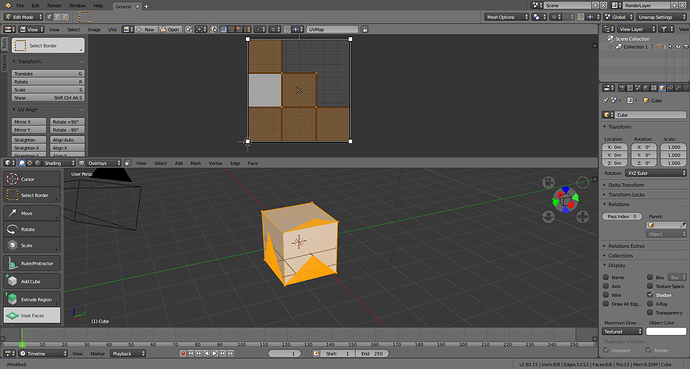
- How is the user supposed to get the Inset options back on the topbar? Do they need to reclick the tool they want to access its settings? Updating based on mouse position wouldn’t appear to work in this case.
- From what I understand the intention is to unify similar options (e.g. snap). On paper that seems logical. In my testing, I’m finding it difficult to tell which editor the topbar settings are actually referring to.
- Is this a simple system to understand and use?
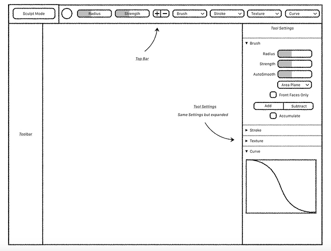
Let’s look at it the other way. Here is the design task for the tool settings. The mockup:
Design Questions
- What exactly is the purpose of the topbar in this mockup? It seems to be just duplicating settings. Why move snap so they’re all in one area and then spread the active tool settings themselves in multiple places?
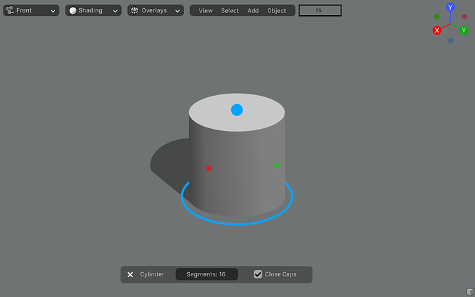
- The only truly global thing on the topbar is the F6 menu. It seems to me that could be handled with the tweak UI or even putting an instance in each editor.
- I guess my question is: is the topbar necessary?
Obviously it’s up to them to figure it out, but the more I mess with it, the less convinced I am that the topbar is the right solution for Blender.
I have the same feeling, the idea is great but that doesn’t work.
Same for the toolbar that remove T panel for tools only beginners will use.
Sounds a lot like what went wrong with Painter spring update. A persistent top bar duplicating tools that already exist.
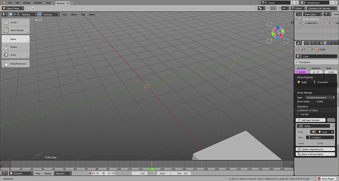
Here’s the drivers popover. If you click on anything it tends to close, but after some polish I think setting up drivers will be less of a hassle.
I slowly became unhappy with the topbar, at least in this whole&persistent incarnation.
So, I digged the new BA site and found this old proposals i made:
I still find these ideas good, apart some UI modifications that already took place here and there.
Notice the “workflow tabs”
BTW I’m a fan of Shift+SPACE quick fullscreen mode
It would be good if they merged the spacebar search function with the popup toolbar they just added.
Instead of having to hit the spacebar two times, you only hit it once. The search field should have the focus at first, and it would be at the very bottom of the menu.
They could also add a magnifier icon with the search function to the default 3D view toolbar for discoverability purposes 
Yassss, thank you! ![]()
I know I am kind of pushing my luck here, but wouldn’t it make more sense to use this, already existing property?
(And perhaps in future, support for some of those other ray visibility switches too. Especially toggling light visibility in glossy reflections and refraction (transmission) is occasionally required)
I bet I can simplify that long list of options into a small panel and have room for other stuff.
Anybody else Maya/ex-Maya users here?
I made a comment for the Industry Standard Keymap to implement the right-click context-sensitive pie menus from Maya that allows, for example, very quick edit mode change.
It’ll take a bit more development effort, but I think it’s something that’ll also benefit Blender as a whole.
For me, this edit mode change was a crucial part of my workflow when using Maya, and is one of the things I carried over to create my custom keymap in Blender.
Here’s what I wrote:
If anybody else agrees, chime in and let’s make it happen, like the double-click to select edge loop ability.
I was thinking about making an addon for 2.8 mimiking maya’s marking menus.
Industry standard keymap is not really the new maya keymap, so not sure they will do what you want.
On a big screen, honnesly the top bar is not good, need to go to the top right to change symmetry when I’m concentrated to the middle of the screen.
Like I said, if we hide the top bar, we lose snap tools, lol
the information must concentrate on the thing you do, not the UI.
Imagine a guy with a 21/9 screen O_o !
I Like this more than the top bar.
They can remove the top bar, use the 3dview like this mockup and it will be perfect for beginners.
In William’s proposal, Topbar contains active tool settings. It is something new.
2.79 have last used tool settings. These things are different.
Active tool is something new. It makes any tool using left click and modal.
In this area, you define active tool settings as options of the mode. Then, you do as many left clicks as you want. Then, you change last left click action settings in last command popover.
No, there is no duplication. If you do an inset as active tool, then click outset option in Topbar → nothing happens.
Modal workflow is slow. As an experienced user, I will avoid it as much as I can.
But I can not deny that is incredibly intuitive for a new user.
When tool settings area will be in place ; I will use it and probably hide Topbar.
Currently, Topbar displays last enabled active tool. I was saying that they should create a workspace property to switch between active editors. It is stupid. Simply, reactivating the active tool would be as quick as a switch.
I was in favor of a Topbar that only shows last used operator settings.
I tried Julian’s branch and was enthusiast about such design.
But I understand that for a modal tool, an area to display its settings is needed.
I would prefer that choosen area was editor’s header.
I hate popovers. I am happy that they accepted this idea of Tool Settings Editor as an alternative to popovers.
But last command popover is a special one. And you don’t want to scroll along this active tool settings column to find its equivalent.
You will use this row. https://developer.blender.org/T55039
I hope that will be extendable.
Or complete last command popover settings could be found elsewhere than in the popover.
Probably not. It can be hidden.
And probably any experienced user will hide it when tool tweaking UI will be in place.
I hope that was not targeted as long term todos to bury these ideas.
I hope that Spring Team will make them understand that last command settings as a popover is a nightmare.
I think that experienced users are enough numerous to maintain pressure to make it happen.
But we have to negociate with people who want an intuitive Blender.
Oh, my god ! I forgot that. Am I in hell ?
