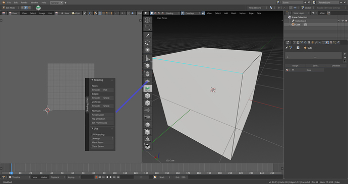
Dont you think we need this.
Shading options can be put in the Shading popover in the header.
Mark Seam can be a tool in the Toolbar
Oh, there’s nothing wrong with shortcuts. It’s just pie menus add so much to your workflow working with your hotkeys once you learn them.
I think you’re right that points 2 (Faster access to more tools) and 3 (Gestural execution is faster) are subjective because this will ultimately depend on your configuration.
For direct access to tools used frequently, I agree direct hotkeys are best. But for tools where you frequently rely on submenus (such as edit mode, snap mode, pivot point changes), this is where pie menus shine.
Right now, every time I’m changing the pivot mode, for example, I have to pop the submenu open with a hotkey then select the desired option. Even though I’ve used it so many times, I always take a split-second to read the options then select. As a pie menu, the ones I use frequently will trigger a muscle memory response depending on what I want to use, making things so much easier/faster. Hope this helps.
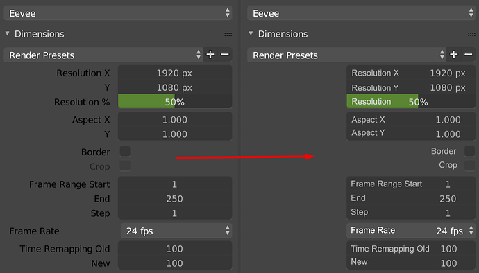
I’m not a complete fan of the one-column layout, but I like the cleanup it’s causing. It would be nice if, like the tool panel, depending on how wide it is, the properties will take advantage of two-column when wide, then single when narrow.
That was also an early 2.5x feature that was cut, so I don’t see how it would require a major amount of work (even with the brand new UI elements planned with a few changes to the layout engine).
We need some seams (mark sharp, mark seam…) uv options in toolbar.
I like the single column interface on the properties panel. My only real critique is that while Translate, Rotate, Scale should be single line, the XYZ should be in that single line instead of having their single lines. If they are going to align everything to the right it makes sense as to why they did it that way. Its minor issue imo. Otherwise I really like it. It looks clean and easy to read and most other apps also handle parameters this way. Sure there’s a lot of scrolling but with some smart culling of parameters it will really make the panel more useful and less cluttered.
Okay. Here’s the problem and why I say the issue is really with Blender’s non-blocking layout engine. For one the N panel (and the T panel) shouldn’t even exist. They exist because Blender’s layout engine is relatively rudimentary. Sure you can split views all day and merge etc. But you can’t stack views and more importantly you can’t collapse views. If the issue is that you want access to your parameters while in full 3d view, then the proper solution is collapsible views. You would press P (or N or whatever key you want) the properties panel slides into view from the side. Press key again to get rid of Panel. Now you may ask what’s the difference between that and the N panel. The main difference is one you aren’t stuck in the 3D View context, all views should be collapsible so if I want the node editor instead it will slide up from the bottom and collapse back into oblivion when not needed with just a key press.
A real non-blocking UI allows for easy collapsing and expansion of the different views. Blender doesn’t do that. You can’t easily split a view and collapse just one portion and re-expand when necessary. You have to basically manually window manage the views by dragging the handles to move things out of the way. So that node editor you have on the bottom half of you screen you can’t just hit a key and collapse so you can have your full 3D View goodness and bring it back when needed. Instead you have to literally drag the window down maybe leave a few pixels of that view so you can drag it back up when needed.
The N panel becomes redundant when you can literally press a button to bring the full properties pane up make your change, press said button again and go about your business. That’s what I’m getting at and that’s why I think the N panel is basically a hack added to give you something the layout engine in Blender should already be doing.
I should be able to stack views. So that if I wanted to have the node editor, properties pane and animation editor in one section of the screen, it’s just a matter of clicking different tabs to go from view to view. I don’t need to split views and basically create a jigsaw puzzle to try to fit everything on screen. I could keep my views clean with no clutter but still have all of them available at any given time. All easily collapsible and still non-blocking (though the option to float each view should be available too).
Right now each view in Blender has the option to maximize and restore the size with the tile area functions. We also need a collapse area and the ability to bind a key press to hide and bring them back up again.
Ideally since there is more than enough space in each view there would add a maximize button, a restore button as well as a detach window button (to convert to a floating window) to each view just like any window manager on the far right.
Some tasks: T54991, d8203b04228a
Not really sure what that second one is so maybe somebody can explain. Bear in mind, this isn’t editable motion path.
I like it, too, but it would nice to be able to take advantage of a bigger screen and see more at once, since two columns will obviously show more than one. For instance, I don’t mind if a bunch of check box parameters get listed via two columns and I have to drag down both to toggle them.
I agree about XYZ being possibly combined, same with two axis parameters, like the render resolution.
I can’t help but laugh at the irony of it all.
When I switched from Modo to Blender back when, one of the biggest hurdles I had to face was relearning the hotkeys. Honestly, I hated Blenders way of doing things when I first started using it. It felt sloppy, goofy, and weird to me. I fought against it every step of the way, even going so far as to try and remap as much of Modo’s hotkeys and workflows into Blender as I could (didn’t turn out too well).
Eventually, I decided to learn Blender as Blender. It took a bit, but I came to tolerate it. After awhile, I actually came to prefer it. It really is quicker once you learn to live without your manipulators, and go freehand for everything.
Now with 2.8, they’re changing all the hotkeys around. Going by the list, it seems a lot of these hotkeys mimic Modo’s.
…and I don’t remember Modo’s hotkeys anymore.
It’s almost funny.
I can partly agree with you. The scrolling in the properties panel sometimes get really grueling.
There should be consideration about how to reduce the size of it.
I am also a bit concerned that there will be a lot more scrolling now.
Below is the default layout I use for right side of the screen- above is complimentary 3D view (often in render mode)/image view(for doing UVs), center is properties and python console or timeline in the bottom. As you can see horizontal space is very efficiently distributed in Properties panel. If this were only column based then there would be very, very wide columns and a lot more scrolling. In other words, I am concerned that Form is being prioritized to Functionality and layouts a side of default one are not being fully considered with. Ideally columns/rows would automatically adjust based on width of the area.
There is a differential for that, that probably with modifications can be implemented.
https://developer.blender.org/D2395.
So in the future it’ll possible to have an adaptive layout that will solve the issues with available space 
I’m pretty sure they explicitly stated they intend on leaving the hotkeys just as they are and just make an additional setting that’s more “industry standard”.
It would be awesome to have a nostalgic preset with the old shortcuts.
Hhhh… yeah i felt completely the same and now this ![]()
About the new keyboard layout :
3 fingers on the 1-5 keys
thumb on the spacebar
ring finger on the tab key
I like that
I really hope they don’t remove the old hot keys for everything. Keep the changes optional would be he best.
Yes, this exactly. I don’t understand why this already done grid flow wasn’t implemented 
Cleaner, but not sure the mouse-over experience will be pleasant with now the numbers needing adjustment not being centered. Also, aren’t there arrows that appear on either side of a slider when you hover that would overlap with the words?


