The text can be hidden when changing the values.
1 Like
finally gave it another try after a while, good to see subdiv modifier is now working, but damn what happen to Tab?? what’s wrong with tab into edit mode in 2.7x?
and where’s the layers? I have to say it feels like a stranger even compare to early version of 2.8.
Someone’s making Blender 2.8 into Blemaxya4D. And we can’t do a thing about it. Because we are not the “Industry standard”. /sarcasm.
The good thing is, we still got amazing features anyway.
There is no way we can’t make things work the way it used to be in 2.79. It just need some time to tweak it backward.
Pablo Vasquez is making videos on Blender Developers Youtube channel , every day.
https://www.youtube.com/user/BlenderCoders/featured
If you did not understand how blender change, take a look at his videos. Everything is explained in it.
You can also read developers blog.
I don’t think having text in the input fields is really practical from a coding POV…I do however understand right side alignment of the booleans[‘boarder’,‘crop’]…but some things just are not plausible…like the FPS.
just having the fields smaller would be better IMHO.
one thing I would really like to see…is once you delete a data block…it is gone…period. Until you create another one…also the way that data gets duplicated by default is not great…
always a lot of ‘cruft’ in a scene you have been working on for a while…especially with revisions etc.
Just some thoughts.
1 Like
I don’t think your layout looks cleaner. Theirs is better aligned, and thus easier to read. label - value.
I don’t think hiding the text inside the value when editing is going to end up good, either it’s messy aligned, or it will have to jump to center.
I really like how it is currently in 2.8 trunk, and if they add a keyframe icon to values that can be keyframed. Maybe there should be an option when making themes to not have the color overlay that happens when a value is keyed or driven. just my thoughts.
2 Likes
Removed Object color from workbench.
https://lists.blender.org/pipermail/bf-blender-cvs/2018-May/109164.html
I liked this option but I’m not clear why it is being removed.
To clarify, the “option” is when you code the layout in python. So it’s not a option for the users but rather the authors of add-ons and blender UI developers.
They have an option to use the old layout engine functions, 2-3 columns. But hopefully lots of the add-on developers will evaluate the new option of single-column and update their layouts.
I worked with 2.8 today and yesterday. And I personally love the single-column layout, reminds me of both Unity and Unreal layout design and it’s much faster to read labels - value when they’re center and labels are right align to the value.
I hope Campbell and William goes through the entire UI, because at the moment it’s roughly 33% that has been updated. Of course not all panels make sense to force a single-column, but it’s clearly in some places it would work much better and it’s just not yet updated.
1 Like
In Edit mode : Xray mode is sometime confusing/messy
Hidden wire is clean.
I miss the “limit ot visible” option to select vertices inside or on the other side of a mesh
Sorry, but nope, the devs proposal is not great at all, we loose too much space just for texts.
I like the idea to decrease the size of the properties, but the text don’t allow that.
3 Likes
Persistent data blocks can be painful, shift click delete sometimes hard delete. But I recall Action sets really hard to kill without saving - close - reopen.
I would also see a smart system to detect image data blocks if they have changed on the drive, compared to what’s currently read. even more so now that texture properties are removed from properties panel. Only workaround I found is to disconnect and reconnect nodes, or reload in image editor.
Now when they have Ctrl+Tab to change Tab and a reasoning was it’s more like in browsers. I suggest F5 to reload any changed texture data block in 3d Viewport. Would be sweet.
An addon like Atombomb to easily delete unused datas, images , materials should by by default in blender 2.8
1 Like
This is because now the color of the object in the viewport is per material I guess, and it makes more sense I think 
Don’t be sorry, you can think and like whatever you want.
But I think, the UI teams proposal is way better than what we have. And is pretty much inline with consensus out there how to layout a property panel.
I don’t think throwing in labels into a value input field, to get more screen space real-estate in extreme case scenarios is valid. it just doesn’t help read-ability. I hope the input fields can be kept as clean as possible.
I don’t really like truncated labels or abbreviations. But for extreme case with narrow property panels maybe authors should/could deliver truncated labels. It would be more or less just an variable the UI layout engine can use if panel hits breakpoint.
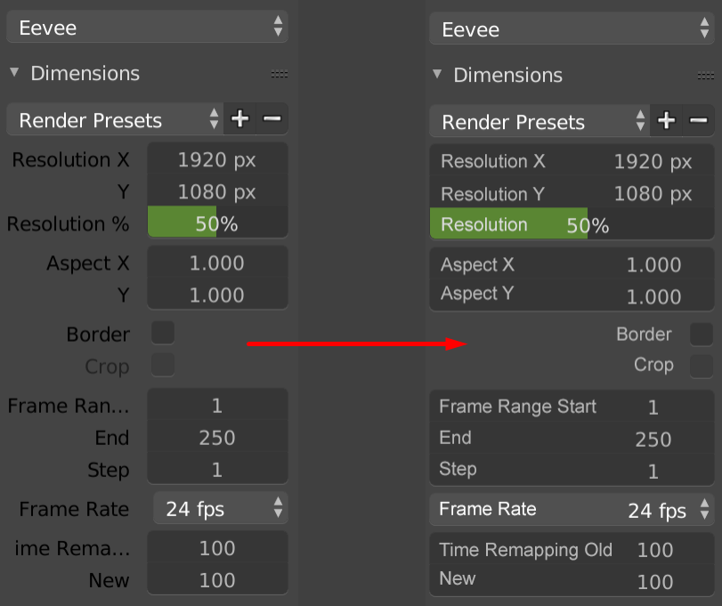
Resolution = Res
Frame Range Start = Frame Start
it’s a matter of preference, everyone’s taste, I think their proposal is not good for now, they will obviously change it, will see.
Indeed, personal preference will alway polarise people. For me, I am not seeing anything that causes me to have a hissy fit. Indeed, I prefer the concept of the single column. Funny because people want to be able hide/show panels with the press of a button, which you can do with the single column, but then complain about scrolling through them all. but if CTRL+H deals only with the panel you want, I’d argue there’ll be less scrolling.
Even so, long way to go yet and I’m sure the devs are taking notes of peoples reactions.
It does not seem to be pertinent too. Why putting words like Resolution, Aspect , Frame Range, Time Remapping in numerical field ?
Why suddenly Frame Range Start and not Frame Range End
Repeating the word does not make sense because values are already grouped.
Why suddenly Frame Range Start and not Frame Range End.
In 2.79, Main label is outside of numerical field and low label part is inside.
Resolution X/Y/% Aspect X/Y Frame Range Start/End/Step
Alignement is not perfect in 2.79 because of 2 columns design of panel.
But principle of label for group and a name for value still makes sense.
Proposal on the left is bad, too.
Labels of group and names of values should be distinguish in order to avoid repetition of label.
It could be 2.79 solution. Name in numerical field.
But it could be Label and name outside of numerical field but with different colors.
4 Likes
Material was already a separate option. That mode is unclear as it uses the base diffuse colour which is not shown in the panel when using nodes!
Guys, if you have time check this out. I think it is the first fully functional App Template, and it comes with a lot of nice UI concepts that could inspire 2.8:
1 Like