Yes but now you have a “viewport color” option in the material panel when you use nodes, where you can choose a color independantly from the material diffuse color.
Good thing this has been posted here! I really like this UI, it has a lot of great ideas I think it’d be good to take inspiration from.
I saw Josh post an update regarding NLA editor. About not grouping keyframed values depending on if they where clicked by button or not. But I think my suggestion makes also these matrices of icons easier to read if we just have icons at the top as “labels” and then use the small checkboxes seen in places such as enabling/disabling add-ons as the matrix grid.
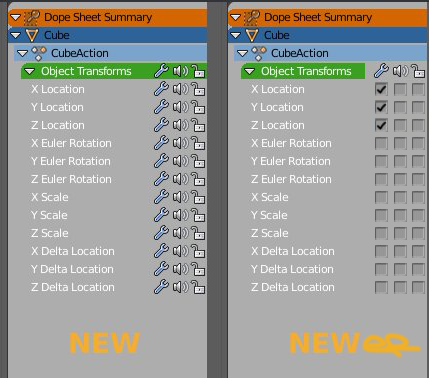
Also I kinda get the idea behind user the speaker to represent a “channel” or something. At least that’s how I’ve seen it. But I rather use one of the many F-Curve icons instead. I only wished there was a Curve+Wrench icon to represent Curve Modifier.
1 Like
the struct or whatever handles this can be set to just hide those data blocks entirely…and que them for deletion on close.
then the user simply has no access to them and it auto cleans when the file is closed…it somewhat does this now…but by not hiding the data people(myself) sometimes accidentaly re-use those material.001…simply by using hotkeys to assign them…
I do find that easier to read.
The only issue is when that list so long it runs out of view…the icons would be hidden…but if you cannot remember the ordering of three things without seeing the icons…you may as well give up on using blender 
I don’t like that they removed the random colors in workbench because you have to do for every material and when you have many objects that share the same material, you can’t quickly recognize the different meshes.
i hope it was just removed for a better solution. 
EDIT: Sorry. I’m wrong. It still present Random color option
It could be an issue with long lists, also height in NLA editor window. But, yeah.
Anyways using the small checkboxes open up a opportunity for larger matrices. I just find using the icon itself and it’s state /modifier just dims down, not super clear if disabled/ isn’t as clear as the checkboxes. Easier to see what’s enabled/disabled.
There could be matrices that are 5-6-7 wide. The icon hell. Anyways hope Joshua consider my suggestion.
But they didn’t remove random colors from workbench engine did they ?
Sorry. I’m wrong. Random colors are still present.
1 Like
Is there a profiler addon in Blender ? Or is it planned to integrate one in Blender ? Could be useful, I was looking at this task where they have performance issues with some production files and it made me think about that.
Perhaps they are planning on removing object colour altogether. Random colour is still there.
I don’t really know  we will to be patient to see what happens.
Looks Good!
overlay txt over Bars saves a lot of space, also left alligned txt is much better readable.
2 Likes
This is why we have user preferences.
1 Like
How I imagine a 2 column set-up.
We could have a discrete a little languet at right bottom of Properties Editor. By dragging it user could define desired width of columns.
And panel with an hidden header would not be affected. This way, at least top panel of columns would have their title aligned.

1 Like
Regarding the HDR studio lighting setup , i’d like to see sliders for exposure, gamma, and bluriness
1 Like
Is it just me, or has something changed about the text anti aliasing as well?
Text has always looked horrendous at small sizes, but for whatever reason, it’s much more readable now.
This is clearly the superior option, since it allows the easy stacking of any number of columns
They are implementing things without a clear understand of why such feature is like that in that software.
The Channel Box in Maya shows you all the keyable parameters:

In Object Mode, it shows the object’s Transform Node (pCube1), the Shape Node (pCubeShape1) and ONE (a single one) Input Node at the time (polyExtrudeFace1), you have to click on the other Input Nodes if you want to see their parameters, or use the Attribute Editor and navigate through the tabs to see all the features.

In all of this, the vertical scrolling is minimal, I can’t say the same with how they are implementing it, there’s also a lot of wasted space, like in this example:
As said ad nauseam through this thread, do I really need to see every time the Transforms of the object, even in Edit Mode? Wouldn’t be better if it shows the position of your selection instead? Which is what the N panel is doing, so that you have two panels opened because the one that occupies most of the screen space, is doing absolutely nothing.
If I want to edit a Bevel operation, I have to move all the way up to the right to access the parameters, use F6? Sure, if I want to inspect the model I have to constantly push F6 every time.
Another thing, using mixed units is not a good idea.
If in an input field you read -2.60451cm and try to round it manually to -2.6, instead of getting centimeters, you’ll get meters. Or you show only one unit, or you set the input field to be aware of the previous unit, so that your object doesn’t jump 1 Km away.
6 Likes
Object colour is removed it seems as it is part of the old BGE.
https://twitter.com/PabloVazquez_/status/1002139928954916865
1 Like