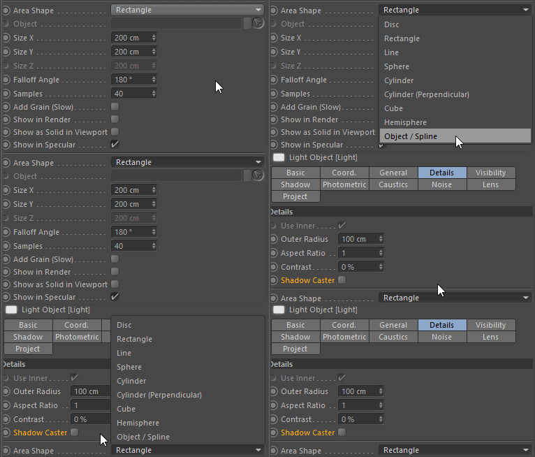
Lol… It doesn’t matter where it’s located or if the popup will open in the up or down direction… the down arrow is pretty standard, it never changes…

Lol… It doesn’t matter where it’s located or if the popup will open in the up or down direction… the down arrow is pretty standard, it never changes…

Was wondering since i’m only observing single GPU and some minor CPU use.
And as always i wish to compute frames on all units at the same time. Is SLI/Crossfire needed then?
Yes, GPU revolution showing it’s teeth & CPUs fall short in this regard. Not a frame can be rendered with, what a waste 
How to make it so that in version 2.8 you could change the numeric values through ctrl and the middle mouse wheel as in version 2.79? If the cursor above the input field can be pressed ctrl + mouse wheel and change the values. In 2.8 does not work
Campbell changed particles to single column layout.
Now, I think it is obvious to anybody that grid layout UI is a must-have.
Tabs on the left, that looks gorgeous.
Eevee is just OpenGL, I don’t see how network rendering would ever work for that.
Edit; I do see how distributed rendering over networks could work, not just in the most common sense people would like to see it. I.e. Object distribution. With good data scaling, and each render node delivers a intermediate image for compositing the final result on the workstation.
I do see how distributed rendering with frame distribution would work, it’s basically having rendering node render a frame range and just do the final editing on the workstation.
But sometime in the future after 2.8 there might be Vulkan support. It’s really effective with using multiple CPU cores to offload to the GPU. Because the real bottle neck will be the CPU. There’s tons of videos out there about Vulkans performance compared to OpenGL. Both are from Khronos Group.
There’s is nothing wrong with those things.
There’s something wrong with setting that as the default option which clearly shows that whoever did that does not do modeling of knows how modelers work.
The new mode by itself is useless save for selecting components that are in the back. It can’t be used for the same purposes the regular wireframe mode was used.
Sorry, if you think that wireframe mode was only to see “orange and black blobs” then I suspect you also don’t do modeling.
There’s also something wrong with putting “nice looking” above usability. Because whoever set this up as the default setting did not have usability in mind, considering every time I hear it mentioned is only about how “nice” it looks.
Also, what presets?
I downloaded the starting file YAFU posted above and no, that is not a fix.
Yeah, the wireframe in object mode looks kinda like before. But that’s not what I’m talking about.
Really, is anyone doing modeling in Blender? I’m talking about wireframe in edit mode. Meaning switching from shaded to wireframe. That startup file switches from wireframe to wireframe with backface culling. What is the point?
The way it was before you could easily switch from shaded to wireframe to check the reference images or adjust the object using other objects and guides and then easily switch back to shaded to see how the object looks.
Now, to do the same with the default settings you have to press Z->select Hidden Wire from the menu->do your change->deselect Hidden Wire from the menu->press Z
this looks really good!! not cluttered at all, easy to read, optimal usage of available space / almost no empty space, beautiful to look at! also its common knowledge that monitors have moar height than width! ^^
btw you cant blame campbell for that mess in the commit log says “Patch by @billreynish”
No. Nobody except you is doing modeling in Blender. Thanks for pointing out that you can do it in Blender! I’ll try that in my free time between rotating a cube and rotating a sphere .
Ehh. This is all WIP. Still, there is a whole month of CodeQuest and even more time for Blender 2.8 to being even beta. Mind that. Pablo said that this is just first version of wireframe, it will be per object and will be more changes. You are moaning about the feature that was added few days ago! Please, give it some time.
The see-through wireframe will eventually come back, it’s a no-brainer. In the mean time, just keep calm and use 2.79. Why would you even model in 2.8 now?
I realize my post is needlessly inflamatory, I apologize, but when I get replies that suggest this mode is an improvement over standard wireframe (as in you can totally do everything you did before and more!!!) I get annoyed. Because it’s not an improvement. It’s something else.
Essentially, now pressing Z activates the “Limit selection to visible” option that was already there in Blender.
It’s not even a new mode or anything.
I’m not complaining about the implementation of the wireframe with depth and everything. It looks good and I can see how it can have its uses.
I’m complaining that they changed the interaction and relegated wireframe mode to a toggle in a menu.
That to me feels like the developers telling me that using wireframe mode is not really a feature you need a lot. I really don’t like it when developers try to tell you how to work.
This is as puzzling to me as the fact that by default Blender doesn’t switch to ortho view when using a side or top/bottom view.
But the thing is that it’s there already. It’s just that it’s a toggle in a menu instead of being activated like before. Why would they do that if they don’t intend it to leave it like that? So, I’m complaining against replacing the normal way to activate wireframe mode.
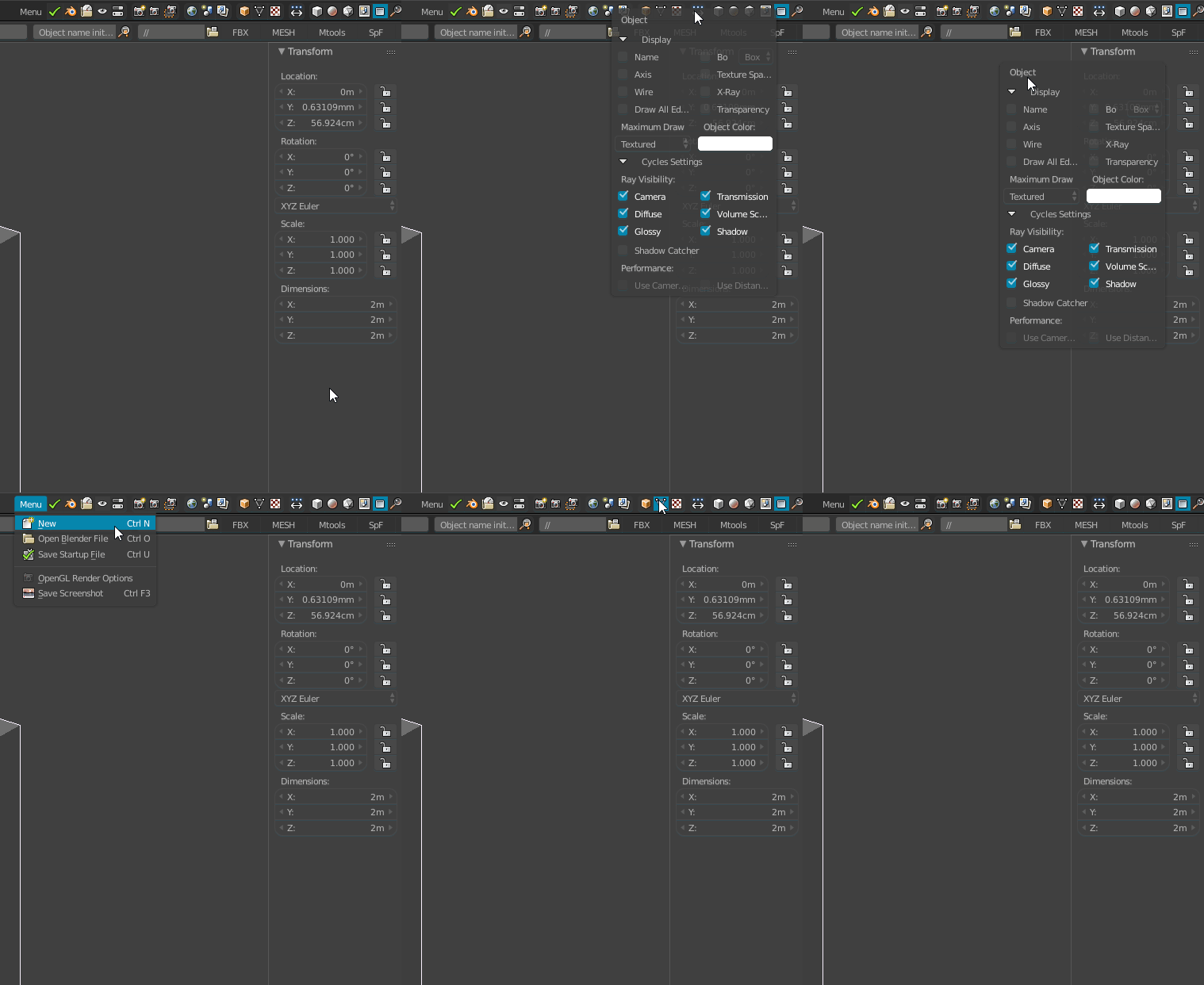
Should be doable with popovers, not sure about those dropdown menus though.
Currently in 2.79, my popups can be moved around, just need the stay-on-top feature to complete it.
Because it is better than it was in 2.7x but it is not ready yet. Wireframe, keymap, default etc. Neither of them are ready. The default behavior of wireframe and pressing Z is WIP/temporary or call it whatever you want. Just wait patiently until it is ready. Devs are not less smart than we are - just give them some time and let them work. Again, Blender 2.8 is in an early pre-beta stage.
Yeah, I have some menus done like that with pie menu editor, I put the moving dots on the top just to have a visual reference and make it more clear the window is drag-able. I think something like this should be added by default just for the increased flexibility.
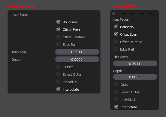
Also, now that I’m at it, I know that this probably will change but I adjusted the layout of the Tool Settings pop-over to what in my opinion makes more sense.

In some mode like the texture paint mode, with a UI display of 1 and with an old 1280*1024 monitor, the top bar is heavily cropped
I have to set the ui display to 0.67 to have the whole top bar displayed.
And it’s unusable and unreadable
Zbrush can display the menu bar in two rows, if necessary
I dig that !
I went the extra mile and made a slim version, with the settings organized in a more sensible way (in my experience) I know this might be controversial but I had fun doing it and I find it more convenient. one can dream.
Slim version look like very good! Like it! Maybe bit bigger spaces but that would be like tons less scrolling anyway! Rightclickselect is a place where it should end up.
What I meant was that very dense meshes look like orange and black blobs (ie. heavily subsurfed meshes or heavily detailed dyntopo meshes that can be quite dense by nature). When the viewport has to display hundreds of thousands of individual wires in a small space, it’s not possible to see any empty space between them unless you have a close zoom level.
It’s the same with editmode, a dense mesh means you no longer see the individual dots for faces and vertices unless you have a very close zoom level (and in this case even wireframe mode isn’t exactly fast, because editmode within 2.79 in general has speed issues). The same goes if you have a lot of objects or particle instances in your scene (the bottleneck is the number of objects that have to be drawn, not how the objects themselves are drawn).
For lighter meshes you can see most of the details just fine, but the fancy wire drawing that 2.8 will do out of the box will help in the cases outlined in the first two paragraphs.
Also, I will once again emphasize the possible solution of allowing fast switching between varying drawing options via a list of presets (ie. you would use the presets to instantly switch between 2.8’s equivalent of wireframe mode and solid mode, no box checking or toggle sliding needed).
Full agreement here, let’s have some of that responsive UI layout as seen in that video (simply put, too much empty space unless we wanted to heavily truncate all of the text or clip the icon row for the different contexts) ![]()