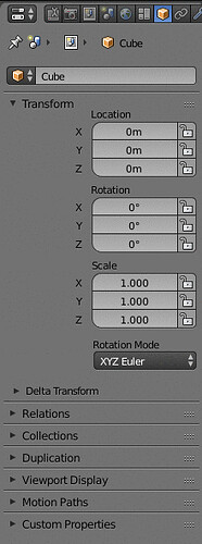
The gridflow is amazing, but now we can clearly see that those labels (Location/rotation/scale) are in the wrong place. They take a lot of space for no reason when you expand the editor.
Perhaps they should position the labels like this:
So when expanded, we would get something like this:
Like this there would be no need to have a super wide panel to show those 3 columns… Much better use of space imho.

