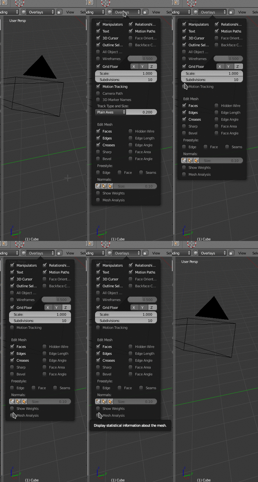
It would be nice but with 3d cursor from 2.8 I feel that it’snot must have.
Double columns, and subpanels for popovers.

grid flow layout could be useful for horizontal areas.
Is there a column number limitation ? I don’t really understand this situation.
3 lines for 5 columns. 1 line for one item.
But there is a space for 6 columns and that would result in 2 lines. 1 with 6 items and 1 with 5.
There is a readability problem. Popover panel is not wide enough.
It does not make sense to have an item labelled “All Object …” for “All Object Origins” option. Important info is “Origins” word. Popover is not scalable by user.
Same problem with Relationship Lines, Face Orientation and Backface Culling.
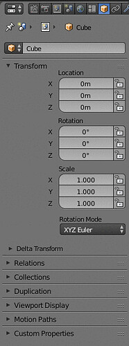
The gridflow is amazing, but now we can clearly see that those labels (Location/rotation/scale) are in the wrong place. They take a lot of space for no reason when you expand the editor.
Perhaps they should position the labels like this:
So when expanded, we would get something like this:
Like this there would be no need to have a super wide panel to show those 3 columns… Much better use of space imho.
I think the max single column width is set for all columns, not only for transform panel. So even if that could be true in this particular case, there are some places, where labels are much longer.
The layout needs to be defined in the python scripts. Probably will need some adjustments later down the line so it aligns nicely.
What is global contextual workflow?
It’s just the concept of attribute managers. Which is essentially how all 3d apps works out there.
Basically we have a panel that shows all the properties and settings in context, in other words, it shows the properties or settings of anything you have selected or active at the moment… Similar to the way the new tool settings works for tools, but instead of showing only the settings of tools, it would show the settings and properties of every item or object that has some kind of properties, like lamps, cameras, curves, modifiers, text etc… virtually anything that has properties…
This would simplify the Blender’s interface by like 80%… 
The way you describe this is confusing. The current properties editor does this. What you really want to do is separate global property settings (render and scene settings) and options that can be applied to an object (modifiers, physics, particle systems) into separate editors so that all that is left in the “properties editor” is properties objects already have.
Personally, I like how that is setup now. Changing the properties editor in such a way would scatter these settings into different editors and options in menus. I think being able to change which settings tabs the properties editor displays would be a better option.
You don’t get it… Have you used other 3d apps? There are no issues or additional tabs/editors needed… It’s the other way around, it simplifies everything.
Dude, please don’t get defensive. Just because someone prefers another way of working doesn’t make them your natural enemy. Yes I have used a few other open source (and inferior) 3d apps (misfit model 3d, wings 3d, k-3d), but that shouldn’t really matter. You are aruguing that way is the “simplest”. If that is the case then even people who have no 3d experience at all would instantly agree with you. This clearly isn’t the case.
There will have to be some compromises. Being able to edit the tabs the properties editor displays would at least allow you to work with a properties editor that only displays contextual properties. You can spawn a floating instance of the same editor or display the other tabs as needed when you need to change things like render settings.
That and there is the template system. The blender pro template already has a floating window for render settings, so there is no reason to think that having these options as windows outside of the properties editor wouldn’t be possible in 2.8.
Every issue you’re pointing out doesn’t exist in the contextual workflow, so I don’t know what to say.
I could make a really deep demonstration of this workflow for you but that would take forever… If the devs show interest in this standard workflow I would describe it really deep… But I guess most people know what I’m talking about… But trust me, it’s a really nice way of work, because nothing is hidden from you…
I don’t think you really understand my reply. I wasn’t pointing any “issues” out with what you describe. I fully understand what you mean when you say contextual. What I’m saying is that you are acting as though the only way it should be done is the way you prefer (the way other apps do it).
Its ok to feel that way, just please don’t act as though people with different preferences are somehow a threat to you getting that workflow. Its like how some people within the community were against better window management.
We already know there are going to be custom python editors. That combined with the features we already have for templates should allow you to have the workflow you want. There will probably be something like an “industrial” template.
Anyway, I like the current properties editor. I like having the power to add a modifier and change its settings in the same editor. Yes we could move that elsewhere if we wanted to, but to me it makes more sense to edit its properties in the same tab we use to add the modifier to begin with. If you ask me, more of the settings in blender should work that way. If we had the power to customize which tabs it shows, we could also get around the issue of it having a lot of tabs.
I posted the same mockup a few days back : D
So I agree! The current one is space-wasting and not elegant.
Lol… no… You take suggestions as something I’m forcing, but that’s not how it works… a suggestion is just a suggestion nothing more… I’m just saying that there are different ways of doing things and probably better ways, cuz I only suggest something after comparing deeply the options available in blender against the other apps, based on easiest to use, speed, and future proof… Like the tools settings panel, I always said from the start that it should be part of the properties editor, and I was attacked because of that, and now here we are…
Dissecting user interfaces is a long time hobby of mine, it’s easy for me to spot right and wrong directions…
But hey, no probs, to each their own.
You still don’t seem to understand what I am saying. I’m not one of those guys who automatically rejects things because its not the “blender way”. I said:
as well as:
This was me simply expressing a difference in opinion. Saying these things is not an attack on you, or your workflow. I’m actually one of the guys who wants you to at least be able to have your own workflow. Your response however was:
Which is defensive behavior. As though preferring the current properties editor meant I didn’t want you to be able to have a “fully contextual” version of it. As you’ve said, suggesting something isn’t the same as forcing something. So then please don’t act like I’m forcing you to use the old editor just because I say I like how it works.
There is no need for a private chat. I just wanted to clear things up.
Exactly.
I hope we can see a change on it… ![]()
Pack those elements a bit closer and it will be about perfect (assuming we don’t embed the labels in the slider like in 2.79).
Outliner > Data API. You want something similar to that with filtering out of non editable internal properties and using the current objects selection?
Blender in that mode displays pretty much everything. It goes so far that will happily try to display the stored values for each pixel of an image block.
Like it was said, Properties editor is contextual and related to the Active Object. You can change the active object from the dropdown on top of the Object tab. As the active object changes, so does the properties editor.
Do you have some time to watch a 20+ min video?

