I know this is arguably just code bloat, and will have no effect on general usability, but IMO it would be nice to have a way of editing the splash screen content without rebuilding Blender from the ground up.
I’d completely understand if this is not seen as a priority, but it could be a nice touch if it’s feasible.
That sounds like some sort of glich on your end. I’ve never had any sort of stuttering while adjusting cycles materials when the viewport is in rendered mode.
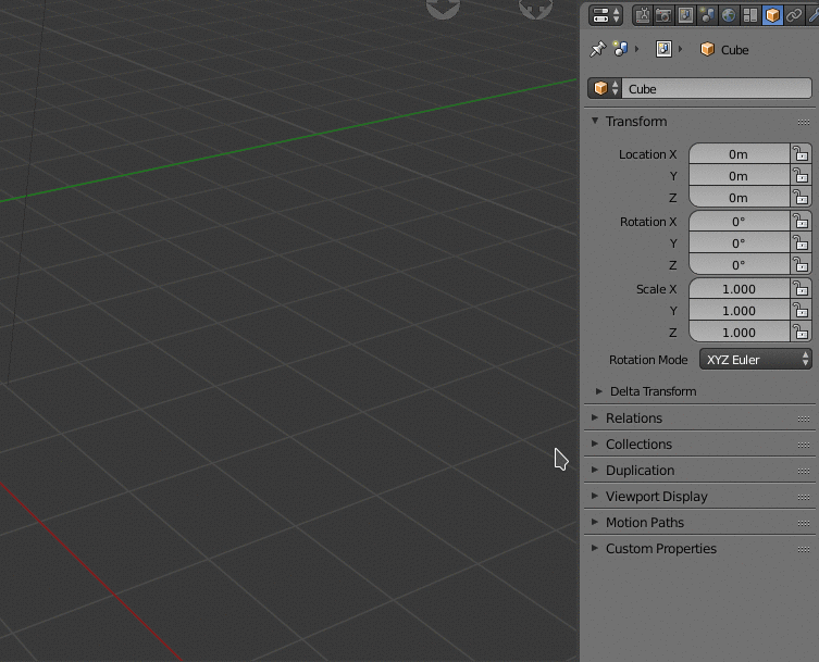
Yes. Set origin menu is very limited to centers (of geometry, mass, volume) and have a complicated shortcut Shift Ctrl Alt C.
So most of times, we are forced to use 3DCursor with switches between modes or align tool to place origin. It is slowing a lot the work.
+1. Having a shortcut to snap origin to selection in edit mode is all we need.
Video is about a temporary pivot. But changing pivot type to active element or 3d cursor is a faster workflow in Blender.
Set pivot type to active element, then right click on a vertex to make it active vertex.Or set pivot type to 3D Cursor , then place 3Dcursor (simple now, with snapping support). And it is done. 2steps
You don’t have to call and snap a temporary pivot to it and then lock this temporary pivot. 3steps
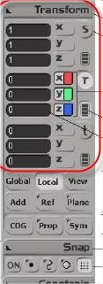
What is painful is defining a new permanent pivot for object mode, for rigging.
Yes. Changes in Edit mode are not taken into account by several things. You have to quit to object mode and then re-enter edit mode to be able to snap cursor to mid vertices created after a subdivision.
Developers are aware of that. That’s WIP side of 2.8.
There is no bad UI element. There are just bad uses or choices.
A pop-up for crucial informations like active scene name or active viewlayer name, active color of your brush is a bad choice.
But for a menu, to bring it under your mouse, it is a good practice that will speed-up your workflow.
People have different workflows. And what is a crucial info for someone may be not for another person.
It is why customization is important.
Now that I checked, I’m using an “old” version of Nvidia drivers, 390.77, on my GTX 1060, because the newer one gave me problems with Maya wireframe mode (they tend to disappear covered by the grid).
I actually found it a boon to productivity to put all my layers and painting tools on one monitor and the canvas on the other…I realize not everyone uses two monitors, but acting like floating windows is a handicap is a far cry from reality.
May be copycat -mimic- was not the best word, but look at this information.
I think that will be good to Open sidebar -N- and see all this element grouped in one UI place.
That depends on the individual preferred workflow, I think that if the user want to detach a panel, he should be able to do so, nothing forced, all optional.
Sorry, totally lost with fragmentation of threads related to 2.8. Maybe my question corresponds here.
@ideasman42, With “Select Circle” in active tools. Is it planned to make brush/circle outline always visible from the same moment since you select the tool, right? As it works now, it is a bit difficult to know at first instance what you are going to select until you make the first click and then you can see brush outline. So at the time of making the first click you could be selecting things that you did not want to select.
That looks weird. In some panels, there are 3 columns. In others, 2 columns. And motion paths panel does not seem to be affected at all with only one column.
Maybe it would look less weird if it was working with Motion paths panel ; but I still think that columns of panels instead of columns in panels is a better solution.
These extended headers and buttons are taking too much space. These lines would be segmented and displaying other things in a columns of panels layout.