Blender 4.0 Modifier Menu

I am not fond of the changes either, as for modifiers, I found it easier to find the tools I want by a direct presentation, now it is more mousework, more intentional…where do they put it …kind of thing.

Please take notes of how many aren´t liking this, revert if possible, or make an option within preferences to chose what you are presented with.

For blenders sake (being in conspiracy mode)
I do really hope it´s not an unholy alliance between plugin developers and the blender market, where the “improvements” in UI, is so bad, that you are forced to buy plugins to get it back as it was. :grin:

1 Like

I do really hope it´s not an unholy alliance between plugin developers and the blender market, where the “improvements” in UI, is so bad, that you are forced to buy plugins to get it back as it was. :grin:

Yes it really looks suspicious :smiley: :thinking:

You can’t be serious about this?

Given that the modifier menu will contain a lot more items than before, the UI team made the right choice in making this change.
GN setups should be accessible in the menu for sure and having (multilevel) dropdowns is consistent with the create object menu.

I don’t really understand what people in this thread are ranting about.
Do we need to adjust? Yes.
Does it require an extra click? Not per-se. The menus open on hover.
We can type one letter and see instant search results.

Unless you want to click 3,4 or 5 clicks to add a GN setup, this new menu is the way to go. It doesn’t take that long to adjust.

2 Likes

I do not think there is a chance of this happening as long as Ton is around.

Now there might be a slight possibility that whoever his successor is will be poorly vetted and will try to monetize the userbase as much as possible and strive for the BF to be every bit as corporate as Autodesk (though Blender itself remains free simply because you can’t just close up a GPL application).

The team can do whatever they want, as they see fit and exclude most of the users and their feedback, that seem to indicate, they do not like it.

I or they do not have much of a saying other than just respond that it is of no liking, then they have to listen in to other users who may like it.

Will it stop me from using blender?
No.
Will it make blender less attractive for me to use with this kind of UI workflow?
Yes.

What impact i thas for other users, or users who may want to look at blender as a complement or replacement for their current 3D software they may not be pleased with?.is written in the stars, or the space unfolding in time.

1 Like

Everytime I go in to the modifier properties, it just stresses my mind not being able to see the tools at once, it forces the mind to keep a track on operational types, in order to get to the right modifier, that is no good, it just makes the software lesser easy to use.

The modifier displayed tools were just fine as they were, there is no need to change igt, there are plenty of UI configurations or structures they could adress instead.

1 Like

So where would you suggest they put the auto-smooth modifier, the hair modifiers, all the custom nodes people have and potentially new modifiers the blender team will add themselves?
With the old menu you will end up with a fly-out menu that covers the whole screen and would be a nightmare for different screens

Personally , I also hesitate sometimes about what menu I need to drop down to. But I am forcing myself to type one or two characters for search. That is actually faster than clicking twice in the old menu. (if you can touchtype)

3 Likes

They could split standard modifiers to be exposed directly, put the others in catgories of choice, that can´t be that hard to implement.

You are assuming the “standard modifiers” list won’t ever be expanded.

1 Like

Of course I am, this is a task for the developers team to solve.
the current click modifier and the direct list that pops up, can hold those exposed modifiers directly while still having divide section lines for the others that need to be enterered specificly.

This could be split horizontally or verticly, with an additional list for the custom modifiers, it wouldn´t expand the former direct list that much.

That said, I don´t think they will do anything about it.
So not much of a point to discuss further really.
They are aware of it, what people think, they can take it from there, Either they will, or they won´t …either they can, or they can not.

1 Like

Actual menu is not removed, just button to show it is not there.

Just use addon to add it back as second button if you got used to it/have Stockholm syndrome towards it :wink: .

237a7a7f382ca6022d41ff6e970b7494e38beb5a_2_662x499

But thats not elegant solution, so that’s why its not built-in.

And it will quickly be outdated when more and more GN based modifiers will show up and will be more essential than current regular modifiers. (Eg. new controversial autosmooth modifier is not there)
New menu automatically adds new GN modifiers. Old don’t, so someone would have to waste time on it every time new essential modifier drop in or inventing wheel once again (new old menu that adds it automatically) instead of making new features/fixing bugs.

I’m surprised that ppl actually used vanilla menu, or even preferred old one to the point of arguing about it.

1 Like

Now we can add our own categories with our own modifier assets (mine is humble for the moment I have only just started using an asset folder).

Imagine what Higgsas’s modifier menu looks like, he could probably fill the screen with collapsed menus. We could need to use the collapsible menus inside collapsible menus!

I am pretty sure that in a years time I will have hundreds of modifiers to sort through!

1 Like

just add a fifth custom menu for, “custom” added modifiers, this could include all your desired modifiers by will.

Keep the rest as usual, the custom menu could be a specific one, and once clicked, only showcase those and not the other ones, there will be no collapsing menus within menus.

Now…has the New UI made it easier to find your modifiers, or are you finding yourself having to scroll more in list, and actually think where a modifier is placed based on it´s classification?

1 Like

It has made it muuuch easier.
Lets say i need a mirror modifier, i just type “mi” and press enter. Boom done. Way faster than ever before.

1 Like

Yeah, don’t scroll, browse or even look. Just type. After a short while, you get most of your commonly used modifiers into your muscle memory. As @ManuelGrad said, you’ll usually type two or three letters, and press enter. That’s it.

1 Like

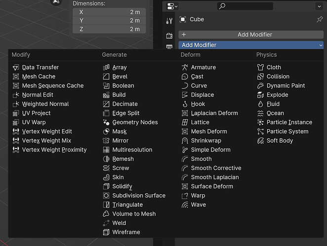
Guys, that´s not good enough, it suggest a requirement of knowing exactly the modifier you need to use …by memory, something a direct presentation does not require, and some modifiers you may miss.

Also, you put more muscle work in to dropping the mouse and start typing, it takes longer time and also accepting the tool, with a direct presented list, you look at the presented modifier tools, hover over it and click, done.

The kinematic motions for the keyboard tangent hits, either requires the finger setting method using two hands, ergo dropping the mouse, or pen, or it requires you to start looking at you keyboard to find the tangents with one hand.

I argue that is faster in most cases, for some it´s perhaps not much of a difference.

Ask yourself, would you still use the keyboards to write the two or more letters needed to get the modifier shown, or would you use the old list and hover over it and press, had you that available, try with the old version and the new version and think twice about that.

Text searching is not bad, can be good sometimes, but it depends on modifier type, category.

Besides, if the search by text is the way…thenwe have the issue solved, and there was no really no need to change the modifier list in the first place in to sections you have to scroll and enter, they could have just added that search option, then kept the old list as it were, couldn´t they…so why the change at all
?

With the direct presentation and pick by mouse, you do not need to type, you do not need to drop the mouse, you do not need to pick it up again after you have added the modifier, which is required if you have typed by the two finger keyboard setting method.
More muscle work for both fingers and hand is needed with the text searching.

What they could do though, if you have a headset and ai voice recognition or something, just shout :smile: give me the darn displace modifier, and you are done, no typing, no hand movement, people around you…if any may however wonder.

The future solutions would of course to just think about it when you have your neural connection implant done.

1 Like

you have to look, unless you have learnt the finger setting method
and you have to drop the mouse and move you hands and fingers more than a simple mouse movement, muscles used are more for the type to search method than a slight mouse movement.

1 Like

That’s some great satire right there, I commend you.

Knowing exactly the modifier you need to use.

^^

greetings, Kologe

He’s not wrong.

The entire paradigm of the modern operating system is click based… and became so popular, because people didn’t want to type commands in DOS.

I understand why the menu was changed, and it does offer some advantages. I’m coping with it. But don’t go into some reality distortion zone, and pretend that the new menu is just as quick to use, and browse/find a modifier as the old one was.

4 Likes