So they’ve added an extra mouse click for the same function. how can I revert it?
2 Likes
Short of downloading all the source code, making the code changes and compiling Blender your self, I don’t think you can.
Or option 2, stick with 3.6…
someone already created a solution:
just one search away
3 Likes
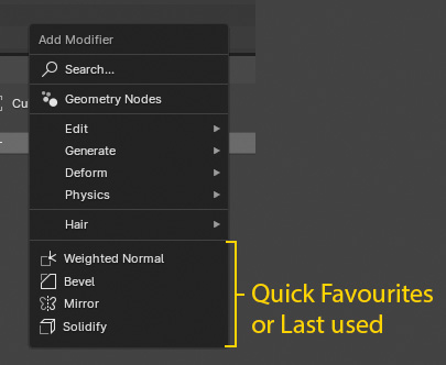
Damn, there’s should be something like quick favourites or last used in this list. It is possible to add some of modifiers as quick favourites in this list on Q button but unfortunately there’s no editor for changing the list (as I remember there was google summer grant for this but was not merged)
8 Likes
That seems like such an obvious change and the first thing I thought seeing this new menu as well. Adding an extra click feels like a basic ux oversight, how was this missed?
I searched on this forum and nothing came up not my fault this site is awkward, at any rate, thanks.
1 Like
After creating your own modifiers with Geo Nodes for a while, you can kind of understand what the devs. are going for with the new menu design.
All of your custom modifiers will be found in the new menu (which by design was not possible with the old layout). As more nodes get added and you create more scenes, you will notice more and more use of custom setups over time.
1 Like
There is a free addon already that brings back old menu
I think the developers should have done this way - add a new list with geometry nodes modifiers, and leave old modifiers list as it was. So there will be 2 lists - old and new
3 Likes
not sure if that would be ideal, i understand changes in muscle memory are not welcome, but in order to accommodate improvements redesigns are bound to happen. keeping lingering code and multiple ways of doing things leads to syncing more pieces of code meaning more burden on the developers.
1 Like
sorry for the passive aggressive comment, read it after a couple of other posts complaining about changes which skewed my understanding of the question.
No problem, im sure you can appreciate using software for over 15 years and one day you have to do an extra action to perform such a basic task is very frustrating. And I get they need to accommodate for the future systems, nodes and custom modifiers but this seems like such a lazy and ill conceived way to accomplish the task, I hope with enough people making a stink about it they will tweak the implementation a little.
Hello, I saw your comment about the need for a feature to show last used modifiers in the add modifier menu. I’m excited to share that I’ve developed an add-on based on your idea.
This add-on allows you to see your last used modifiers directly in the add modifier menu, making it quicker and easier to access the modifiers you use most frequently.
I’m currently in the final stages of development and considering making it a paid add-on. I hope this will be a valuable tool for your Blender projects. Stay tuned for more updates!
3 Likes
Crazy that they thought this was a good change. The add-ons are a blessing, but having to rely on paid add-ons for UX features that 3.6 LTS has as its default is pretty IMO a pretty embarassing mistake by Blender UX folks.
Hopefully they realize this is a terrible change and go back to the legacy UI, nobody likes unnecessary drop down menus.
3 Likes
BUMP
I want to revert it too. Don’t want to make an extra click every time or search modifier continously in everu freaking category
There is a free addon already that brings back old menu
It’s NOT FREE
Puzzling UI and workflow decisions is a normal part of using FOSS. If you need guaranteed logical decisions that help productivity, then you should become a Max, Maya, or Cinema 4D user. Otherwise, be grateful that such technology is free and embrace what we refer to as tradition.
Why not give the user a choice?
Just one checkmark in the preferences menu
If there was just one checkmark in the preferences (plus a ton of extra UI code in the background, which needs to be maintained), for every little UI-decision somebody wished to be reverted, one sunny day, we’d have probably dozens of such checkmarks.
Which UI related change hasn’t been asked to be reverted over the years?
Random examples a simple forum search spits out
what a step down… what a disappointment… first they took away what made blender unique and different, then they killed it all together. the new UI in 2.9 is far flung even from 2.79, it’s so counter intuitive, everything you want to do needs to be hunted for (if it’s available) and backwards compatability is shot.
I agree with most of it, but the part about killing horizontal buttons was sad, at least for me…
And there was only 3 votes against it!
I know… Alt-A isn’t that hard…
But, hitting that A key over-and-over… it just became a habit that’s been hard to break.
The new mix nodes are great.
There is one slight downgrade to efficiency though, which is in 3.3 and earlier when trying to swap the mix node inputs you could drag one input into the other and blender would swap your mix node colour inputs.In 3.4 and later it just disconnects the node input you dont have selected. A workaround is using node wrangler alt + s to switch inputs but would love to have old functionality back
Let me qualify. The new features of 2.80 will be awesome, but the changes to the GUI. Layers replaced by Collections etc. There are plenty of threads about how hard it can be to learn the Blender way of doing things, and having gotten used to, for example, layers, I will have to unlearn it all and learn a new way.
What makes it worse is, there was (is) nothing wrong with the old way. I don’t mind change, but change for the sake of change is a different matter.
greetings, Kologe
the ones that are actually an improvement
1 Like
No problem, im sure you can appreciate using software for over 15 years and one day you have to do an extra action to perform such a basic task is very frustrating. And I get they need to accommodate for the future systems, nodes and custom modifiers but this seems like such a lazy and ill conceived way to accomplish the task, I hope with enough people making a stink about it they will tweak the implementation a little.
Absolutely agree! ![]()
Crazy that they thought this was a good change. The add-ons are a blessing, but having to rely on paid add-ons for UX features that 3.6 LTS has as its default is pretty IMO a pretty embarassing mistake by Blender UX folks.
Hopefully they realize this is a terrible change and go back to the legacy UI, nobody likes unnecessary drop down menus.
Absolutely agree! ![]()
The fact that addons are written to return the old UI component indicates that the developers have clearly taken a wrong turn ![]()
My experience using Blender is not great, but even I feel the absurdity of this decision. The old modifier window in the form of a table with columns was much more ergonomic.
I think Blender users and especially veterans will be grateful to the Blender developers if they add a checkbox in the settings that returns the old modifiers window ![]()
![]()
![]()