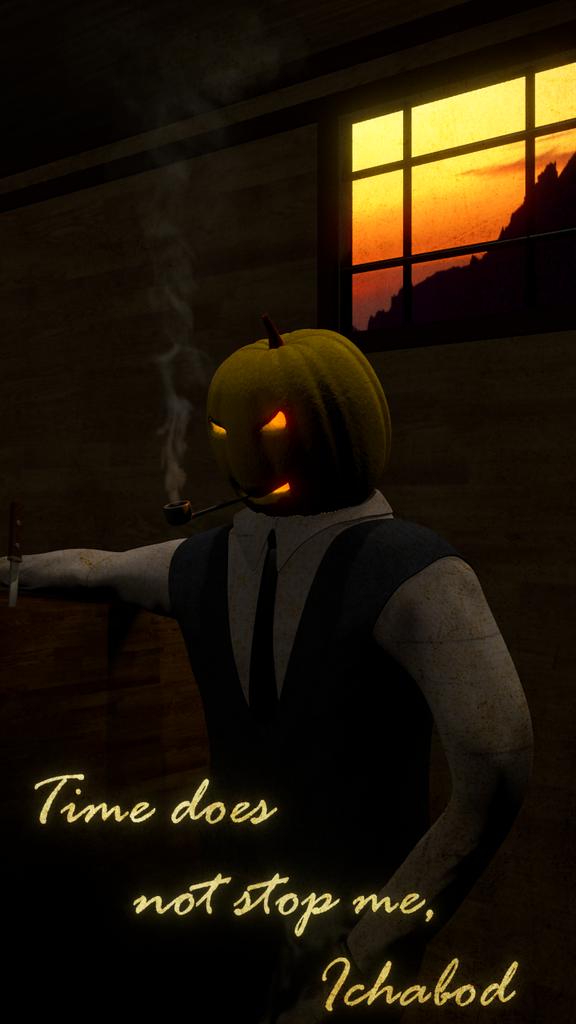
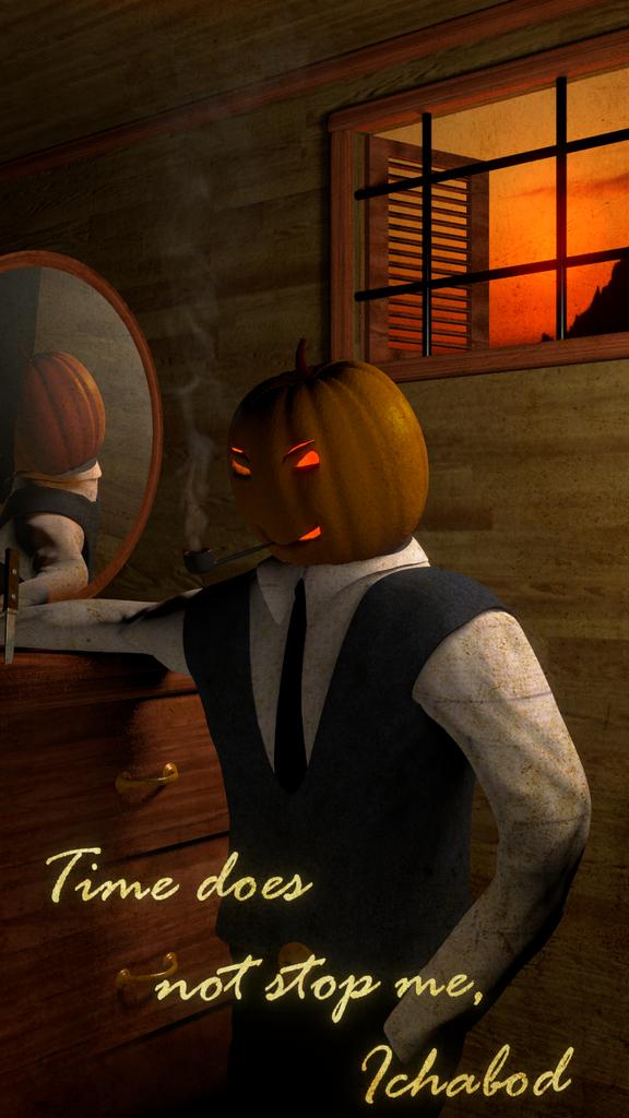
For a while, I have been hesitent to post contest material on here, but I think it could be very helpful. I mean, honestly, I dont think some one will steal my idea and recreate it in half the time I took. Anyway, I will get rid of the orange alising around the neck, so please ignore that. Any other critiques are very welcome! I am going for the classy version of the headless horseman from the Ichabod Crane tale.
if that’s what you’re aiming for then perhaps consider changing your composition. something that permits for a more even distribution (or blance) of dark and light.
The image appears quite dark on my iPad, however, it looks much lighter on my desktop computer. Depending on the type of monitor, and the monitor’s settings, it may appear darker or lighter. I suppose that it couldn’t hurt to lighten it a little more, if that doesn’t take away from the mood you are trying to convey. This is of course just my opinion, you are the artist
That’s pretty sweet! Good work. I’d lighten it up a bit, and make those eyes bigger so they are scarier. The window is really bright which takes some focus off the pumpkin.
Also I’m pretty sure the contest is : 1280×720 and your picture might be 720x1280 instead (it should be wider than long)… That’s OK though because you can cut-out the bottom area which isn’t that interesting. Good Luck
Is this a better brightness? I feel like it is still a little lacking though, but I cant put my finger on it. I wasn’t really sure what to write at the bottom, so I hope it dosent sound too cheesy.
Do you think that the eyes are too small Kumo? I thought bigger eyes are less scarry, but what I have in my head is not necissarily best. Is there any way to brighten it up without changing the mood? thanks
It’s looking good! I still think that the lighting is too dark; even though it’s supposed to be dark, it should still be a little more visible. I think the main thing that would really help it is changing the lighting setup in general. I would turn on either Ambient Occlusion or Environment lighting to both lighten the image a little bit and to add the shadows in the corners of the room (turn down the factor if it’s too light, which it probably will be), and add an Area Lamp (with an orange color to match the sky) right inside the window with ‘Ray Shadow’ enabled. This will cast some ambient lighting on the ceiling and will also help with the general lighting of the scene (and make the window look more like a window and less like a picture).
Well, heres another update. I tried all the suggestions, so hopefully its better. Is there any way to increase the creepyness that was lost due to lightening it up? Also my smoke domain is reflected in the mirror as a black cube. Is there a way to fix this? I turned on recieve transparent.