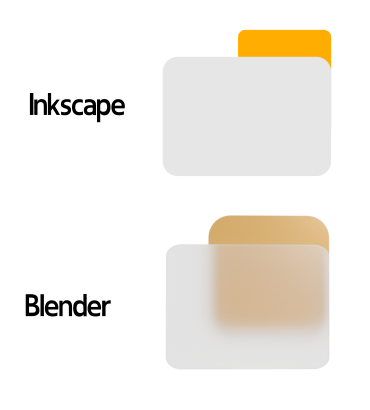
I was trying to create a simple icon for PC, it looks great on viewport and in render, but in PC, it looks awful
It is good looking on the viewport though

I tried adding an HDRI as well, but still the same. Any help will be great. Thanks.

I was trying to create a simple icon for PC, it looks great on viewport and in render, but in PC, it looks awful
It is good looking on the viewport though

I tried adding an HDRI as well, but still the same. Any help will be great. Thanks.
Hi,
What exactly do you mean?
Hi, please see image1, that is my File Explorer / Nautilus. While the model looks great within viewport and as image, when applied as an icon, it has a washed-out feel, faded colours.
Thanks.
Hi, thanks, I meant, bad, faded colours. It is a transparent PNG.