Thanks for your reply
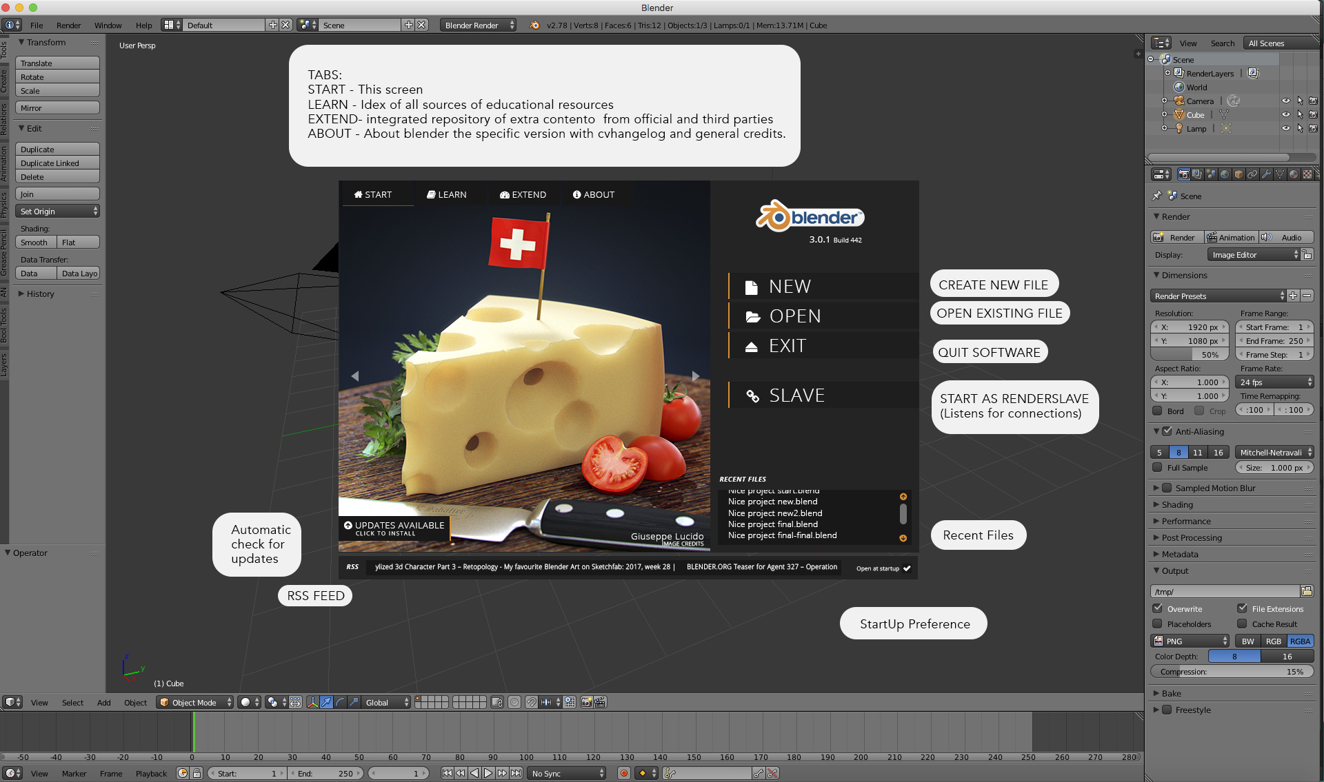
IMO, your buttons do not make sense for a splashscreen.
I think a splashscreen is useless a welcomescreen the contrary, the idea is to make less a splah eand more a welcome.
If people launch blender by mistake, they probably will close it by closing icon of window title, by habits. So, Exit button is not necessary.
I dont think that UI should just follow what user probably do, but mostly on a good balance of good design practice, logic, and pure usability. but I also do think it may not be essential.
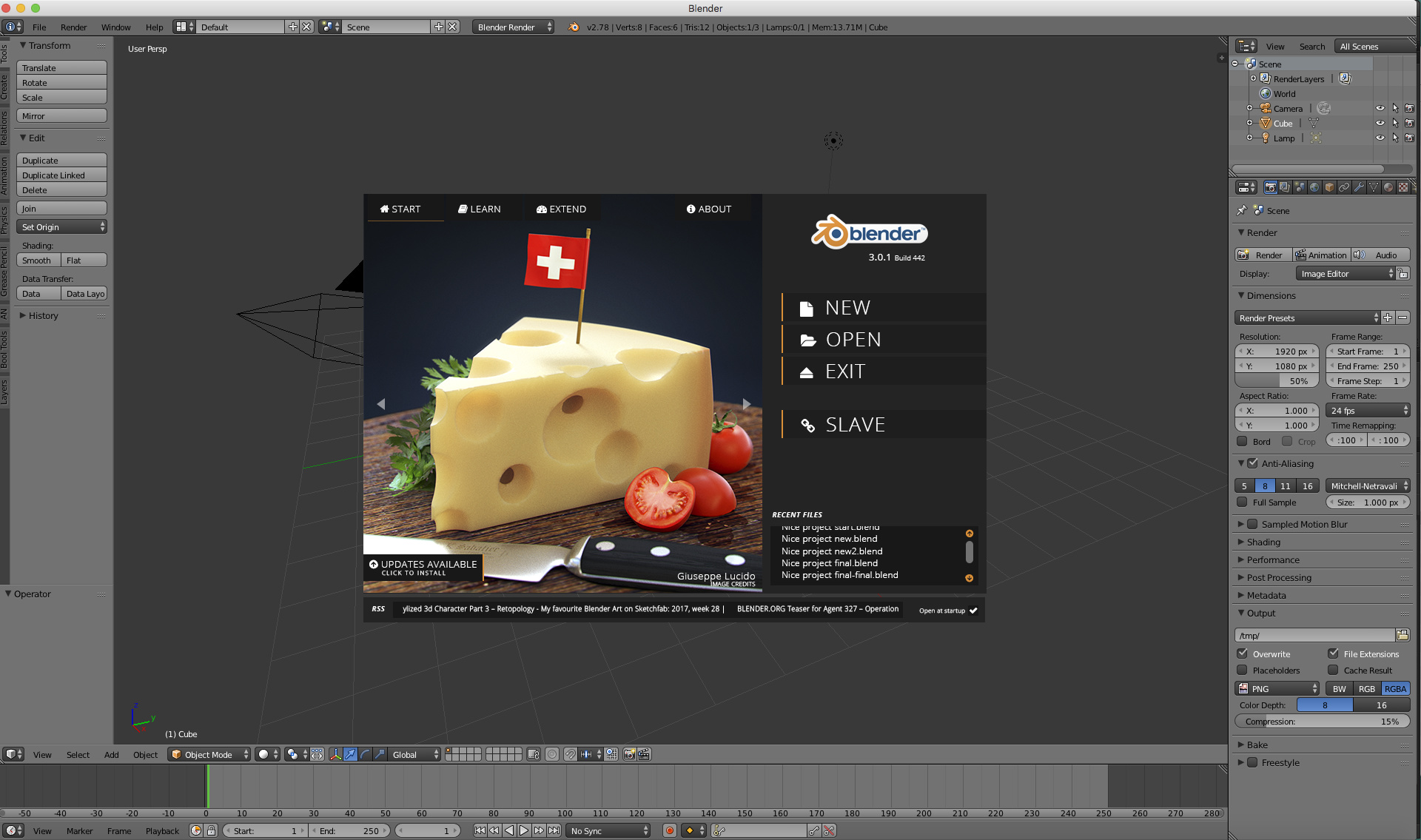
When you launch Blender, you are lauching startup.blend that is same template used if you use File-New item or Ctrl N.
So a new file is already there ; you just have to click next to splashscreen to start.
So, it will only make sense if it provides a choïce between several templates.
The idea is to avoid loading a startup file before you know if the user wants a new file a recent file or whatever other option could be available. Definately the click after new file would be selecting a template, much like skethup.
Then, Open button could make sense but there is already a list to Open Recent Files and a standard shortcut Ctrl O.
So, it does not correspond to a must-have.
A list of recent file is NOT a substitute for OPEN ANY FILE, and shortcut are selexplanatory a Shortcut" another way of reaching a target can’t be the only option.
Finally, if you are at a state to use slave blender instance for a render; you probably master command line and are able to launch slaves as background task without a GUI that will consume memory.
This “probably” is not working, and again, command line being the only way to achieve something scares many users and is not the best way to handle things in a FULL GUI WORLD, the slave button anyway could just restart blender in console mode with on a minimalistic window if we really need to optimize perfomance.
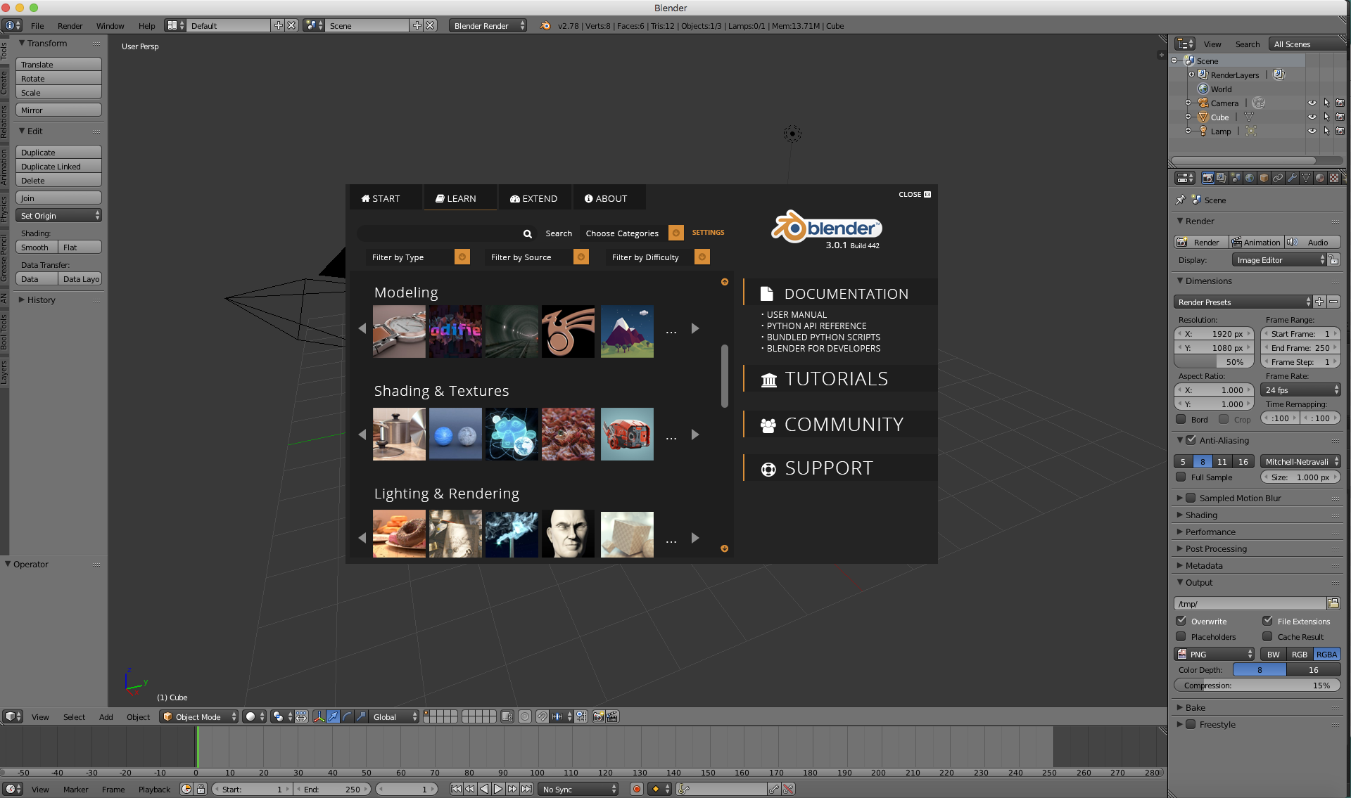
I like the idea of tabs for credits. I am just afraid that it will not fit under splashscreen area.
The idea of check for updates make sense. But it cannot be automatic.
Developers and testers, sometimes, have to close and open blender several times during a short period to track or confirm bugs.
And some can be related to start-up.blend or preferences.
There should not be an unnecessary scan made ; each time, they do it.
I don’t agree with your " Can’t be automatic" the automatic update could simply be a script that checks if the there is a new release to download or a more complex system like Aptitude which handles specific packages and dependencies from repositories.