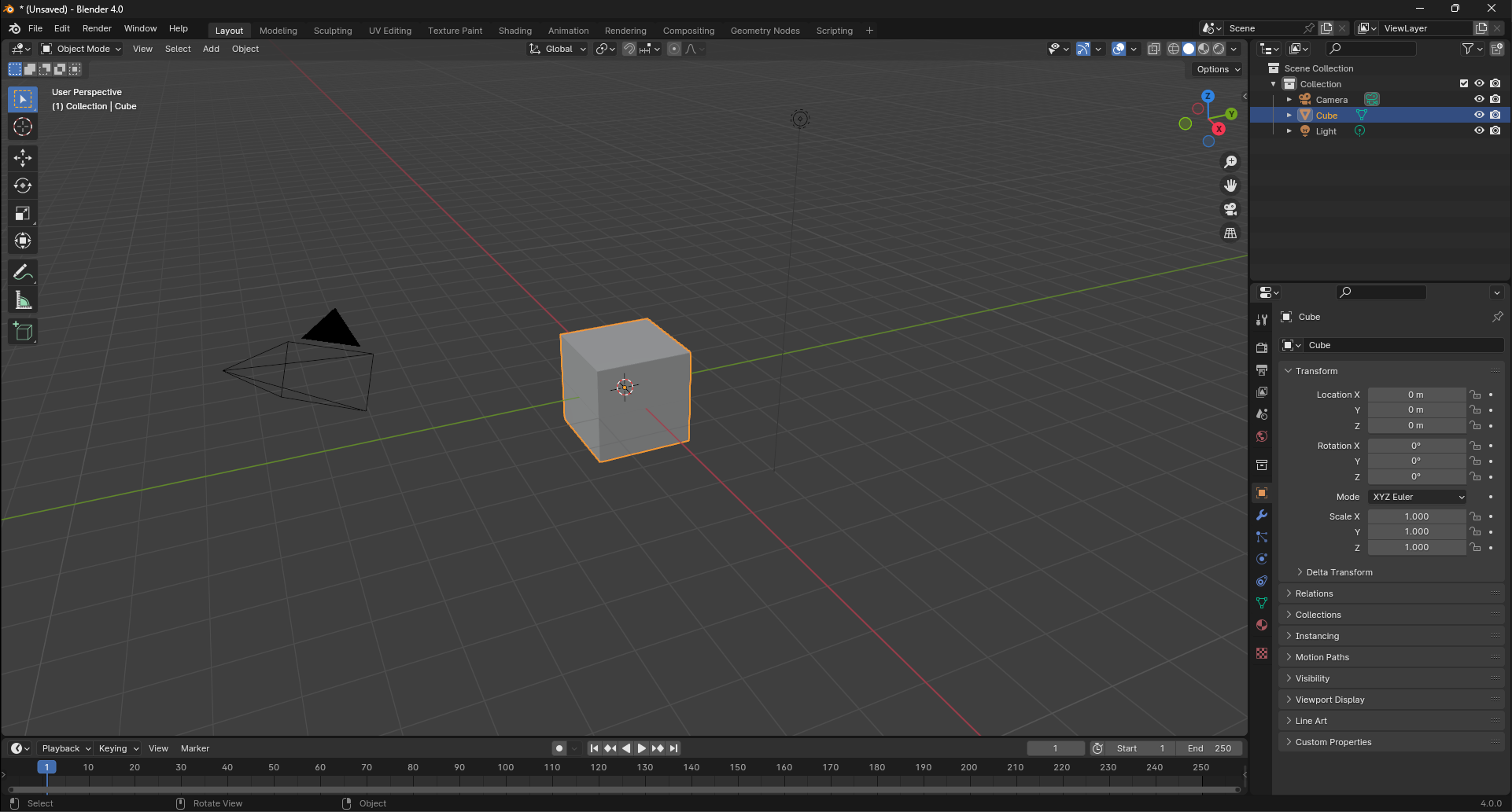
In my opinion, if the blender environment becomes darker, it will give a better feeling to the work and it will look more professional.
I created this theme for myself and I am sharing it with you.
I will probably add more changes to it in the future. Thank you for your comment.
Hey that’s cool ! I like the scheme but not sure about the white outlines that replaces the black ones. But I guess nothing can be done for that.
Keep in mind that many UI for image manipulation tries to stay around a neutral gray, so it doesn’t change too much your perception when dealing with colors and values.
Some exceptions are for instance Resolve with a much darker UI, why is it so ? since it’s about grading and therefore colors matter the most ? :
It’s simply because grading on movie is done in a dark room just like a movie theater, and that’s the primary goal of resolve.
To sum up, when doing modeling or animation a dark theme looks cool, when doing texture, lighting, rendering, it might shift your work a bit from the neutral…
Just like when working colors at night under a yellow / orange light might shift the result toward a blueish tint : because the light is orange, you need to add more blue to make it look blue enough, but it’s too much in the morning when seen under sunlight
Software are Photoshop, Krita, Blender, Nuke , Houdini and Resolve and they look surprisingly similar… Didn’t tried other software like 3ds and maya…
the gray shape in the center are midgray (srgb 128/128/128).
Looks like a big part of subjectivity and perceptual stuff is going on there, for instance I was convinced Resolve was much more darker, and I would also believe that blender was a bit lighter than counterparts.
I agree that darker themes looks cooler and a bit more professional in general…