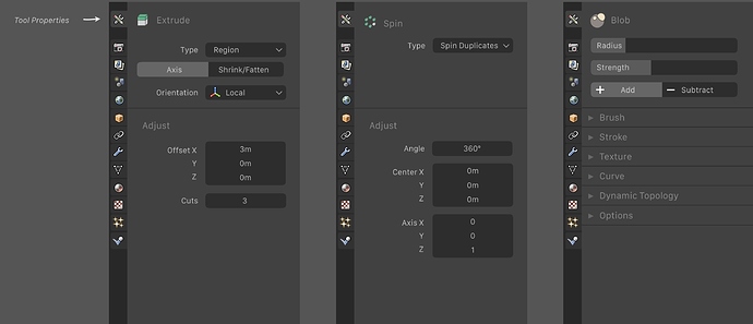
I’ve seen this image in the Blender ui thread:
(Thread: (2.8 usability))
And I was wondering:
The ui in the Image looks fresher and somewhat newer. I am not talking about the arrangement of the icons, text and operators but about the way sliders, values, enum appears, they look newer, they somewhat gets near the material design made by google.
So, I was wondering if the ui looks like that because it’s done in a software which is used to make mockups, for example Sketch so the blender ui looks wasn’t achievable, or becuase in the future blender will like that way.
Does anybody know?
