Blender UI top bar (EXPERIMENTAL)

Is Blender about to go standard issue with its UI?
#116967 - UI Experiment: Top Bar Quick Buttons - blender - Blender Projects

From Harley, this patch will allow you to have a UI that becomes significantly more similar to Maya, Photoshop, Office, ect… with the industry standard icon bar making you wonder if this is still from the Blender Foundation.

Well, the de-quirking of Blender in favor of getting closer to standard design practices (save for the cases where the BF believes it can do better than standard) appears to have been good for development funding and growing the userbase, and this is the program where asking for things like colored wireframes and left-click selection was once equivalent to pulling teeth.

7 Likes

I am very much in favor of this kind of direction.

I can’t understand why when you are reporting about those, you very frequently have to add this sort of narrative to it. I don’t see how this sort of oversimplified claims are useful in any way. If there was any truth to those sorts of claims, the default would still be right click selection.

10 Likes

Is this customizable?
I mean, can you choose which items you want to have there?
For example I won’t need undo/redo as I use the shortcuts for it.

Maybe it would also be possible to add ( optional ) things from the “Properties” side bar there. Wtih a drop down arrow thing, you then get acces to the things in there.This way you can work in full screen and still have acces to these.

3 Likes

As the title suggests, at this point it is just an experiment.
Usually, when this sort of experiments are made or when there are prototypes or things like that, it is to check whether the idea as such makes sense to begin with and whether it is worth proceeding. To me, this task also appears to be of that nature at the moment.
In my experience, the developers quite often have many details figured out at that point, but the first step is often to get an agreement on the direction. I wouldn’t be surprised if the aspects you mentioned were already considered at least by the developer. However, mentioning any of those likely doesn’t make sense, especially not if the direction might change or wouldn’t be further pursued.

3 Likes

Well that just makes it all look more cluttered and takes away screen space from what we really want, the main viewport.

Still, as long as it something that can be toggled and ideally not on by default, then I guess it doesn’t really matter.

7 Likes

This looks like a very interesting experiment! If this “quick bar” would accept any operator as a button (maybe taken from a list akin to the Quick Favorites and/or saved in Preferences) it would be fantastic for general use. I think something like that would cover the use of many of those little “one button” add-ons and would also help for first timers or people coming from other software to ease the migration.

1 Like

Yes. I guess I’d use it only if there’s some degree of customization. A dedicated panel in preferences just like keymap has

2 Likes

I agree that it needs to be customizable.
And it also would be very handy if this can be done for each workspace.
For example in sculpting - if you are in full screen - it would be handy to have quick access to the modifiers like the multi ress.

2 Likes

To me, another non customizable Topbar row can only make sense for things, that are not relative to an editor.
Playback being defined per editor, in Playback popover menu, I don’t get the need for redundancy of timeline header buttons.

For the rest, it looks like just a quick access to content of Topbar menus.
But those menus are not long and don’t contain a lot of submenus.
Many of operators contained in it are accessible through shortcuts.
And there is the F4 menu.
So, the frustration to access something from Topbar menus is low.

That reminds me, the higher frustration I get, when I discovered that 2.79 Timeline, buttons for keyframing, had been transferred to a Keying popover.
I never understood this change. If there is no space in Timeline to show all buttons, sliding header will always be more efficient than opening popover.
The useful buttons have been hidden. And, now, useless ones could be displayed.

Such customizable Topbar row will need to show different things per workspace. Things that are not already present in headers of editors.

The experiment about F9 panel as Topbar row, has been thrown to the trash, although every user who tested were pleased by it.
Because when the row was empty, it was judged as looking as a glitch.
A critic was about alignment issue on big screens or multiple screens.
As a right handed, Adjust Last Operator panel per editor, stuck to left bottom corner, is an higher frustration than any other access issue.
Most of people on the planet, being right handed, having ability to display those setting on the right of the screen or top, bottom center of the screen, should be the priority of UI team.

Adjust Last Operator panel should be converted as an horizontal row, in original design.
For an incomprehensible reason, there never was an experiment of this panel as a sliding row like headers.
It was only tested as a limited display of settings of operators and a … More popover for more settings.
A row with width sufficient to display arrays of 3 or 4 values was never an option.
But, now, there is a project of an Asset Shelf, wider than that, positioned at same place.

I can understand that somebody using a tablet may want undo/redo buttons or file menu items as buttons.
But seriously, if it is not customizable, that probably should be thought as an alternative display for menus, like an intermediate display, between menus and collapse menus display, instead of a supplementary row. Plus such concept of an alternative to menus by quick access buttons could be extended to headers menus.
Anyways, if developers produce a UI customization shortcut trick to display operators as buttons in Topbar ; that would be appreciated to have the same for headers or toolbar.

Sliding of headers in Blender is not standard, elsewhere. But that is an advantage in Blender. That is better than the standard.
Adding buttons in multiple headers to display them all, will always be better than trying to put everything in one Topbar Row and having to hide most of it.
2 Likes

I really hope this doesn’t happen. There’s simply not enough horizontal room in a topbar for all the fields and labels for even the most common operations. Also, when you put fields and labels horizontally and there’s more than a couple, it gets more difficult to determine if the label is for the field to the left or right. There’s a reason why forms you fill out in real life and on the web aren’t just listed horizontally forever.

4 Likes

That is not true.
Without Proportional Editing disabled, Translate means 7 words to display. Rotate 8 words. Scale 7 words.
Proportional Editing enabled, you add 7 more.
Around 15 words + 2 numbers + 4 checkboxes.

Most of other operators are below or around 15 words.

Current Topbar is by default displaying 9 icon buttons + 5 menus + 12 workspace names + extra space for a thirteenth, Scene name and View Layer name.

Of course, there are operators, like Bevel, displaying a lot of settings.
But we already had to find solutions, to that for Bevel active tool settings, displayed in Tools Settings bar.
We put labels in numerical fields, avoided labels for dropdown lists and added a popover for multiple checkboxes to reduce space taken by operators settings to one third of screen.
So, there is clearly enough space to get rid of popover in a row, that takes the whole screen.

So, to sum up, Current Topbar default is around 20 words.
There would be no issue to display operators with 15 words as labels.
And operators with 30 words as labels would just require one sliding of the row, that would be more solid than a popover or panel display, disappearing at mouse movement.

Yes. And that reason is not pertinent for Blender operators.
A Blender operator is not supposed to be a web survey. It is something you write on a paper on a table.
You are supposed to see the action of modified setting in the editor.
So, current panel, over the result, you have to inspect, is not the best.

I don’t need a row/bar with fields and labels.

If this experiment allows me to do that, it would be completely fantastic. Users will small monitors - the mockup showed a checkbox to turn it off, so your screen real estate would not be impacted in the least.

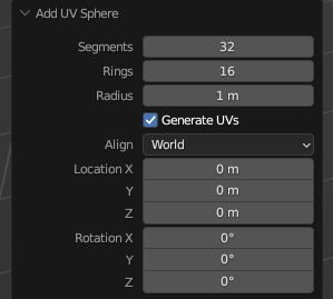
Yes, I agree, that’s totally a valid use of the Topbar. Trying to cram this:

topbar_nonsense

into a horizontal nightmare row of settings is not, in my opinion.

at bare minimum I expect this to be python customizable like the rest of the UI is.

1 Like

Look at the mockup that Harley did - what about that mockup implies it would have the 11 options for the Add Sphere operator crammed in there?

Guys. It’s an experiment. Most of Harley’s UI experiments never make it to a PR, let alone review and merge. Maybe save the discussion for when there’s something to discuss?

5 Likes

I wasn’t replying to Harley’s experiment, I was replying to zeauro’s comment. Please read what I quoted.

It could be added to there as a pop over similar to the lookdev/spheres thing.

Which is the definition of “sad”.

4 Likes

Why should that be sad?
Sometimes, ideas can simply not be good. It can be the wrong time due to other developments. Or they may be considered good, but low priority. Or there was an oversight and it would clash with other functionality, leading to inconsistencies.
It is just as important to find good new ideas, as well as realizing when something is not worth it, or not worth it right now.

6 Likes