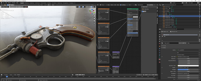
Blender used to be

Blender used to be the application that challenged the industry standard. a straight forwards easy to use application with great potential. it could import just about everything and exports just about everything, it’s rendering engine was constantly getting better and more and more physics and game engine features were being added all the time. the interface never really changed the UI was simple yet with complex abilities. Unlike Maya and 3DSMaX it wasn’t a guessing game of what hotkeys to use in what pane, they were all streamlined.

anyone could learn it, it wasn’t a chore.

then 2.5 came. I know they had to remake blender entirely out of python 3.0, but they didn’t even make an effort to maintain many of the core features of 249b. they instead didn’t even offer the same set of hotkeys and went for “the industry standard just like maya and 3DSMAX”. in a halfbaked attempt to “get more industry professionals to use blender.”

it didn’t work. they still don’t use blender.

Especially now with 2.9 which doesn’t even show your materials or textures on the model in the 3D view… what a step down… what a disappointment… first they took away what made blender unique and different, then they killed it all together. the new UI in 2.9 is far flung even from 2.79, it’s so counter intuitive, everything you want to do needs to be hunted for (if it’s available) and backwards compatability is shot. it literally crashes if you try to do too much with 249 materials. it only renders in 2 colors, black or alpha transparent background color.

It doesn’t even import ASCII .FBX files, a format Ideasman42 one of the blender devs was responsible for creating an export script for. what is going through the blender devs heads? “ok a new 0.# lets completely throw away everything and start new”

not only is that foolish, it’s expensive to keep starting new.

and it’s bad for your users. just when they think they are getting the hang of it, you change everything so they have to relearn the wheel.

This is a rant brought on after trying out 2.9 only to be thouroughly disgusted with it. even 249b is more capable than that! might as well go dig up the 249 source code and start back on that branch, before things took dramatic turns for the worse. doens’t mean it has to be in python 2.7, you cann make it in 3, just use 249 as a guide for what you need to put in. then build from there. no, not mangle and distort, “build”.

What the heck happened?

Well, Joshex, times a change. So does software.
This reads like you’ve done a Rip Van Winkle. I was/have been thrilled with the changes I have experienced. From 2.49 to 2.79 was jarring, but the whole Blender scene was designed to be.
I would say their users told them to change is what happened. That ‘petulant child’ act wasn’t going any further; becoming a viable, mentally-acceptable option for DCC the world over was the goal. Being different just to be different got them noticed; the power behind that weird time was hidden for the casual user, because of the act, was now desired; yet this power was ‘inaccessible’ by the masses who disliked the interface.
Alas, we awaken to today, where 2.9xx is trying to get out the door.
Have you looked at the bfartist fork? I think its called.

I must say: I’ve noticed these rants coming less and less, lately. I always wondered if the authors had the mental time machine going. You know, the one where you rant and everyone agrees and goes back to “the way it was”. I sure do when I write them. lol
Enjoy the day, Joshex. It’s different. And it renders in a few more colors than black. hehe Terrible straw man argument…

2 Likes

Stuff changes…

3DStudio DOS became 3DStudio Max
Softimage|3D became Softimage|XSI
PowerAnimator became Maya
Lightwave basically moved on as Modo - I know LW still is there… :wink:
etc.

A lot of the same but different at the same time. We all had to adapt to do our work. That’s life :wink:

Just realize that for software to become a staple at (VFX) companies, it has to be at least as good, or better than the current one used. Or much cheaper.
Blender is the latter, but not the first. At least, not for now.

Also don’t forget it takes a lot of time, and money, to switch from software A to B, as companies have invested tons of money in their pipelines and artists. And change is glacial…
Just saying switching to ‘standards’ didn’t work is way too limited as a argument.

Blender 2.8 really created a lot of buzz, and a lot of people in the industry are actively looking into it. Again, it will take time to see Blender taking it’s place amongst other applications like Maya, Houdini etc.
But it is not a unknown name anymore.

Just enjoy the ride, and the new things you will discover along the way. Looking back is often done through pink colored glasses… :wink:

2 Likes

I have no idea how Blender was before 2.8 since I started using it when it was released, and tbh i’ts waaay more intuitive and easy to use than Maya ever was. There’s just no competition imo, Blender is so much better (with some exceptions of course).
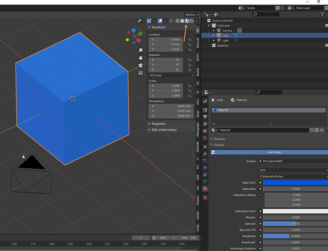
But you are saying that 2.9 doesn’t even show your materials or textures, which is wrong, just go into material preview mode and it’ll show just fine.

Anyways, it’s all about what you’re used to, and if you give 2.8+ some time you will adjust just fine :slight_smile:

3 Likes

shows, modern society is ill - as we tend to cure, we also make parts sicker
get aware of Heisenberg’s uncertainty principle as it’s really universal

luckily history and old works, products are in reach :wink:
and with all due respect, nobody is forcing anyone to what should or must one use

You know, looking at Blender 2.49b I’ve seen that it has a weird gesture thing, apparently you could scale, rotate and move by simply dragging the mouse cursor (that green tracking line) drawing a specific shape.

That’s a thing that with a pen would have improved Blender’s UX, I mean, better than the default shortcuts of CTRL+ ALT + GSR.

Other than that, 2.49b is pretty confusing, and the UI is a complete mess. Buttons with no clear logic bundled together with some having the name cut out.

Have you read the (giant button) Extrude info box?

Converts selected edges to faces and selects the new vertices

What does that even means?

4 Likes

What does this even mean?

8 Likes

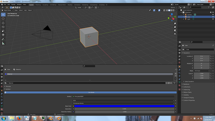
cube, material, blue, cube is not blue, stays grey.

broken. let me guess they have some hidden redo function to change the color after changing the material? so backwards and unnecessary.

1 Like

Just scroll down and change viewport color…

1 Like

I’m gonna be honest, Blender had to change if it wanted to get anywhere. There’s a difference between being innovative and different. Zbrush is insanely different than other 3D software but it innovated on the character creation pipeline for video games and film and was widely adopted even though it is so different. Blender having right click to select as a default, a UI that is different from almost anything people in the industry are used to are two things that were different about Blender for the sake of being different. There are arguments for right click to select and it’s old UI that have their own place, but in the context of being adopted on wider scale it had to change it’s UI and defaults to match more of what people are used to.

It’s no coincidence Blender got so much attention and funding once they made it look more like what people are used to seeing with 3D box modeling software. This is the best time for Blender, when else has there even been a consideration of another software being integrated into major pipelines since Autodesk has had a hold on the industry?

There are a lot of factors of why Blender never broke into the industry pipelines and replaced other modeling software’s (which it is replacing box modeling software in a lot of places for video game assets mainly hard surface.) A big factor though is that a lot of jobs require and expect you to know Maya or 3Dsmax. They work, a lot of people have been using them for years and a lot of companies have their own in house scripts for these programs that make them look a lot different then the out of the box 3Dsmax and Maya that you see. There is little to almost no incentive for work flows to include Blender other then it being an artists choice of modeling tool but you still know how to use their main tool. This is much more flexible in games then in film.

Another one is in schools Maya is being taught. Maya, Houdini, Nuke, Photoshop, Zbrush, Substance collection of software, these are all being taught and for good reason as these are what people use.

Blender is very much a jack of all trades software, it’s great at a lot of stuff but it doesn’t really fall into a dominate category like Maya for animation, Zbrush for sculpting, 3Dsmax for modeling (I know a lot of companies are using Maya but in my opinion 3Ds max has extremely superior modeling tools), UE4 and Unity for game engines, and Houdini for VFX and procedural modeling.

In terms of UI, Blender 2.9 is much better for me and makes more sense then 2.79. Then again that’s just preference, some people like to use zmodeller and more power to them.

Software is always going to change, the of the amazing things about Blender is you can go back to 2.49 and fork your own version. I think autodesk only lets you go back 3 versions of 3ds max.

The future is brighter then ever for Blender. It hopefully will replace a lot of box modeling software and find it’s own niche within the box modeling pipeline of the industry.

7 Likes

Just click one button to enter material preview mode… or go back to 2.49 and leave the rest of us enjoying the many improvements since then. I can’t think of one single thing I miss from Blender 2.79 never mind 2.49.

12 Likes

Magnavis, “…” I honestly don’t know what to say other than this is counterproductive and rediculous. so irregardless the material color, you have the set the viewport color separately? why can’t I link them so it’s automatic? whoever came up with that had a bad idea.

just like making fractal subdivision a redo feature and taking out the fractal button in the edit buttons was a bad idea.

now in 2.9 the buttons windows are all reworded and either a color or float. there are no buttons to speak of. they went too far different from the original. ytou can’t honestly call this new application “blender” it’s too different. it’s like calling 2 models of vehicles made by the same company the same name even though they are completely different, one being a pickup-truck and the other a mini sedan. just because there are x years between them and they aree not both currently supported doesn’t mean you can just flop the name onto a completely different thing.

I’m really just sick of it. 249b was really good. it needed a few things, like an actual from-tff font curve rendering text box with wordwrap and font distribution [left, right, justified] in game, better motion texture support, better external device support, ray traced shadows and reflections in the GE and better fire and clouds and liquid generators as well as basic particles in the GE. and a few other features. but it really was a good base to start with.

there was no valid reason to 86 what was already working as is to branch off in this ever changing mess of a direction.

Maybe it’s not about how Blender used to be or heading to, but the friends we made along the way (sorry)

4 Likes

I can imagine a Blender user’s discomfort and unease if they awoke from a medically induced coma and were comparing their beloved Blender 2.49 with Blender 2.91.

But for those of us who have been awake the whole time, it’s not a sudden jump. We have had 2.50, 2.51. 2.52. 2.53, 2.54, 2.55, 2.56, 2.57, 2.58, 2.59, 2.60, 2.61, 2.62, 2.63, 2.64, 2.65, 2.66, 2.67, 2.68. 2.69, 2.70, 2.71, 2.72, 2.73, 2.74. 2.75, 2.76, 2.77, 2.78, 2.79, 2.80, 2.81, 2.82, 2.83 and 2.90 in-between. 12 years worth of slow, steady changes, tweaks and improvvements.

12 Likes

cube,material,use nodes,blue done

1 Like

I started paying attention to Blender when it got ngon support in the 2.6 branch. Began toying with it seriously around the mid 2.7 line. I’m not exactly an old timer, but I did get to experience a bit of the Before Times.

Honest to god, I can’t think of a single thing that was better in the pre-2.8 Blenders relative to what we have today. Beforehand, I’d describe Blender as capable, but somewhat janky around the edges. Now? It’s an all around great program. I could probably find a few things to nitpick, but overall, Blender feels more like a professional, well designed piece of software.

8 Likes

Switching between modes in the viewport is a fairly common thing among all 3D editors. Maybe you want to be in wireframe mode to tweak the nuts and bolts of your object, or solid mode because it’s more performant, or material to see what your textured objects look like without any of the excess bells and whistles.

I use a mix and match of viewports all the time, usually with a rendered view down at the bottom right, and a solid shaded view along the left. That way, I can see what the final result looks like, while still being able to move all my various objects around at a smooth 60Hz.

There’s good reason for everything.

2 Likes

I just started using Blender after spending the last 13 years with C4D and I’m loving it! Better modelling tools, UV tools, render engine, and with fewer crashes. I’m not sure what it was like before 2.9 but for me and my workflow this is a huge step up.

4 Likes

the legion of 3Dview display modes is counterintuitive and deeply messy.
The mix with wireframe, object color wich is not objects color, texture that work in one case and not another, world ligh, scene ligth, my gandma’s nightlight, eevee workbench cycles, with each having legions of options doing this but not that, displaying object color from nodes and not properties, etc, etc, etc…
This is a real pain when you come from 2.79 and much more if you come from 2.49 where you had ( if i remember well ) wireframe, solid, (multi)textured, and rendered.

dev team wanted to do everything including mostly useless things like flat shading wich is REALLY FLAT ON THE WHOLE SCENE and is not what 3D ppl use to call flat shading, and they finally made what i use to call in french: une usine a gaz…


:rofl:

It took me about 1 week to find the tricks and parameter everything for the 4 modes i ( and i guess most of 3D modelers ) use: wireframe, flat ( with the ability to show smooth models ), textured and rendered.
Now my start.blend is my eye pupil. If i loose it, i hang myself !

However, when you lost the mandatory time for retrieving at least what you had in 2.79, ( including the keyb shortcuts you got to make from scratch, calling API functions ) the use of 2.9 is pretty fluent and nice.
Of course i would have prefered devs work on better and new unwrapping tools or debugged nodes/cycles for proper render, instead of implementing fluids or towels physics but noone chooses what is developped except devs.
Blender is free and i feel that it allows dev team do do what they feel like, the way they feel like. you don’t like it ? then shut-up or use MAX.

I rumbled when jumping from 2.49 to 2.76 and also rumbled from 2.79 to 2.9 ( i only left my 2.79 about two months ago ) and i hate relearn everything. But when the ‘rape’ has passed, all is fine and work becomes fluent again.

I hope you can insist on 2.9 as there are really some improvements on many aspects.

Happy blending @joshex :slight_smile:

2 Likes

Couldn’t agree more. There is so much work to be done to make this somewhat user friendly. Right now, it is a huge mess. However, it is still way more flexible compared to previous versions. And once you get used to it and you know where the options are you are looking for, it isn’t as bad anymore.
When people get used to work around those sorts of issue, they often don’t see the mess anymore.

3 Likes