If Bartv were really cool, he’d put this on the Featured Row.
Not only that, but the Blender project survived the big 2.5 push (which is a remarkable achievement considering its relative immaturity along with the shoestring budget the BF had at the time).
We have also seen the project become robust enough to survive and thrive from pushes like 2.8, no doubt they can do another big one in the future (which is possible since a future rewrite of the core has been discussed).
I reckon I may have been using Blender as a hobbyist since version 2.2*, and would still only count myself as a intermediate user.
I think the UI is better than it has even been. As for features, there’s no discussion to be had.
If there’s an issue with things that have changed around from version to version, then there’s the internet for that.
I wouldn’t know of the same could be said for the Python API, but everything else has undoubtedly improved over the course of the last 20 years.
If Blender and the UI would be so bad then Epic etc would not support it or even try to replace Maya with it.
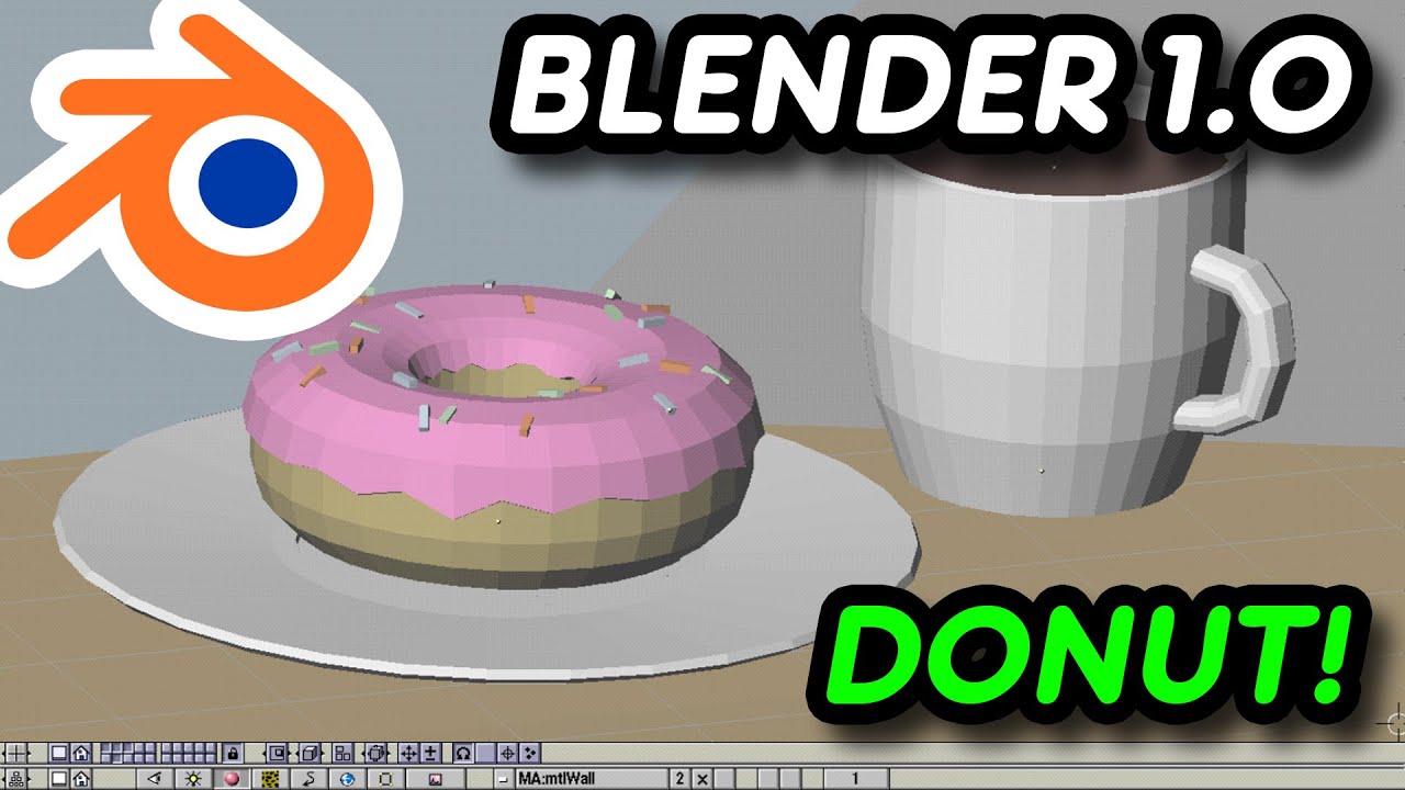
Out of curiosity, has anyone seen this? A guy manages to semi-successfully recreate the donut tutorial in Blender 1.0
I get claustrophobia and vertigo from that UI -holy shit. I can’t even stand looking at it for more than 3 seconds.
Eh, it has a kind of chunkity charm to it.
What amazes me are the similarities between it, and what we have today. It’s not as wholly different as it initially looks. There are bits and pieces that still remain even after all these years.
it is indeed, I still have a fresh version of 2.49 running in my head 
For the record, 2.79 series had a menu like that. Its called the “specials” menu, and you press w to open it. It just wasn’t as well fleshed out back then (hardly any options in object mode). If you set blender to right-click select mode, you have to use the same shortcut to open the new context menu, so it seems like they intended for this menu to be their equivalent of a context menu.
I would like to see display options in object mode.
I would like a brush manager in Sculpt/Paint modes instead of what is already available everywhere else.
I really think that some new UI stuff is very frustrating like Adjust Last Operation panel.
I want to move it to the right of screen but I can’t.
And many people are talking about same kind of frustration for other stuff like inverting groups of settings positions in header or changing topbar into a bottom bar.
Not my experience at all. I came from a 3DMax background and attempted to learn Blender 2.78 but I couldn’t make much sense of the UI. Then 2.8 came out and I decided to try again. Much better. Only complaint I have is that it evolves so fast that those good people who create free tutorials struggle to keep up. I have also found the official Blender documentation pretty useless. Other than documentation, IMO Blender 2.9 is more or less on par with 3DMax and of course infinitely cheaper.
this is the result of really passionnate hobbyists^^
…which I still find myself hitting to this day. I’m fairly well used to Blender’s new right-click menus by now, but sometimes I’ll forget myself, and end up with a lasso select instead of an option to subdivide.
I literally can’t stand blender without my old keymap, I have no idea of how people can use blender with the new left click select keymap, it feels like everything is wrong.
I really hope devs never stop supporting the right click select keymap, or I’m screwed.
You know it’s a matter of habit… on 2.7 I had my own keymap too, and my pie menus. I never ported them to 2.8 because the interface improvements made them mostly redundant and the few things I was missing didn’t look like they were worth the effort. So I stuck with the default 2.8 keymap for a few weeks and now it’s second nature.
I’m kinda envious of people with such neural plasticity, I simply can’t learn a new keymap now, it’s almost like learning a new keyboard layout or a new language,
I took to it surprisingly quickly, possibly because I cut my teeth on another, more standardized editor before moving into Blender. The only thing I keep around from the old keymap is spacebar to search.
Though there are still those rare occasions when I’ll do something I don’t do all that often, and I’ll hit up the old standard before realizing it doesn’t work.
I tried switching several times but I always get frustrated because no matter if I’m aware that I must select with left click, I aways automatically use right, then I get frustrated/nauseous and ragequit.
For the guys using the Blender standard keymap: Do you go into the different views (front, top…) with the numpad or somehow else?
I tried this for a while and find it absurdly slow because you have to move the mouse hand.
old keymapper, but my mouse stays an inch away from the numpad, it takes less than a a second to move it tho, with pen its even easier, sometimes I dont even need to take my hand out of the mouse, my thumb can reach the numpad…


