Edit: This is supposed to be a response to Sundialsvc4 but the forum broke
If OP had any desire to actually improve blender, they wouldn’t go on a massive ego fueled rant putting down the new systems and all who use them (while also demonstrating a profound ignorance of how they work, and the new context of Blender in the modern 3d art world.) They’d have put some actual goddamn energy into at least understanding the new workflows and as such probably wouldn’t have made this topic in the first place.
I mean did you see their custom UI they posted here with the whole viewport squashed to the upper half of the screen like we’re in 1999 blender or something? That shit made sense when monitors were unilaterally 4:3, but it’s 2021. The standard has become 16:9 with a lot of people with productivity setups using 21:9 and wider monitors. The 2.4x paradigm is not only not compatible with the modern world, it wasn’t even compatible with the past. Everyone outside of Blender’s religious secular orgy soup (that’s so lacking in self-awareness that there’s literally a thread dedicated to teaching you lot how to be a Blender user while also being a proper goddamn human being) of a community hated it. That’s why it’s fucking changed. That’s also why it’s had a massive influx of new users and features in the past 5 years, which is apparently a downside for OP. The drum circle kumbaya shit worked for blender when the path to pro work was more obfuscated by geography and cost, but times have changed. We aren’t all hobbyists anymore.
And to top it all off, the OP said “irriguardless.” Dropped.
Forgive me if I seem mad. I am. I can’t believe we’re finally on the verge of having this incredible disruptive software shake hands with (and have a changing effect on!) the industry standards and actually have a chance of knocking Autodesk down a peg just for the oldest least self aware fanatic members of the community to make active efforts to screw it up.
I just saw this response. You could try the alt+MMB+mouse swish method. I used it quite a bit until I switched to a trackball, and it became too hard to control.
Errr, I mean, it’s very human. Totally normal. Happens all the time.
There are flat-earthers, anti-vaxxers and all kinds of people who think we should promptly return to the “good old days”. It would be unrealistic not to have some version of those in every community -_- They don’t even have to be old members
Come to think of it, there’s nothing preventing these people, those who prefer the legacy workflows and technology, from just forking 2.49b and calling their new software ‘Blender Classic’. They can see how much development they can do with all of the old cruft still in place, horizontal layouts stuffed with buttons, no Ngons, no operation editing, no hotkey customization, no clean booleans, highly rigid rigging tools, basic multires sculpting, no PBR, no GI, no modern export formats, materials that look vastly different in different lighting setups, addons limited to the script window, single-object general editing, single-object IPO editing, many properties not animatable, no connected mode for proportional editing, slow and buggy texture painting, features that don’t work with each other, just nostalgia for those who only want the basics.
If they somehow make the legacy cruft preferable to the modern stuff, then the original poster can claim to have a good point.
I did that several times on d.b.o, here, on blender chat, devtalk forum. But situation stayed without response.
William plan was to change this vertical panel into a row.
They did a test with the row of settings as a second line of Topbar.
I fight against Severin who wanted to hide a part of content of panel behind a “More” button popover.
Because it does not make sense to consider an option or a setting more important than another one.
That panel is there to do adjustment.
If you modify the setting after the action in this panel, it is because it was not obvious to you that you would need to tweak this particular setting.
You use this panel to make adjustment needed at the moment it is required.
At that specific moment, that option is the more important thing you have to deal with.
At another moment of session, it could be another option of operator.
And because we are doing a job where our eye is the judge, we know that this will make a lot of adjustments in this panel.
But I don’t know why it is incredibly difficult to make understand to developers that this panel is crucial.
When the tool settings were in Topbar, in Texture and Paint mode, most of operators did not have options. So brushes settings could be displayed ,there.
Feedback of UI team who tested it was :
" That is more pleasant than expected to work with. But it looks ugly to have an empty row when launching software or using an operator without options. And it looks lack of space on very big screen."
So, instead of giving satisfaction to workers, developers choose to put esthetic consideration above everything else.
William decided to use this bar as a place to put active tool settings, because there was no region planned for that. But Brushes being considered as active tools that would be consistent.
Resulting issue of that decision was that the tool settings bar could not stay global.
Just as Redo panel + Brushes, it was working.
But for object mode and edit mode tools, that does not work anymore.
Those tools have a behavior per Viewport, per Editor.
We are now with a crappy Texture Paint workspace with 2 tools settings bar showing half of brush settings. And we have a infuriating adjust panel.
That situation was wanted by nobody.
It is not the result of intense brainstorming session to satisfy the vast majority of users.
Time developers had to allocate to UI refactor was just dried up. And they give up to pursue discussion on that.
This is absolutely not the case, here.
This is something annoying for the vast majority users.
We are talking about right handed people ( 90% of humanity) who have to use this panel (most of users).
And seriously, that is absolutely not complicated to improve situation.
My proposals to improve situation were numerous :
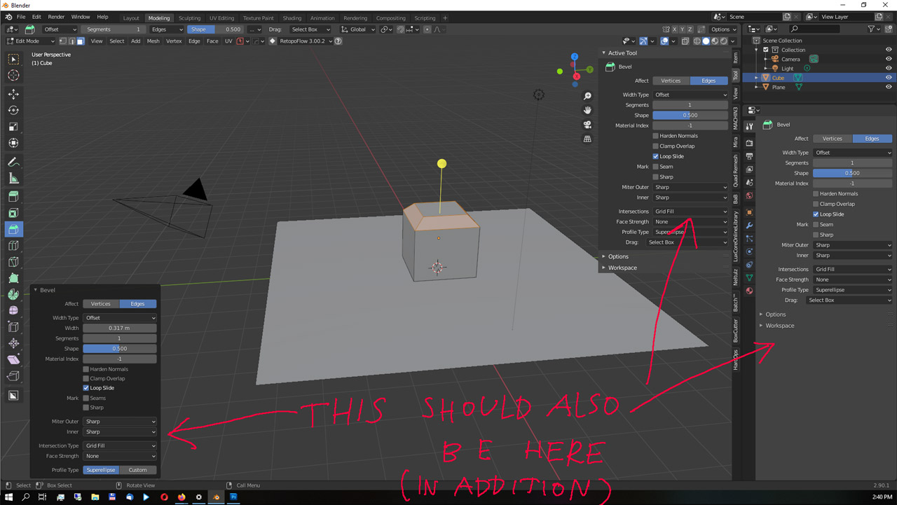
move the panel to its own tab in sidebar.
Most of time, sidebar is used to display properties.
That would just require Ctrl Tab shortcut or mouse wheel to switch tabs of sidebar to display it.
That may be annoying if addons can not have buttons elsewhere. But addons can launch operators through menus, pie-menus, 3D Viewport gizmos, toolbar.
move it to Properties Editor in its dedicated tab.
It is a panel that has no fixed size and can be short or long according to operator used. So, it would be annoying, confused with other panels. So, solution is simple. Just display it in its dedicated tab.
move it to Info Editor.
Last Operator is expressed there in python code as a message that can be copied to create macros. Adding a view to that editor to display such panel according to selected code would be consistent. In such view, user could modify last operation but also repeat older ones.
Go back to 2.79 situation and split sidebar.
Pursue original plan and change it into an horizontal row, not left aligned or right aligned but centered.
I think that for several of them, nobody will be annoyed to face such change.
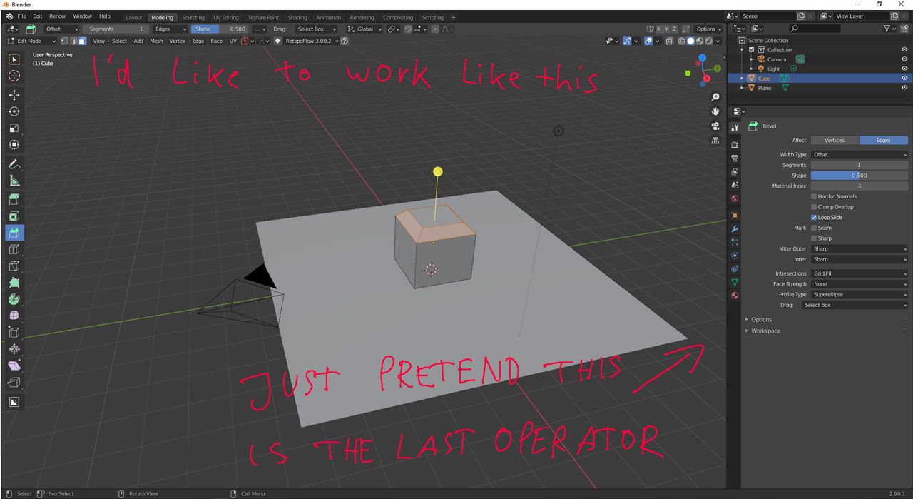
But finally, I just ended up by requesting the ability to move actual panel to the right.
Just the flip region option that is possible for everything else (header, toolbar, tool settings bar, sidebar)
Which is not a request for an improvement. But just the restoration of an ability that was given in 2.79.
Each time, I am treated like we were asking a trip to the moon.
That is sincerely discouraging.
I understood that was not on your planning. But seriously, that is ergonomicly painful to use the software since 2 years, now.
And it seems like you are able not to give a fuck during the rest of decade.
And I actually thought I went a little bit too far with my last rant, in terms of language and harshness.
Reading all this (thanks for the infodump!) I think I did not go nearly far enough.
Holy moly, now I am in such a foul mood, If I put it straight into words, I’ll get banned.
…
…
This is pure incompetence, mixed with a hint of arrogance.
THEY fucked up, put an shield of silence around it and refuse to even consider a better solution now.
Wow!
When it comes to UI designs, a forum is a horrible medium in my opinion. There is pretty much no way to avoid it being a frustrating and discouraging situation if you try to bring your point across. In my experience, the best way to have UI discussions is either in person or in calls. Everything else ends up being a huge time sink due to different views on the subject.
There are so many factors to consider. What is great about 2.8x is the increased UX consistency. In my opinion many things make a lot more sense now, even though there is still room for improvement.
They introduced so many changes and tried so many things that at a certain point, they had to call it good enough for now. UX is an endless topic and there is no perfect solution. Even making everything configurable has lots of drawbacks.
In my opinion having open discussions about the UI is not feasible. The only way to not waste everyone’s time would be to heavily moderate them. Even though this is an unpopular opinion, there are unfortunately lots of examples, both in this forum the on devtalk as well.
It would make a lot more sense to have a few community members in the UI module team and occasionally invite others. However, that would require that the UI module team got a more active role and as far as I can see this is still being worked on.
Edit: From my point of view, the expectations from many in this thread regarding the influence of users towards UI decisions or Blender in general is simply not realistic.
Bullshit.
This isn’t even UI “Design”, the design is finished, the UI is there, all that is needed is to connect the data and make it happen. Nothing needs to fundamental change, something is added. That’s it.
Nobody has to learn a new workflow or has to change his workflow.
It’s not even worth a debate.
I don’t expect that they listen to me: I expect that they DO what THEY SAY, and say what they do.
They told us that they make the UI better and that the Last operator panel was a thing they’d like to change, which many of us agreed with.
They talked about plans, and there was a debate.
Then they failed to deliver.
Then they stopped talking about it.
And now they pretend everything is fine.
You know what is the most infuriating thing about this?
They tried to invent the wheel again, when the only thing they had to do was take a look what the competition is doing to solve this problem.
This problem has been solved by ANY OTHER F%&$ß# 3D PROGRAM.
It still comes down to the same point: “don’t just rant.” Turn your rants into specific changes that you think should be made, and clearly articulate your point. Argue in favor of it, and be willing to listen to counter arguments. It does nothing to “rant and rave” when nothing will ever come of it which will convince enough other people so as to be turned into implementation. That’s “just making noise.”
Describe – describe exactly – what changes you think ought to be made, how those changes would be used in actual workflows, and why your idea is worth a million dollars such that we all should rush to implement it. State your case, without emotion.
I seriously don’t even know what you are talking about. Somehow, you seem to be talking about some specifics, but somehow not. Somehow it is only about adding things to the UI?
Not sure whether you got the point I was trying to make.
That is the absolute minimum that I expect, which is also the standard in many other applications.
In addition to this, we could talk about making the panel an ACTUAL floating panel which comes with the functionality of being moveable inside of the viewport.
Tbh I don’t care about this functionality at all, I just want to banish this shitty thing out of my viewport since I think its nothing but visual noise that doesn’t belong there.
But possibly there are other people who might want to have this functionality.
I get what you are saying, but I WANT TO rant. It helps get the frustrating emotions out of my system.
Secondly, I want to see what others have to say about it before I start to make it official.
Thirdly, I am lazy and my Brain is riddled with ADHD, in making some noise and I am hoping to find maybe some who stand by my side and help.
I disagree. It is horrible and not working when topic is too general and it was the case during 2.5 development.
But when the thread is corresponding to a clear topic, it works.
For 2.8, a lot more people made pertinent feedback, with detailed problems and good suggestions to solve them.
And it is far more easy to follow than a chat.
I experienced something else during the last 2 years.
The unsolvable left click select transition has been solved on this forum.
The new keymap acceptance.The idea of tweak tool. The way gizmos should behave…
Most of the success of 2.8 comes from the ability of community to express a valid critic and to discuss solutions.
That is what is partially done. There were meetings for 2.5 and 2.8.
UI team had meetings with developers before, during and after codequest.
But that was not sufficient. Months of discussing, here, were still necessary.
I understand that one developer prefer to have only one interlocutor.
But that guy is almost always forgetting something.
That is why a community is better.
Of course, there is a difficulty to synthesize feedback from thousands of people.
But I think that people are cleverly using likes, nowadays, to make priorities popping up. (again, I am talking about threads with a clearly defined topic)
I think that most of people are able to handle mature discussions.
I agree that as users, we could continue endlessly to talk about those things.
But that does not mean that recurrent requests can not be identified and considered as priorities.
Toolbar was clearly identified as problematic in 2.7 UI.
It was identified by users as problematic since 2.5.
It is still problematic and this is the year of blender 3.
What is discouraging is that some UI/UX problems clearly identified may last during decades.
Discussion about adjust operator panel is not a question of searching perfect solution. It is about eliminating a regression.
There are clear demands from people about 2.8 design issues.
Solutions to make it more ergonomic for right handed people.
Solutions to make UI faster because Singled Column layout + Subpanels + Popover are slowing it down.
Solutions to make viewport faster.
Solutions for regressions due to Blender Internal removal.
That has nothing to do with ireallistic demands. That is just a desire to come back to a fluent UX.
But the topic of current moment is geometry nodes.
That looks like being totally disconnected to priorities of Blender everyday user.
This is the perfect example of how one size doesn’t fit all, because I like the operator panel being there, and my only complaint about it is that it opens minimized by default.
Though I could see why it annoys you more, since your UI elements are a helluva larger than mine are. It takes up a good chunk of space on your machine, while it’s pretty compact on mine.
 That’s “just making noise.”