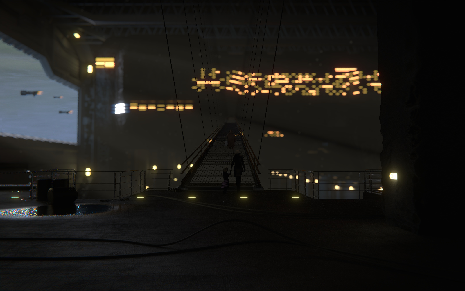
Hiya, this is my current WIP for the blenderguru competition, would appreciate any comments, especially regarding composition and lighting. Currently working on adding more detail to the floor and improving the character on the walkway. Rendered in cycles
Right now the people look very flat. Like they are planes in the shape of humans and extruded. Is that what they are? it is really letting you down. If you fix that, then we’ll go from there.
The people are slightly shaped extruded outlines of people, I originally wanted to try and do a sort of silhouette of the characters since I don’t have much practice with character modeling, the shadows on the characters should be almost black, same with parts of the pillar, I think my monitor is a bit too dark maybe
I’ll still give a shot at remaking the characters properly, as Jonathan said, to see what I can come up with
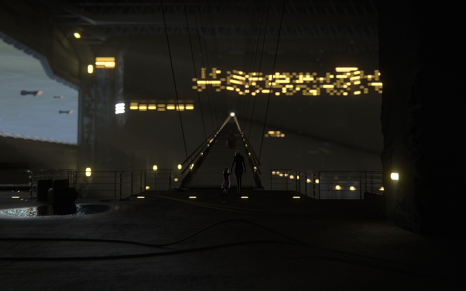
I modeled the characters a bit more and changed the lighting so they have some more light on them to maybe help them look less 2d, removed the other walkways to focus on the characters and added a background sky. The end of the walkway currently ends a little soon to reduce render times a bit since the grid pieces are modeled.
Definitely much better. My only suggestion now is to add more things, focus more on the characters(my eyes are on the puddle), and brighten it up, especially since Andrew hates dark scenes.
That’s just tragic. I really admire Andrew, his skills, what he’s doing for the community, but I don’t agree with his taste in renders, his taste in ‘art’. I checked his review-series and time after time he made technical observations on creative decisions - I don’t get that at all… :no:
Anyhow, I personally really liked the first, darker one, the mystery of it… I got that ‘what the hell is this about’-feeling, and in a good way.
But there’s room for improvement too. I feel the foreground isn’t connected to the background. The background just look like a blurred still, composited in behind a render… I’d check using atmospheric fog to blend the fore- and background. That’ll also give a more belivable feeling of depth in the scene…
As a last note you need to get rid of the antialising in the wires, but that’s kinda abvious…
FWIW I would add some volume lights especially with the foggy feeling. E.g. I’d put them at foot height along the catwalk, pointing up to highlight the people. Even consider rimlighting the peeps. ITs all personal taste and I really like what you’ve put together!
I realy like the dark feel. There’s some points that dont feel quite right. The right side should be way brighter, even a small 15W light bulb gives off more light than that! And yet the (modeled) lamp there looks quite bright. Another part which i have a suggestion is the brigdes. The right one looks like its going into the wall, maybe it’s just me but it realy draws my attention away. On the other hand i realy like the effect the dof creates with the lights on the bridges, creates a desire to know what’s over there at the other end, too bad it’s to foggy to see anything
I added some lighting around the characters as walshlg said, and I really like this idea, so thanks
I still can’t seem to get the antialiasing on the wires fixed though, I’m not sure why.
It likely has something to do with my compositor setup since I’m combining a cycles scene with a BI scene in the compositor for the halo effect in the door opening, so I attached a pic of the composite setup so maybe someone has some idea
There are no jagged edges on the render of the BI scene.