original https://www.blendswap.com/blend/5315
by MimingApe https://www.blendswap.com/profile/1811
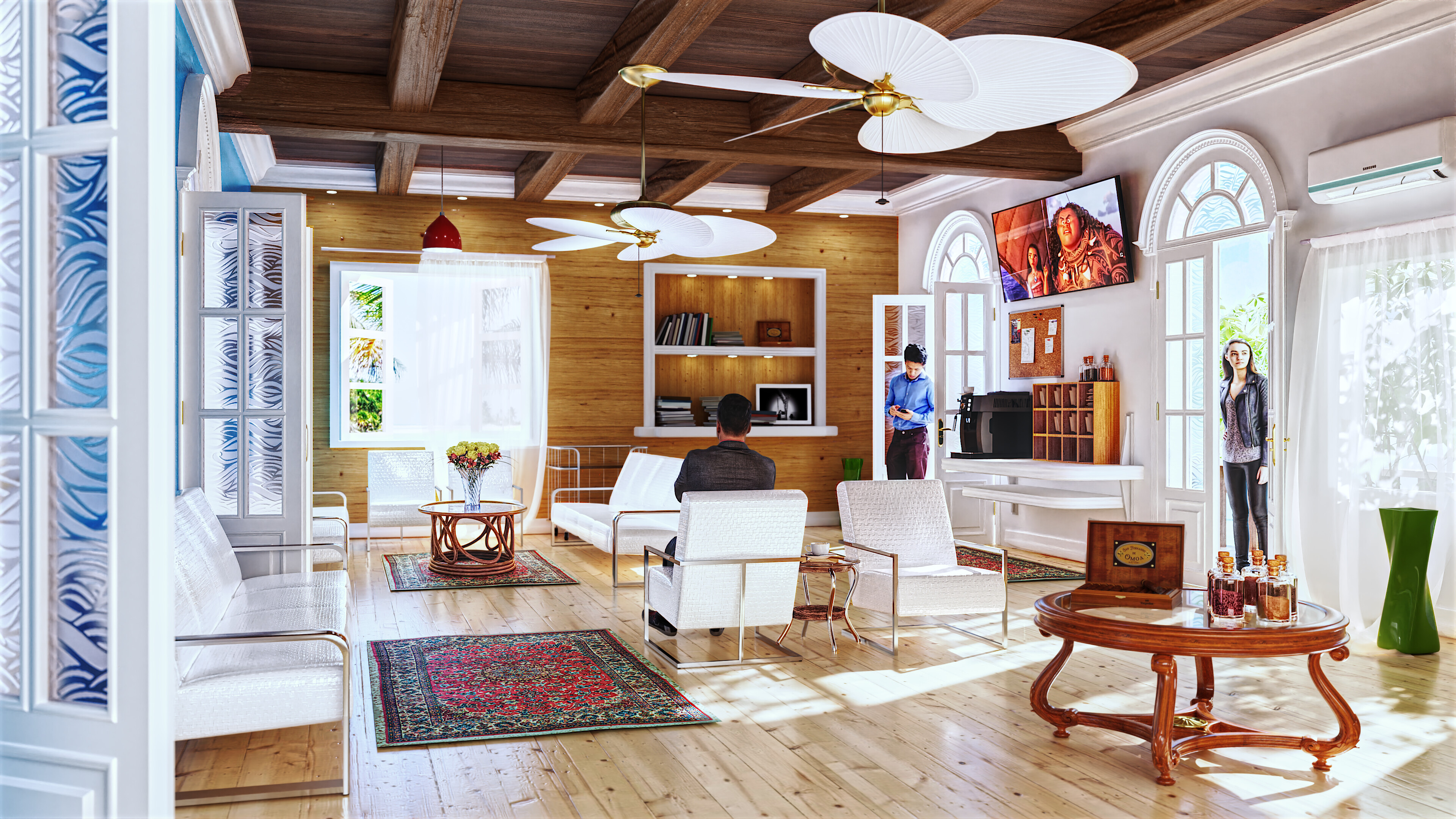
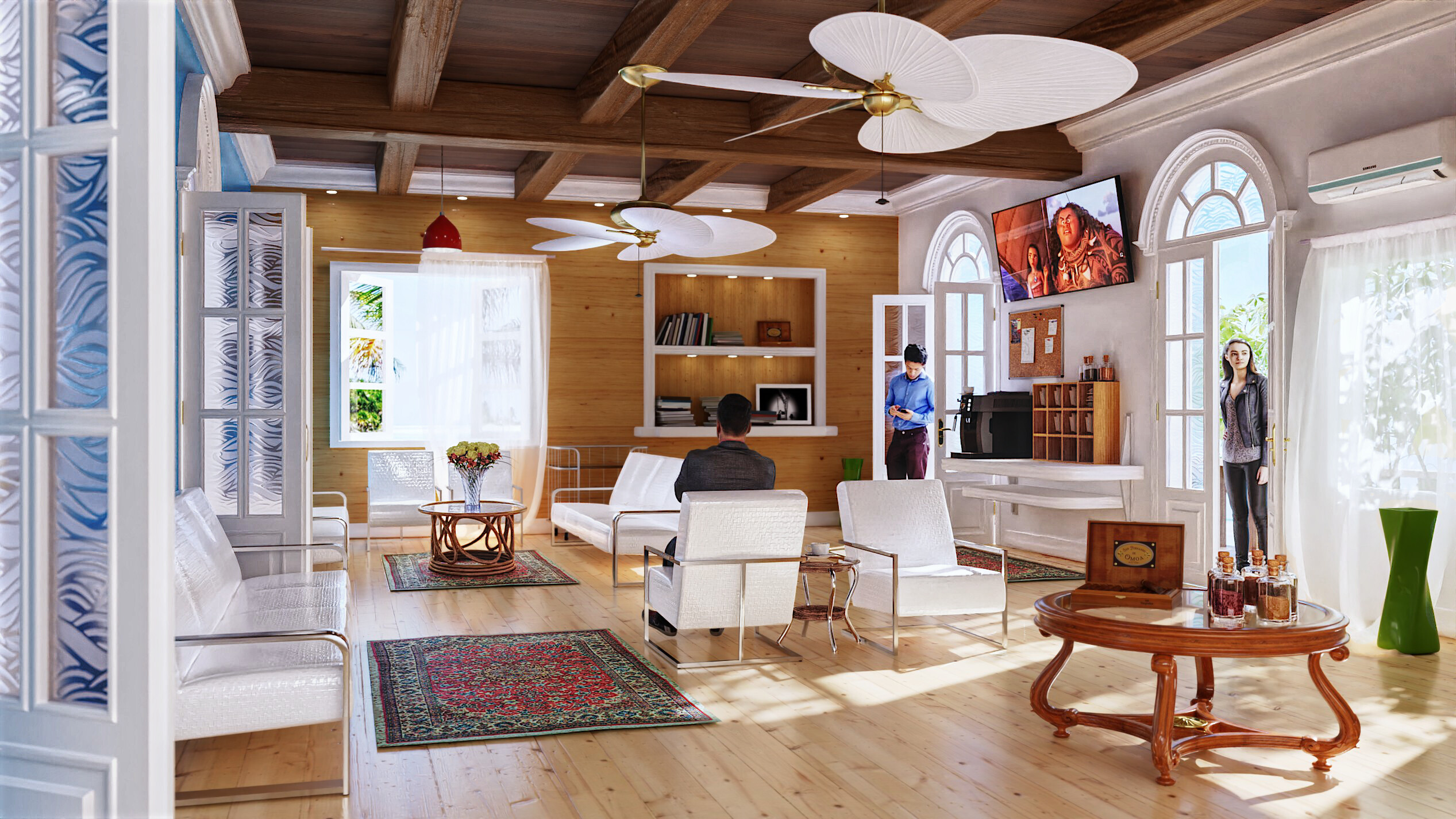
Long long ago maybe the 2nd time I tried blender I saw this scene on blendswap and liked something about it and wanted to redo/enhance/decorate/re-light it.
2 Likes
April 8 2021
More playing with files from Blendswap https://blendswap.com/blend/5315

interior3 2021 pkd.blend (4.5 MB)
April 21 2021
July 15 2022
March 7 2023


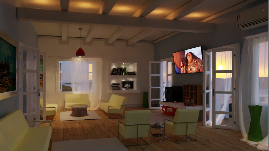
yes, this scene again ![]()
\2021\blendswap villa-interior 5315
2 Likes
March 8 2023
Cycles Shader displacement at render time VS Geometry Nodes displacement.
Needed 6 levels of subdiv with geometry nodes to look as sharp as 4 levels with shader displacement.
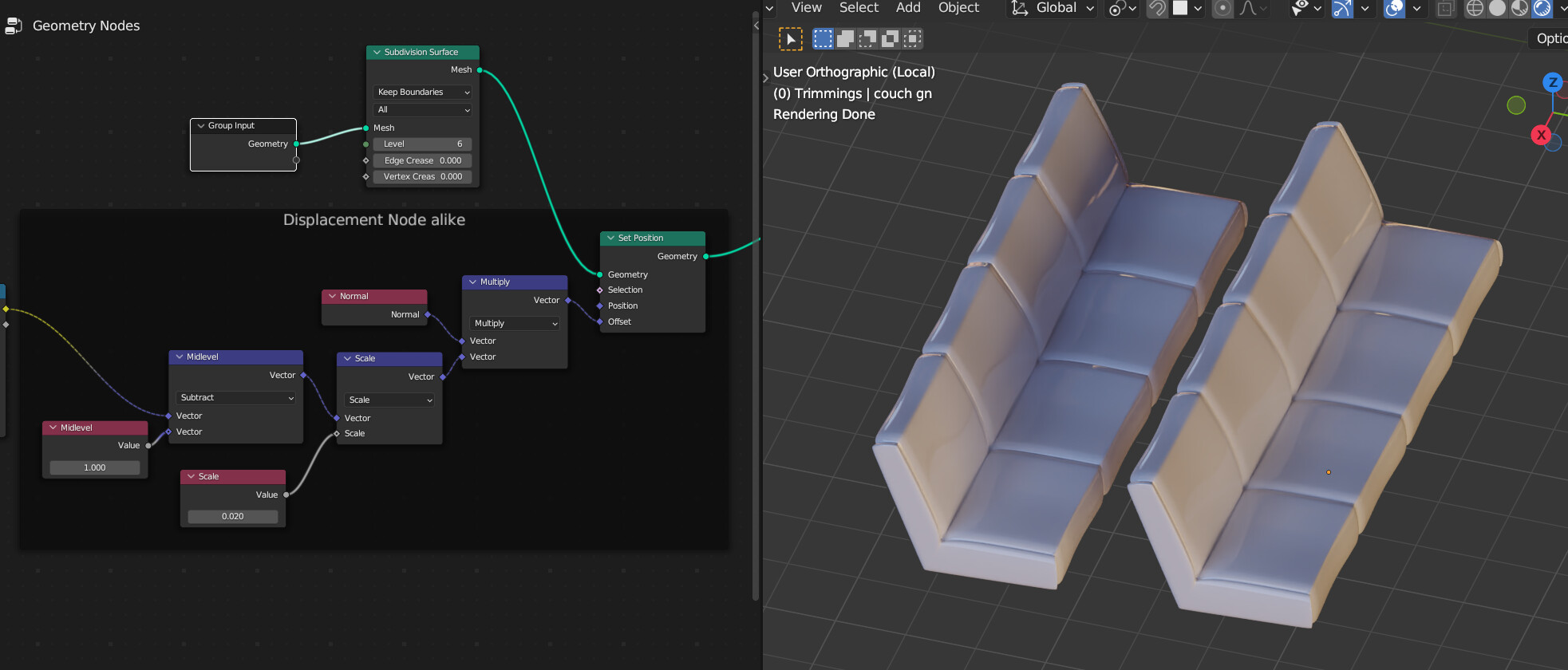

Originally did the shader displament using Generated Coordinates. Couldn’t figure out how to get the same starting point in Geometry Nodes so switched to Object Coordinates. Had to scale the starting coordinates by 0.5 in both shader and geonodes to get a starting point similar to what I had with Generated Coordinates.

Multiply by 10 tightens up the gradient that will make the crease between cushions.
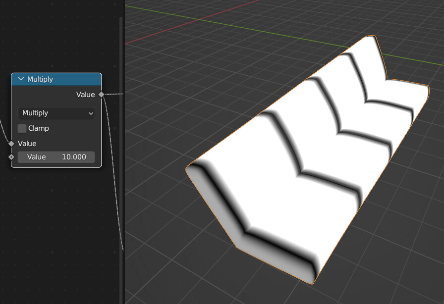
Float curve puts an indentation in the middle of the seat and color ramp set to B-Spline smooths everything out a little bit. It’s almost like a mild Gaussian Blur, but not actually.![]()
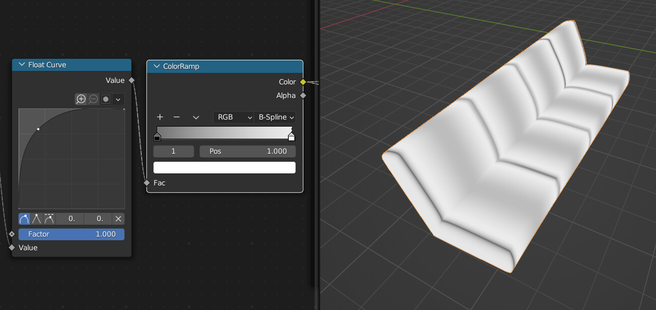
As far as I can tell, this combination of nodes behaves exactly like the Displacement Node in the shader editor:


I guess the original artist who modeled the chair gave it some slight imperfections. As a result, the mathematical precision of geometry nodes does not give consistent results across the entire seat.
Yes I could have just rebuilt the couch cushion with subdivs and modeled in these cushion indentations.
And now my scenes with fog volume are all failing to render so it’s time to go to sleep.
\2021\blendswap villa-interior 5315\interior3 2023 v4.blend

Why is the tiny hint of stuff outside the window always so difficult and slow to render?


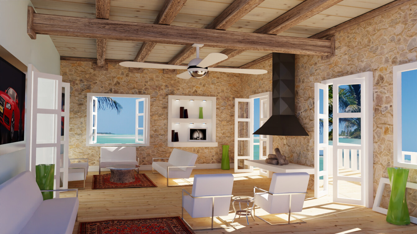
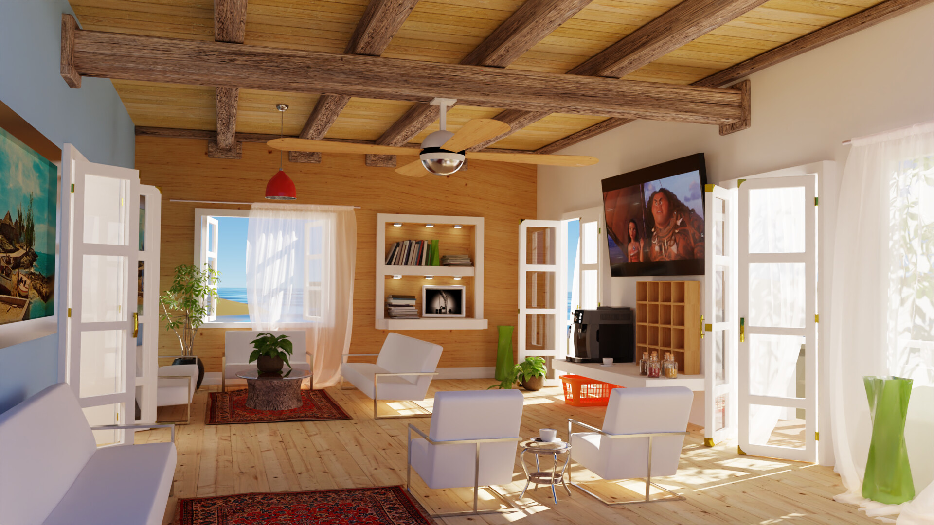
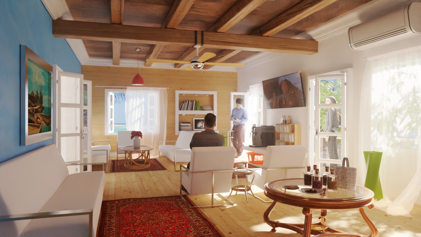
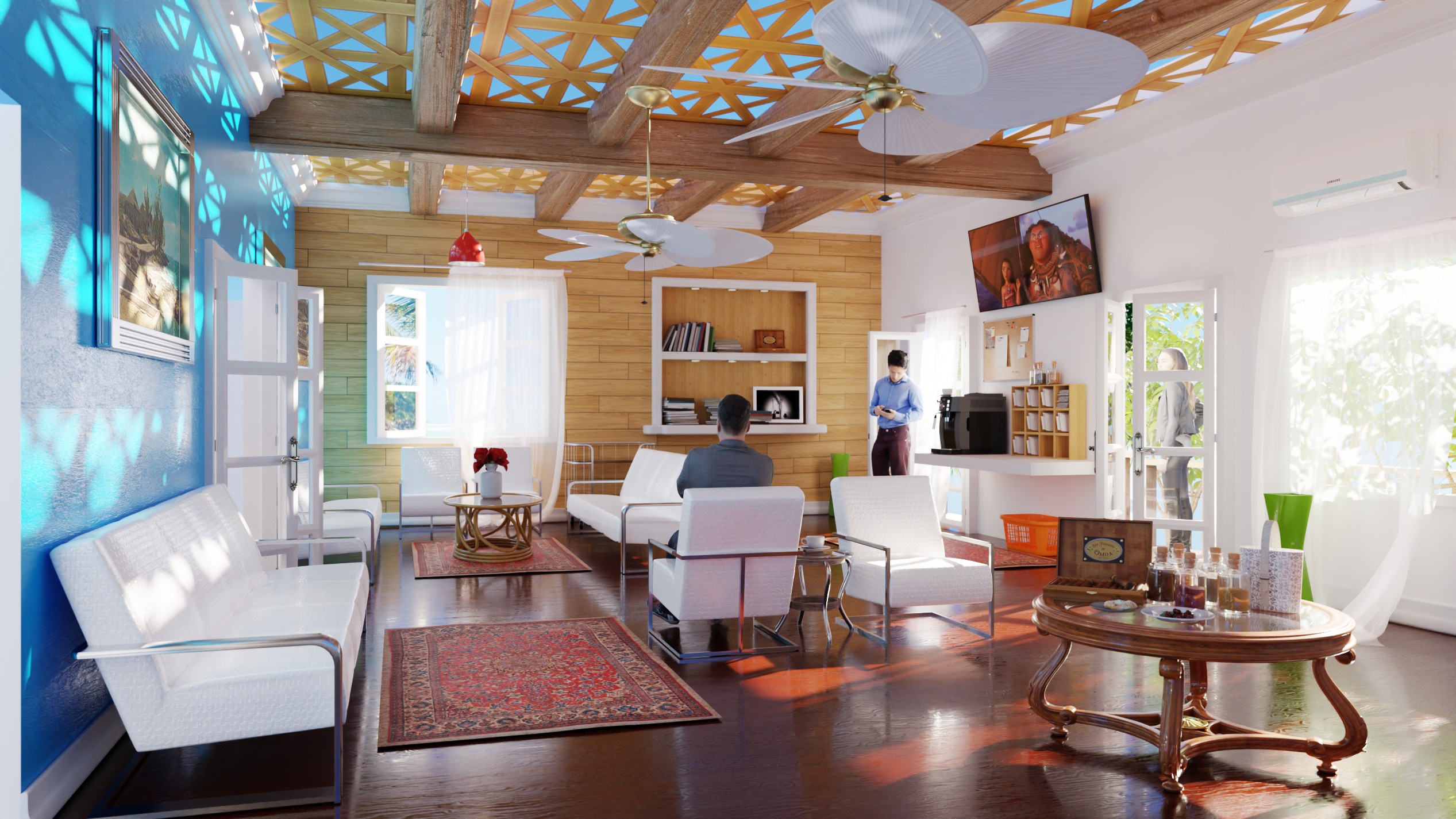
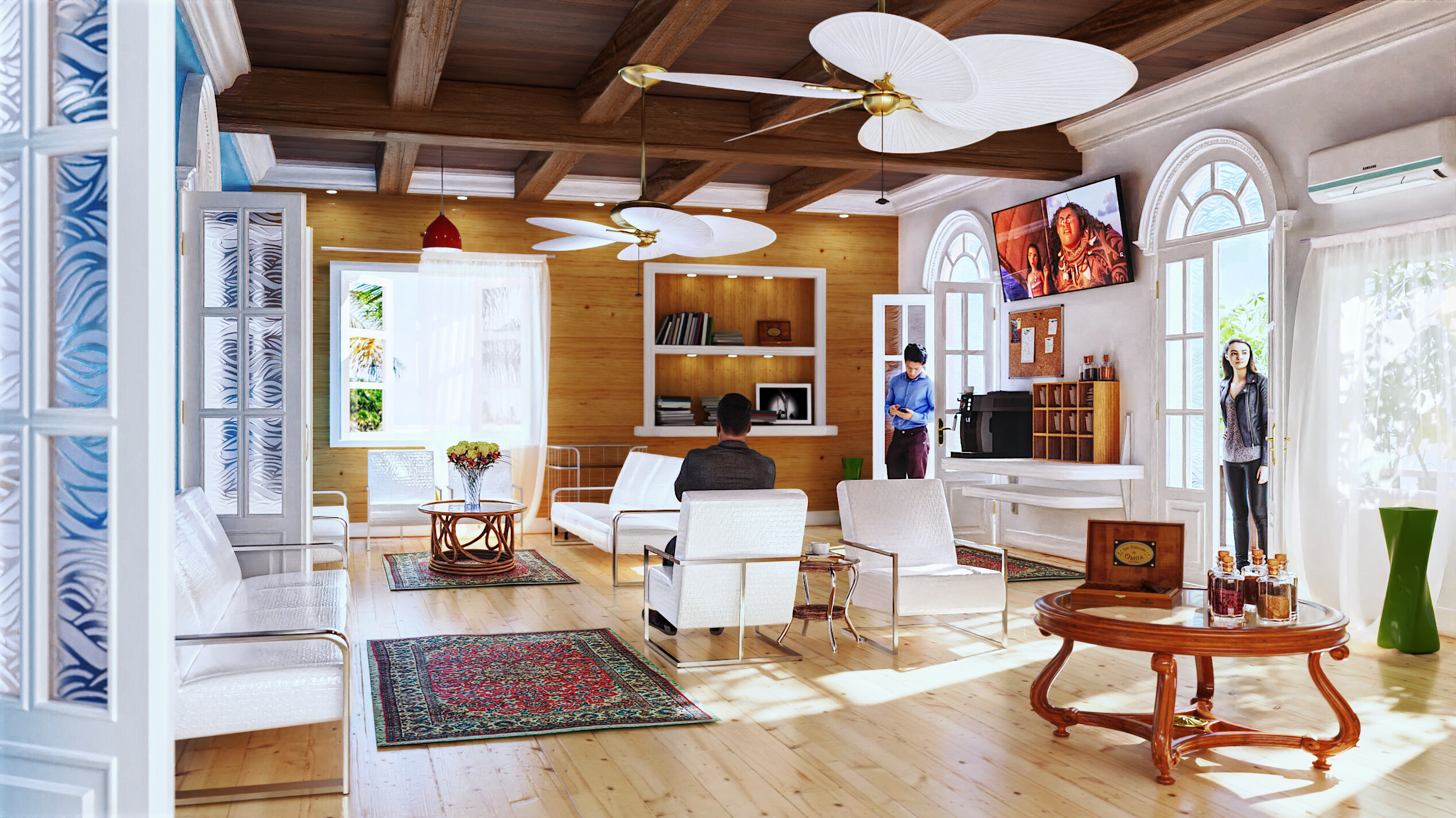
A big part of the problem with the original scene was that the scale of everything was gigantic and out of whack, as pointed out by @…gotta-find-their-name-again.
In recent renders I had scaled everything down to real world values but now it lacks that “cavernous” quality that I think is what I enjoyed about the original scene.
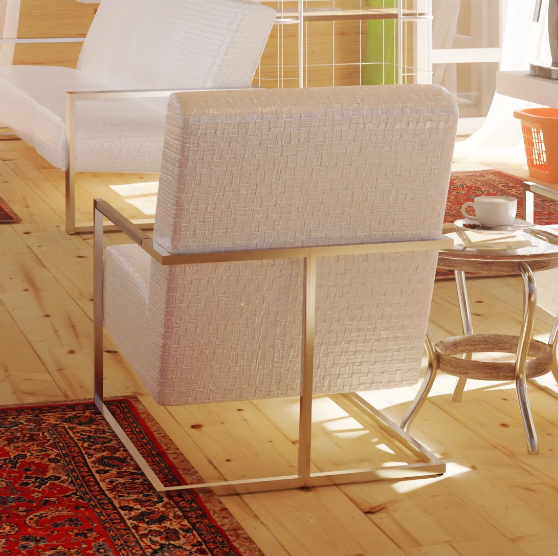
Using the single chair to get a measurement of aspects of the original scene then will consider raising the roof and maybe also enlarging the floor in my next version.
In the original scene the doors are 2 chairs wide and more than 3 chairs high.

The window is a little under 2 chairs high and a little under 3 chairs wide.
The roof is 4 and a half chairs high.
The room is 10 and a quarter chairs wide.
From the far wall to the original single chair location is 9 and a quarter chair lengths.


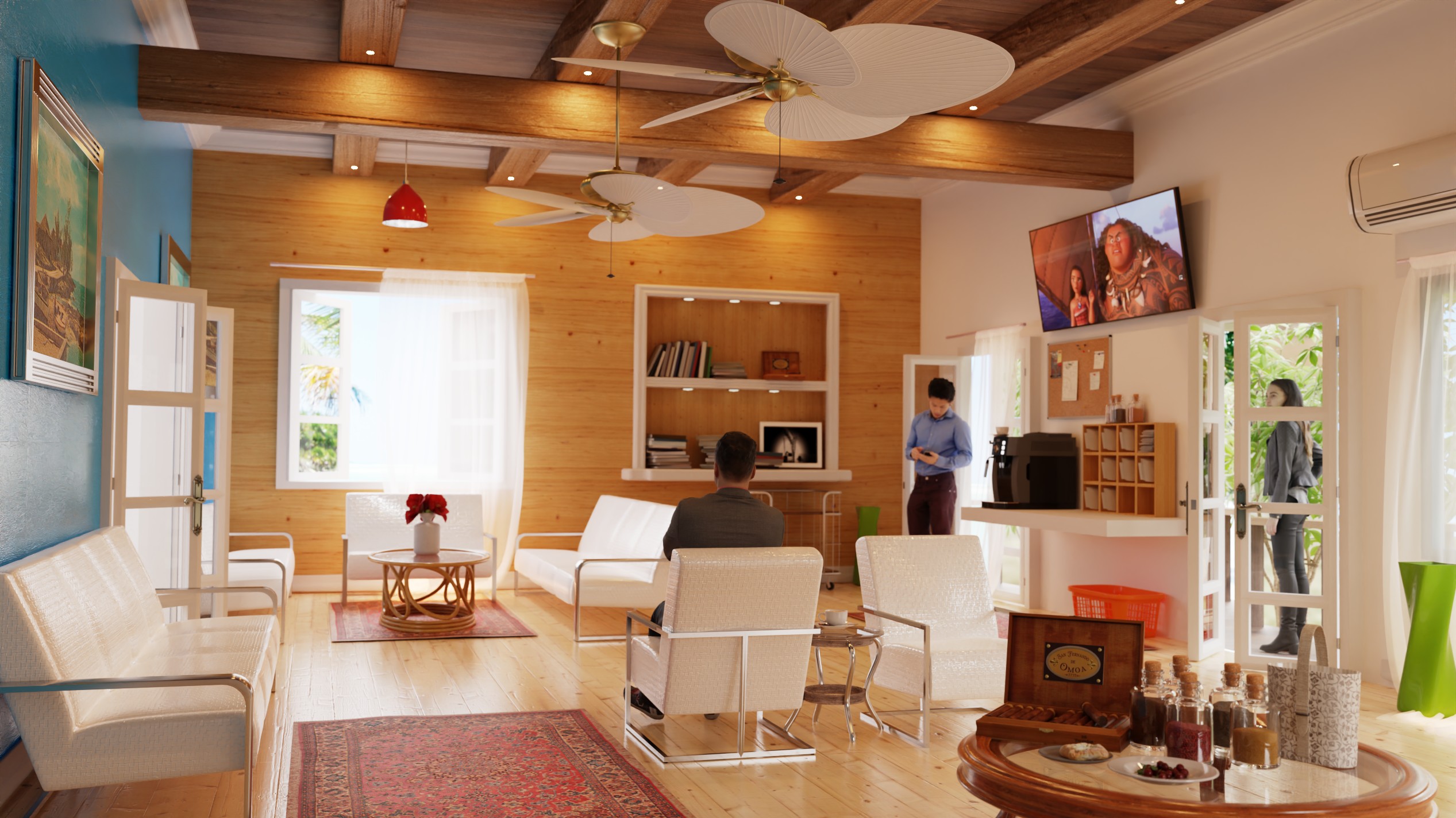
Comparing these 2.
I like the overlap of the beams in the old one .
I like the room size of the new one.
I don’t like the lights on the beams in the new one.
I prefer the sunlight angle of the old one.
I prefer the camera angle of the old one.


Where did you get the human models? Are they photoscanned or you modelled them? The interior design looks awesome
Free scans I found on sketchfab.
1 Like
1 Like
Looking at your portfolio, I should be asking you for people.
1 Like
Haha, I need more people, that’s why I asked.