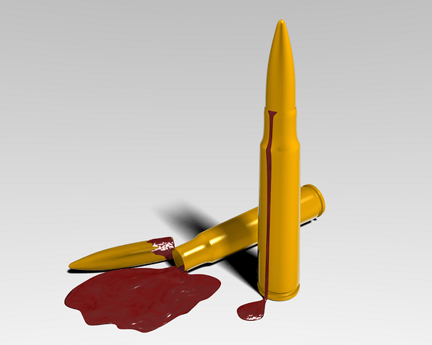
This my first posted work in this forum…
I struggled with the lights…
Any critiques or suggestions are highly appreciated
hmmm … bullets which bleed eh?? nice concept, but the blood looks like ketchup, straight out of a grindhouse flick … try removing the bump texture on it and decreasing the specularity … i dont think blood has that much spec…
also , it would be nice if you could make the bullets reflective … swith to Materials buttons(F5)-> mirror trans -> ray mirror on, and slide the ray mirror slider …
also, you could increase the spec on the bullet along with its hardness… it’ll give it a steel finish …
Thanks for the useful remarks…
As you suggested I worked on the materials … I think I got the metal right but the blood gives me a headache.
I attached the blend file as will…
Attachments
Bullet.blend (347 KB)
really nice concept 
some tips for the blood tough…
-
Blood is a pretty sticky and thick substance… and it gets hard pretty fast… thats why blood on the floor is ussualy …uhm …high… cause the edges get hard and it keeps stacking up… kinda hard to explain tough hehe
-
make it way darker…
-
bulge it up a bit ^^ blood isnt that flat
I think your scene would be more interesting if the bullet was a different color from the casing. (just my 2 cents worth)
I don’t think I need to say it’s a great idea, but I think it’s great. Your blood now looks more like paint instead of like tomato sauce. If you look at the reference you’ll see the more blood pooled in the one spot, the darker it is. It looks like it also has a pretty high spec too, but not too hard.
I think you’ve done really well so far, just those little things to think about.
Thanks guys … this is very helpful.
my only thought was “omg it shoots with aids” wtf oO
It looks good but you guys dont need to tell him he’s making too much mistake he’ll probably do another which is improvable ,its better to leave where he is cuz its awesome what he does, they don’t even look like uv map textures.Love the concept.
hes posted here precisely because he wants to hear what we think regarding improvements to the image…
the bullet is not UV mapped, its a shader - use of computational functions to achieve this instead of an image.
getting something to 90% complete is great, which this piece is, getting something 100% is altogether different though, so we all want him to get there, which is why we are posting in his thread.
I think more contrast in the reflection would make the bullets look more metalic
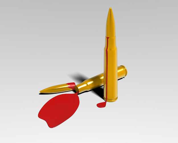
I made some changes to the blood, I hope that I got it right this time.
1280 X 1024
/uploads/default/original/3X/f/c/fc0adf4a886307753003843ec30a2c4cdb62d0cb.jpgstc=1&d=1258816921
Attachments
It certainly looks a lot better this time. Is there anything else that you want to do to it?
Ya … I`m thinking about a different background
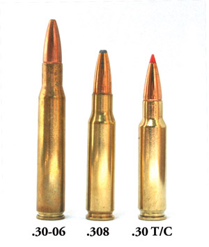
The bullets don’t have the proper material on them (Copper jacketing for the bullet, brass for the casing). Also, the blood is looking better but still not convincing. The reflections are a little weird, as they seem to fade to a bright white towards the back of the scene. (here, have some blood and bullets http://www.brown.edu/Administration/Emergency_Medicine/emr/images/bloodpool1.jpg http://1.bp.blogspot.com/_ICuLB148bJU/Sc9vBOUTjfI/AAAAAAAACtI/Nq0_kskduE8/s1600/DSCF0768b.jpg)


