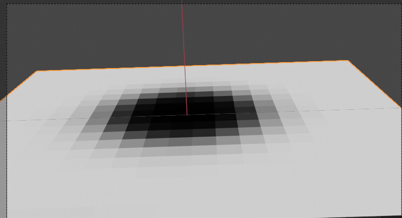
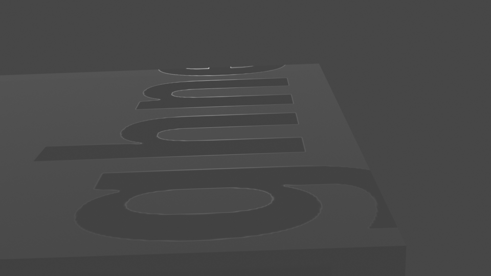
I have generated a texture in GIMP that is the word roughness in white on a black background and saved it as a tiff. When I look at it in the render preview, lookdev or render there is a border. I can’t understand or discover the reason for this.
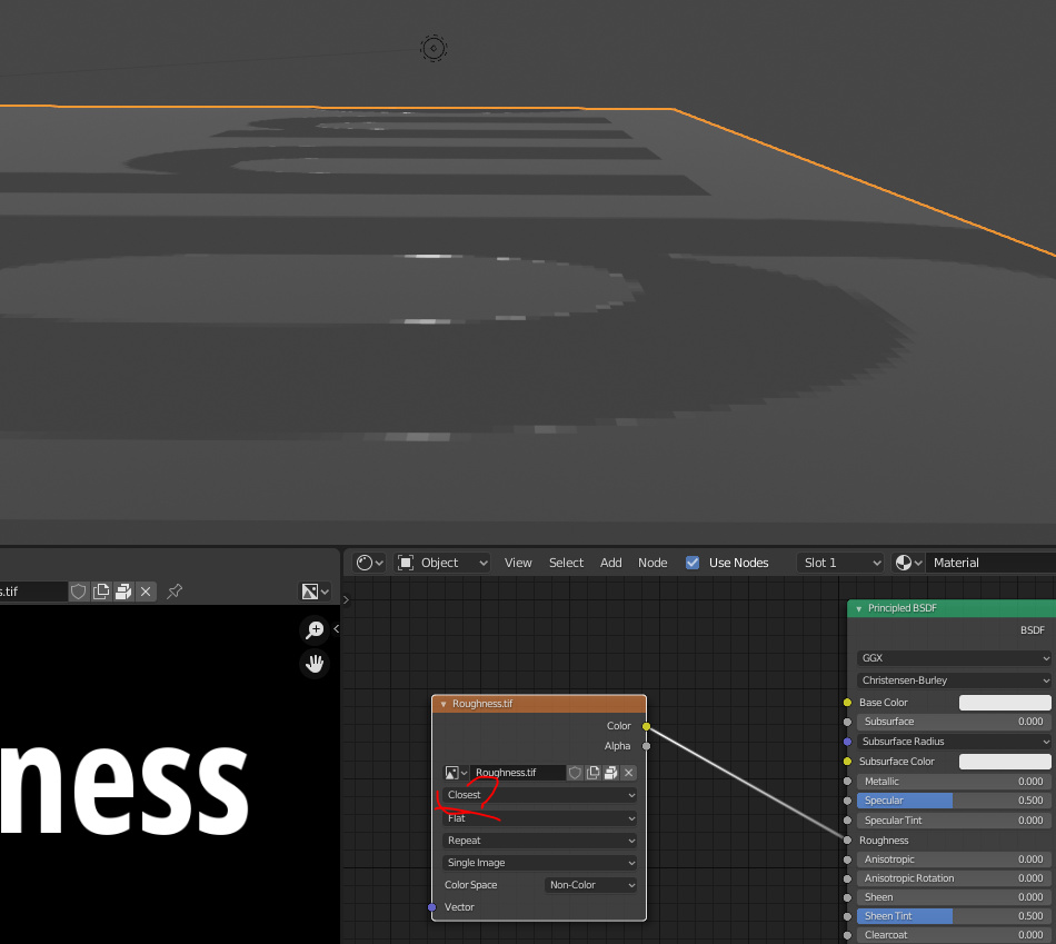
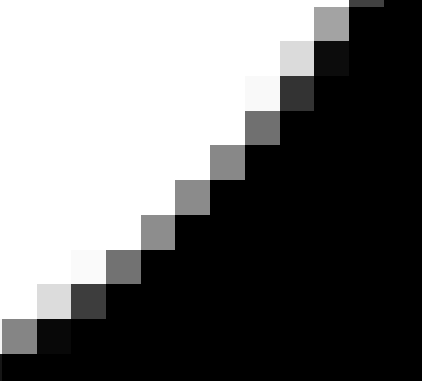
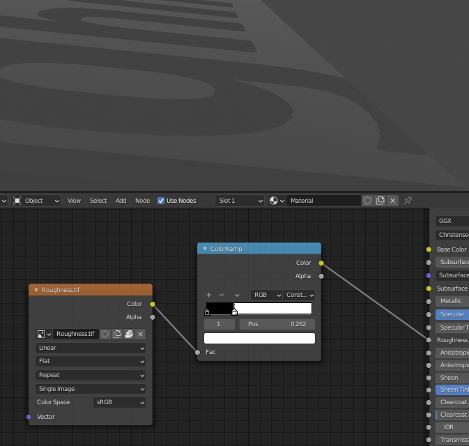
It’s probably from interpolation. If you change the interpolation method to closest then It’s pretty visible that the border of the letter’s isn’t strickly 0 or 1 roughness, but something in between, creating different interaction with the light resulting in the visible border. I’d try just using a higher resolution image.
One thing I did notice while I was looking at the following post is that if I feed the map into a Math node and multiply by .4 and under it goes away.
EDIT: I just reread your post and I can’t understand how to make a clean image without interpolation or maybe the question is, how big should I make it?
Can’t say that I know anything, but:
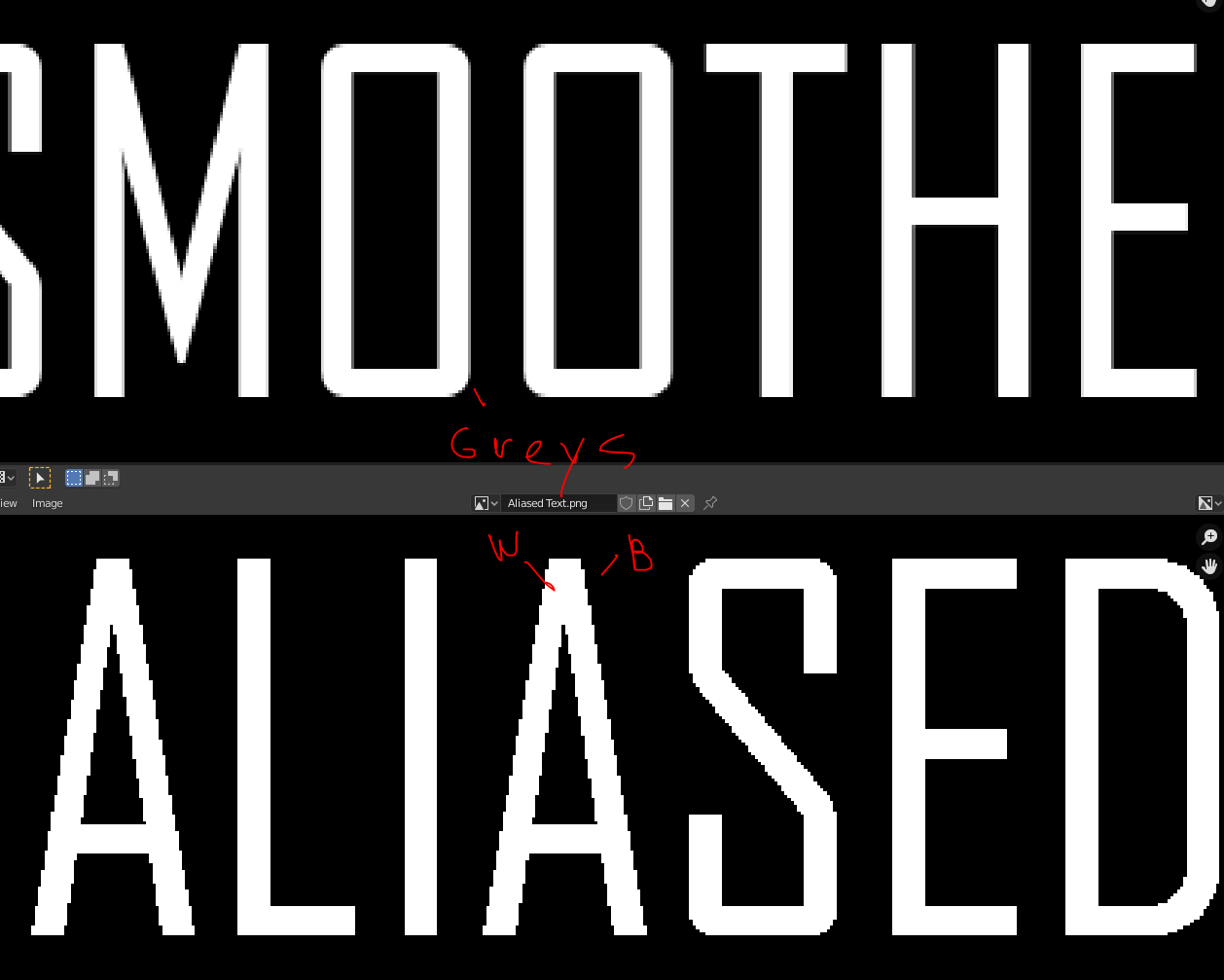
Black gives very clean, sharp reflection. White - so blurred you can’t even call it a reflection. Grays are giving somewhat blurred reflections: light sources look huge but still bright and you see them in those lines.
You might know this effect if you’ve looked at a puddle on the road after rainfall.
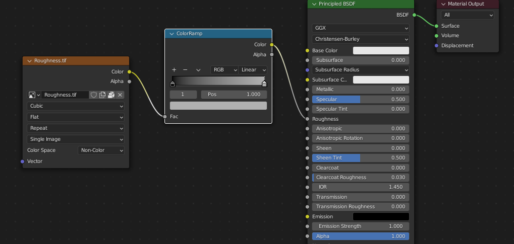
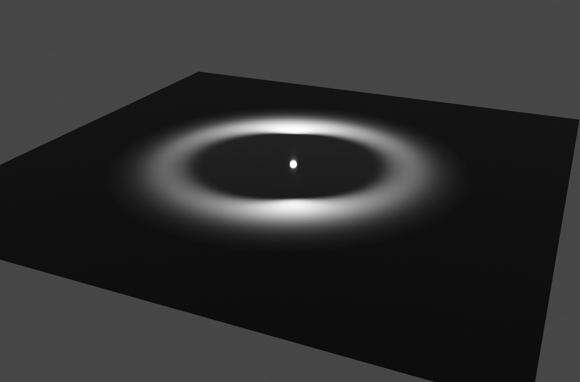
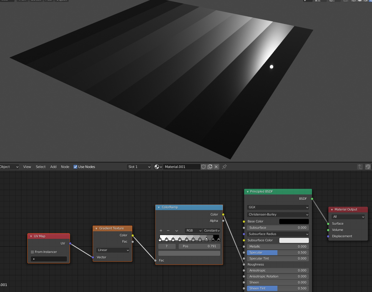
A roughness value of 0 results in a very sharp specular highlight, a value of 1 results in a very spread-out highlight. A value of 0.5 is somewhere in between.
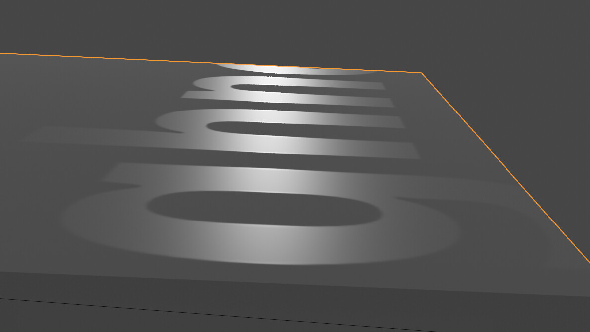
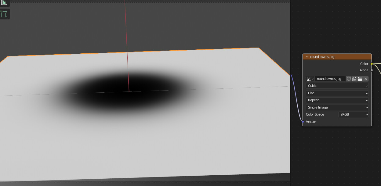
In this image, I’ve mapped a circular gradient to the roughness value, and I’m looking directly at the sun. The sharp highlight of the sun can be seen in the “puddle”, and the rough “road” around it seems dark. But where there’s a value in between, the highlight is spread out, creating a sort of halo effect.
That’s what’s going on in your case, too. You can solve this by doing what @stray suggets, or what @0451 suggests. Both are valid options.
Here I’ve mapped different roughness values across the length of this plane:
@0451@stray@ThomasKole I have to think about this, I can be very dense at times, I think I get it but not sure. I just have to play with it, thanks for the thorough explanations all.
Not Total fit but better : I found if your image has a base color of Mid gray. then there is little to no border. so if for instance, in texture paint mode, you add a New Texture Slot. Roughness. it creates an image with it filled to gray, ( color HEX is 808080 ). then is you say, paint with Black, it looks wet, with no halo, or border. I believe that border effect is because the texture you are using has transparency. alpha, or pure white maybe?
Hi there!
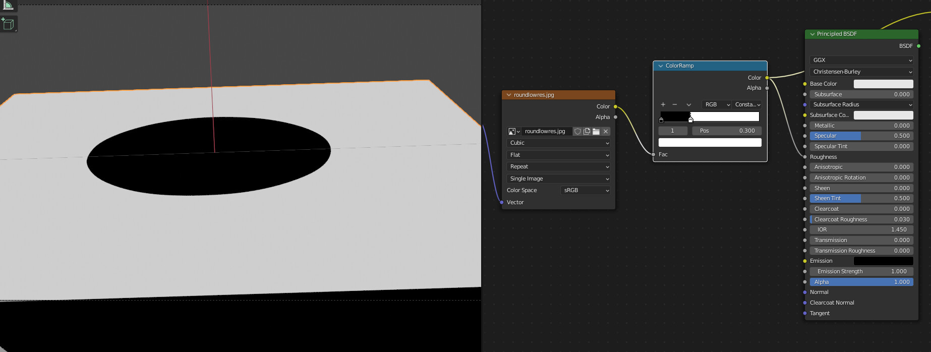
If you only want a strictly black and white image, you can add a Greater than Math node and tweak it a bit. Then, if you want more diversity, you can use the black as a mask to mix it with textures for roughness, e.g. adding a brushed metallic look on the shiny areas.
I’m looking at this, I am confident that the image was made in GIMP, so that is where I am investigating. That definitely seems possible. Thanks for your interest.
I’m pretty confident that I don’t have a bump in there, right now I can’t check because I don’t have access to my workstation, but you could check… the file is in the OP.
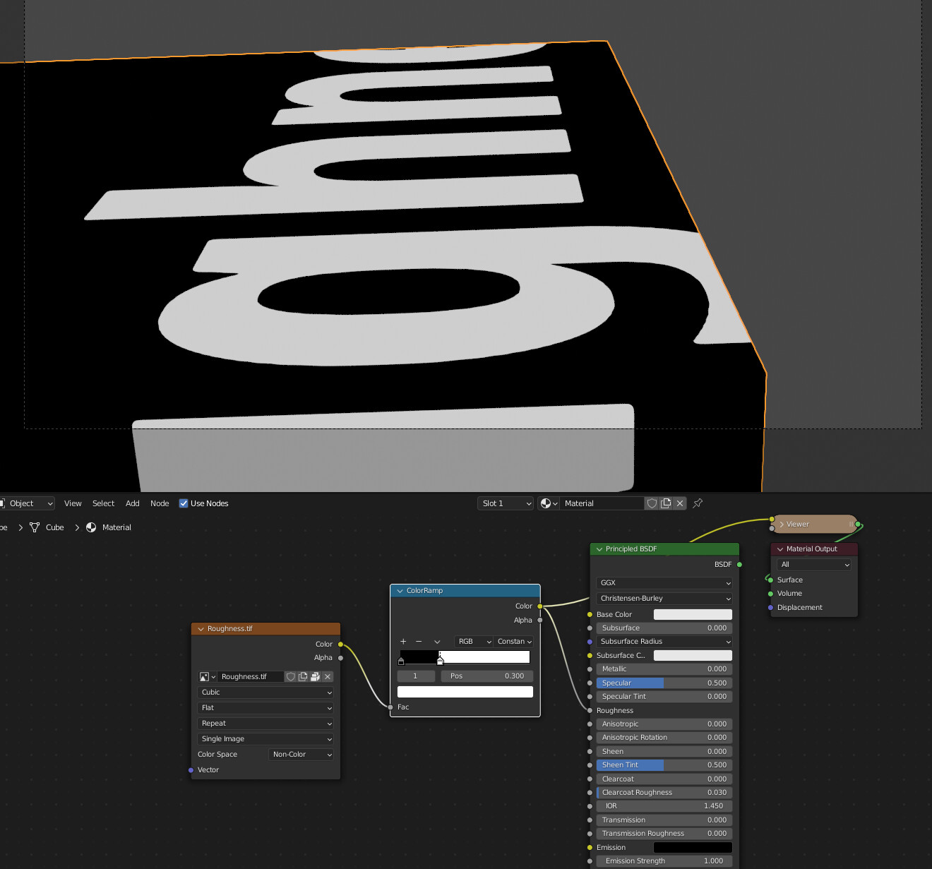
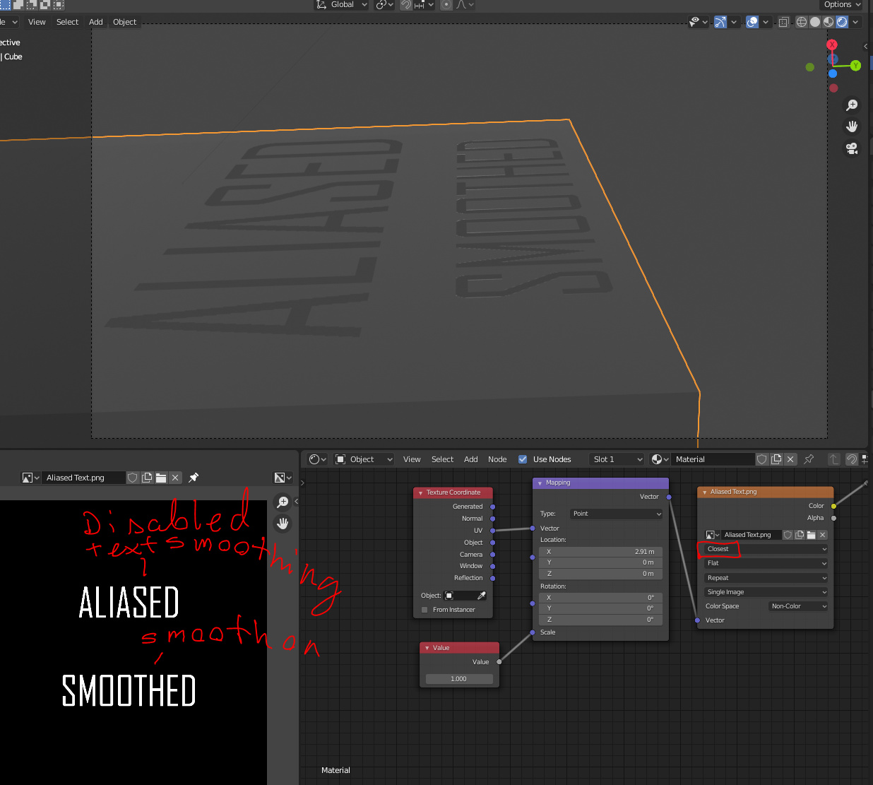
@ThomasKole has the best answer, i think the issue doesn’t lie in the preparation of the image, but of your understanding of how the roughness works. you’re going from pure gloss to pure rough in a 2 pixel “gradient”, so you’re going from seeing no highlights (except for the pinpoint specular, to the medium sized highlight of the “transition” pixels, to the zero gloss, full roughness white. You can see the “size” of the border specularity if you change the middle of the letters is the same as the anti aliased borders:
That highlight pattern is what you’re seeing in the “border” around the words. this isn’t a bug or anything, this is just how roughness works, and would work in the real world. The fix is to dial out the anti aliazing with a color ramp, or use a higher resolution image from gimp with no anti aliasing
This seems to address both of your concerns. For my part, I don’t see that this has to be the way “roughness works”. I want nice crisp lettering on a computer and I have seen examples in the real world where packaging has nice crisp lettering.
One does not have to have a gradient, that is a feature rather than a requirement from what it looks like to me. @0451 simply pointed out how to turn off that feature to me.
It seems, I think, in my testing that both is required to get nice, crisp, clean lettering, and it was pointed out by @0451 in the post marked as the solution.
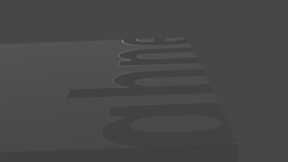
The insight I have gained shows me that not only do I have to turn off the antialiasing in the image editor (GIMP), but I also have to turn off the inclination of my 3d editor (blender) to do the same thing. In addition to increasing the resolution to account for the jaggies that inevitably occur. Furthermore, if you look closely at both are images I think you will see that your lettering’s edge is slightly more blurry than mine.
I spent some time trying to play with the alpha channel in GIMP and blender to better understand… From what I can see that is not the case.
re: . “Furthermore, if you look closely at both are images I think you will see that your lettering’s edge is slightly more blurry than mine.”
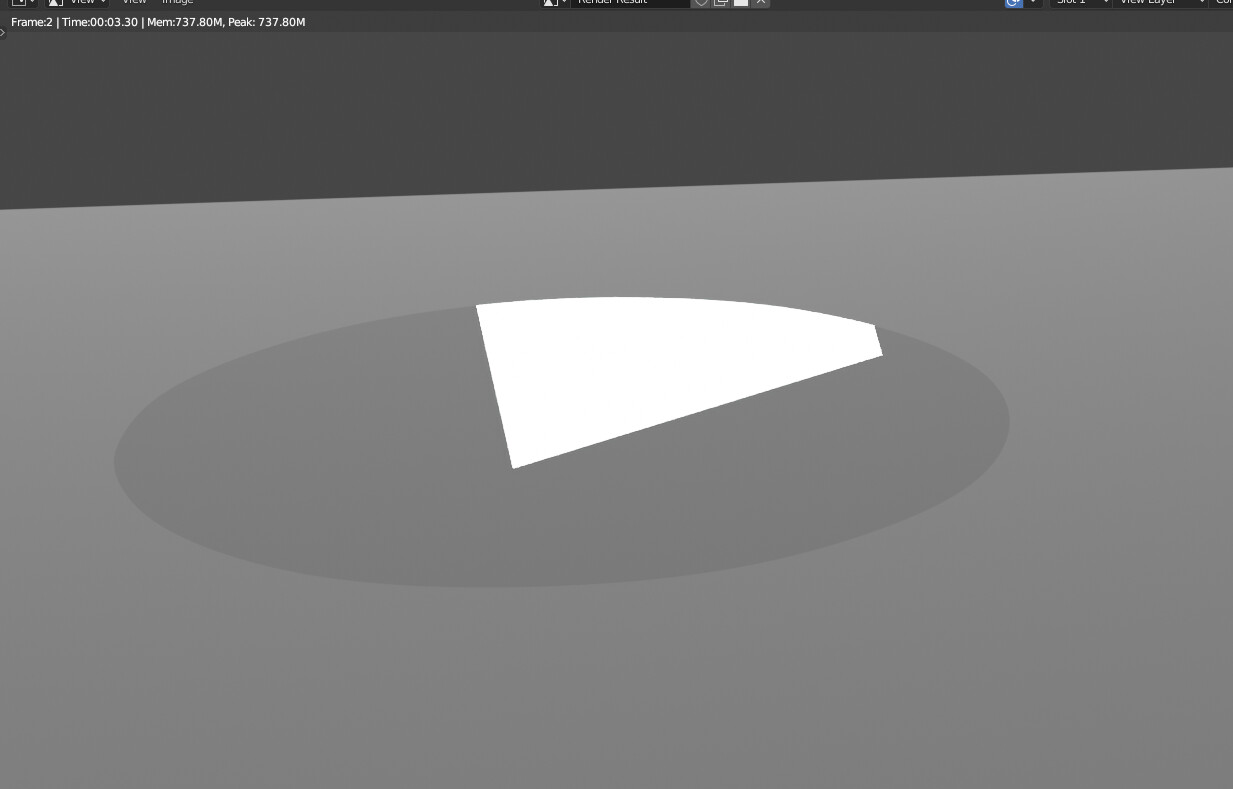
Yeah, I was just using your .blend. Unfortunately nearest neighbor/non antialiased/high res is the only way to get around this if you dont want to constant color ramp it, BUT you can turn a “blurry” image into a higher res (appearing) one by doing so:
 I was just thinking, that a bump may mess with the roughness. I will try to check later.