So, I’d love some critique on my new piece. Rendered at 1500 samples, with Cycles.
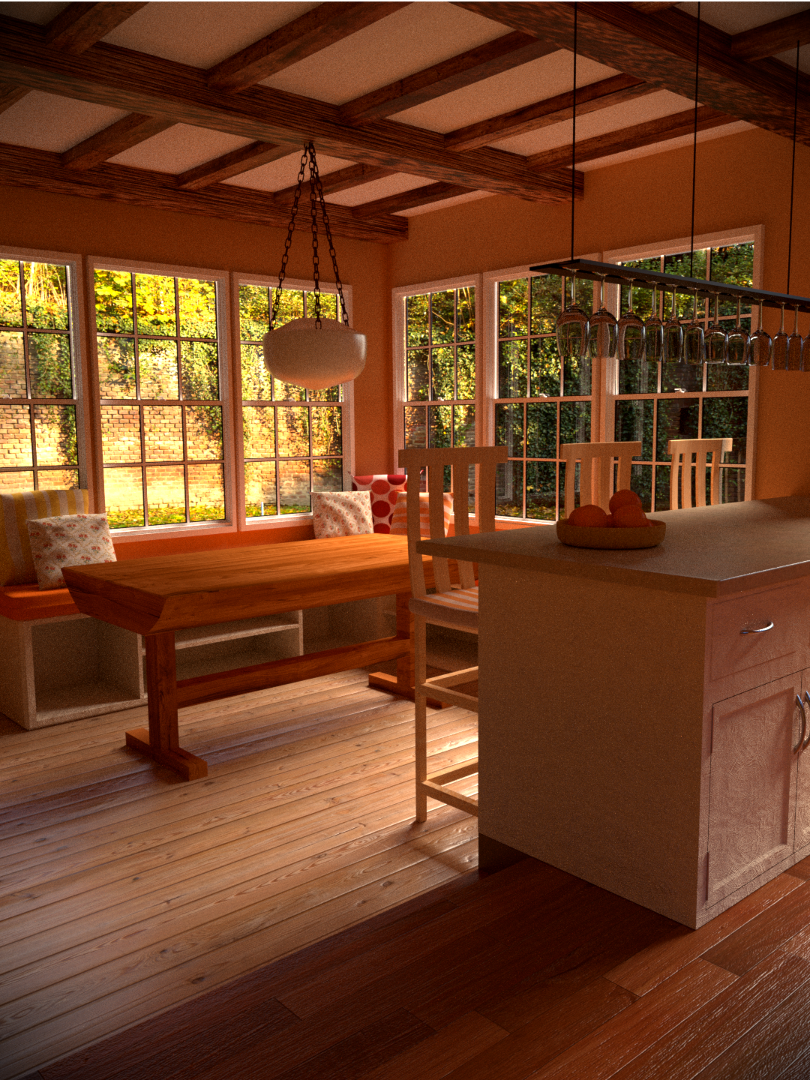
Over all a nice image. I thought the DOF was a bit off. I looked at the hires version and that did not change much. Just seems to loose focus to quickly. That is an opinion and does not mean that it’s a bad thing. The cabinets how ever are throwing me off. First off there “should” be a mop/kick board on the front. Also where the floors change from one to another it seems like there is a step down and the back of the cabinet is going down that step. Problem is I see not other indications that it is indeed a step down. One last thing and this is strictly personal preference…I would swap out the swag lamp over the table for one that is less imposing. Perhaps a wrought iron chandelier.
Hi. I like this. but on very first look at the image it was table beating me to eyes. you know you have some kind of modern kitchen pult in a right. behind a table some seat with storage space with same material like kitchen (looks like). its definetly not bad but i just dont feel this kind of table should be there.
and second thing is a glass i dont know if is it lightning or material, but it seem to way glossy. maybe bit of transparent shader would fix that. Over all i love the mood … orange color was definetly good choice.
Nice image! i would sugest putting some stuff in the shelves underneath the seats
(OFFtopic) is the view out of the window a image?
Love the overall look and the floor textures are really nice. I would however agree with Elsdon that the bottom of the cabinets it is difficult to understand what is going on and my eyes are immediately drawn to it. Also I think the bump on the cabinets may be a bit too much. Really great feel though and overall I really like it.
Yes, the view outside is a plane with an image, as well as an HDRI map.
Woah…this is amazing! 
Beautiful!
I may want to add something, e.g. magazines, coffee cups on the table or perhaps include a sleeping dog on the floor, or a cat looking outside at the window to add some “real-life” touch to the picture.
Keep up the good work!
Great start with great promise, but you’re only 50% there at the moment. Dirt maps and details -
- too many wine glasses - change it up, hang some pots and pans over there as well.
- surfaces too clean
- Composition too tight - it might be nice to widen it up and see more of the kitchen.
- populate the storage units under the seat
- balance the nice ‘orange’ look with more white surfaces
- could you add shelving to that front face of the kitchen cabinets? It is a big, blank white space staring at the camera which could be made more interesting by a modern wine rack or something.
This is all just opinion but you’ve got to a great start!
Excellent work! The lighting is great! I recommend including some rugs or something on the floor, it looks to bare, also maybe adding books to the cabinet under the benches.
Once again great job!
Are those wine glasses a default glass shader?
They look a bit dark and “greyish” to me (rather typical for default glass) - try to change the color of that glass to pure white.
That’s four different wood types and wood colours together in a rather small place - not sure if you would really see that in real life. The light wood foor imho looks a bit too glossy.
Other than that: I really like the mood of your render.
colors, scene, lightning looks great!
However I would make some small adjustments to the structural elements of the building:
(otherwise it would just break if you build it in real life)
*) The beams look too square shaped (in the section), should be higher than wide.
*)The walls look a bit too thin to hold the celing.
*)I would probably try to place the windows a bit, especially the ones at the right side, would reduce the number to 2 at that side and leave some space in the midle