Hellow guys !
I’m back after long time… This time i want to share my newest render.
[Quick story]
Somebody told me let’s create “still nature” (in polish we say literally DEAD nature). And i toke this DEAD too serious.
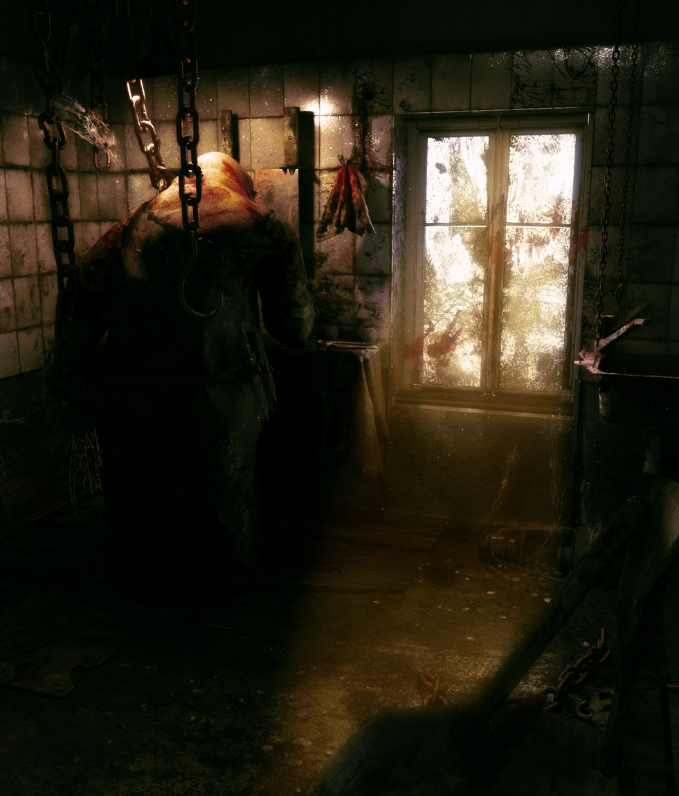
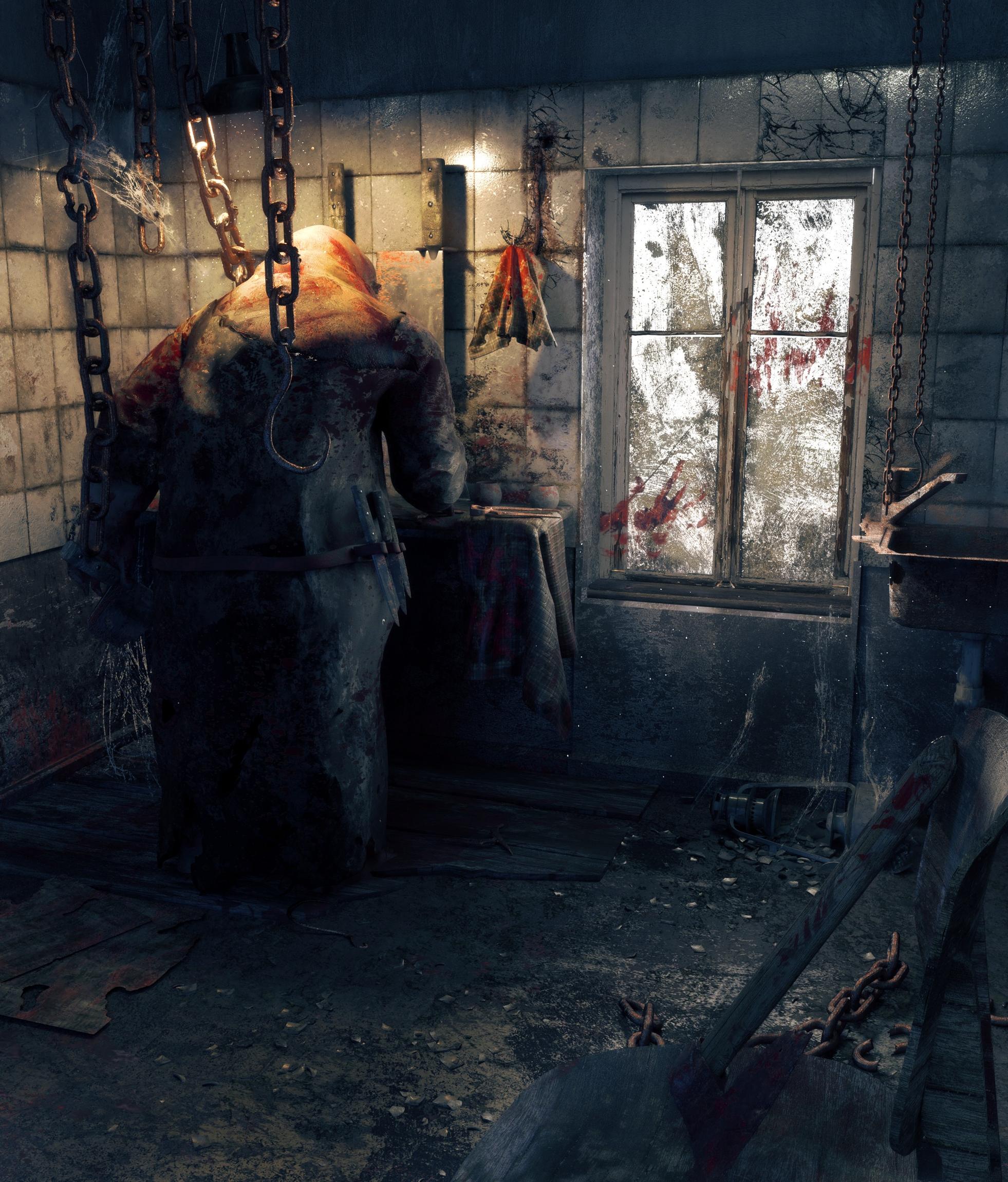
At first it was without butcher but i decided to add hime cuz proportions of the room looked strange. Back in my head i had cook from “The little nightmares” while creating room so i made butcher a bit simillar.
Render toke something like 48 hours … dont ask me why i rendered it in 4K.
I used denoise and 2500 samples for this scene and i swear without denoise i would have noise with 5000samples and more.
Last think i noted was that if you render in biger resolution you should highter your denoise teil size beacause it stops working in some places.
My initial reaction to this image, most unforunately, will not be a favorable one.
What I see – what my old photographer’s eye is immediately drawn to – is that there is a very large expanse of opaque blackness from the meat-hook all the way down to the grimy floor.
A “histogram” of this image should basically look “bell-shaped.” What does this image’s curve look like …? I can readily answer it for you: a tremendous curve of “black,” a small curve of “white,” and precious little in-between.
I am not posting my artworks to read favorable coments.
My first reaction to your coment was " what is he talking about". Im not a photographer im not even student in art school so my knowledge in this aera is a bit small. I feel dumb now :[ . I know what histogram is… Is it this color graph ? Could you tell me more about it and how to correct the image?
But remember… It was never ment to be photography, just a scene for game\cutscene\animation. Although i still think its important.
Yes but rendering is taking a photograph. Learning and using photographic / compositional techniques is essential to producing better renders.
3D is the intersection of so many artforms and disciplines. It’s a little frustrating when you hear someone dismiss learning about them, as if they are unnecessary.
Ow im not dissmising learning… Only this one. That is because i put so much attention into materials models and composition that i wasnt even thinking about it…
And maby its my bad english but i wrote
Although i still think its important.
So im not calling it unnecessary. Im just unable to correct this one
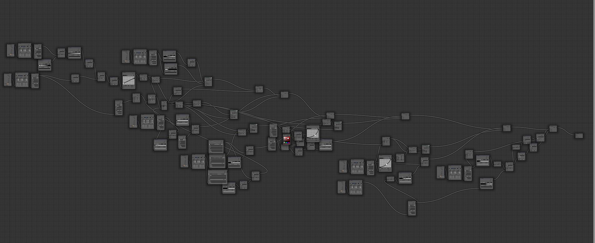
wow, the materials are wonderful! how do you not get lost in the node editor? XD
i really like the butcher. if this was in a game, i’d probably turn around and run away before he sees me… you really nailed the creepy atmosphere!
composition-wise, i’d probably try to add some emphasis to the axe on the chair, probably with a light that’s a little bit below the camera. since you mentioned this could be a game cutscene, imagine the camera as the player’s character who’s holding a lamp while peeking into the room. that way, you’d have one main focal point in the upper left corner (the butcher) and another one, for balance, in the lower right corner (the axe).
Honestly, commentators need to check their monitors, or at the least, the way they set it up. I think the original had the balance right. I tested in post myself. Levels were fine. Balance was fine.
There shouldnt be a window like this one if we have a butcher this is maximum
I cant add volumetric cuz -> butcher is a point of interest and -> render time is already 48 hours.
Main problem here is that first was ROOM with point of interest on window (only 1 bright spot) then i added butcher. So now im with 2 points of interest. In post pro and light settings i tried to make window darker and i did my best :< to focus eyes on bucther not a window.
Edit: And remember adding volumetrics will destroy 50% of detalis here. I made some research and ppl dont like this render in “dark” version with bright spots.
I’m not a photographer, not a color balance or value expert by any means, so i am going to try and give my honest opinion about, just don’t take it as a professional verdict. i’m not going through the calibration monitor thing because i think every image should translate itself through various type of monitor even if they are bad quality. So, the things i see “wrong” here, are these:
The window…messes the contrast up, and give that feel of lightness this image don’t need in my opinion. It would’ve been creepier just by removing the light that passes through it. It didn’t work? maybe the window shouldn’t be considered at all as part of the scene.
The machete (or whatever it is called) on the butcher’s left hand…i noticed it in the viewport shot, not in the render like i think it should be.
the materials are good, maybe not the rusted metal parts but, good after all…you “ruined” your work by improper balance of light and contrast…and about contrast, too low…too much low for me.
Now, remember i am FAR to be consider a professional artist, and a guru of value and contrast, not to mention i probably could’ve done worse! The majority of us here are learning things the hard way, and i think my comments would help you, as well as me and everyone else here!
Point taken. That’s crazy long time. Totally missed that in original post. It’s actually an excellent piece but the two point of interest and low contrast makes it look like it’s everywhere.
It also reminds me a bit of the game “Little nightmares”.
I see many have issues with your window… I like the window, breaks up the room in a way I like. I want to say the whole image is rather bright, but I like the idea of this creepy being going about his business during daylight hours instead of night time when apparently undesirables do their thing.


 These materials are wonderful. I look and I can not believe it. So scary and so beautiful.