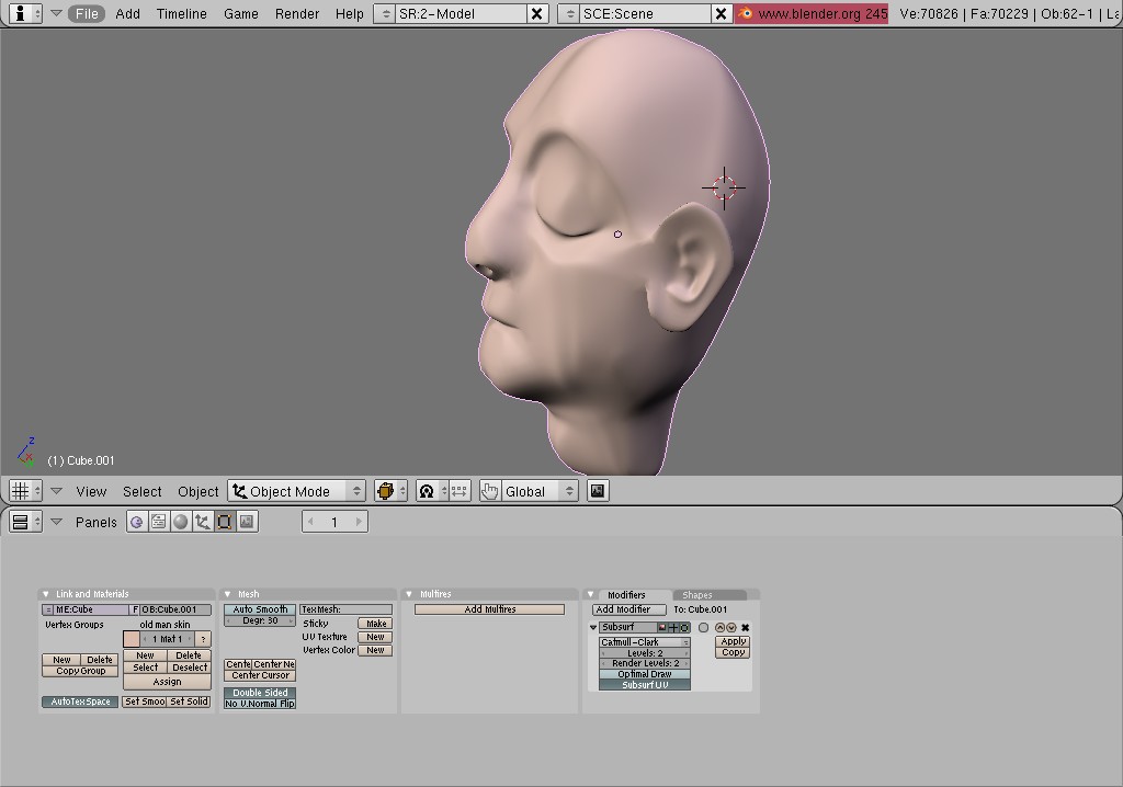
My submission for the BWC blender contest. It is not done yet, but i call it little admirer, for reasons you might not understand until more detail is added…it is pretty rough right now, but is coming along nicely (with some SSS snags). now that i’ve got the lighting down, i think it will just be modeling, texturing, fine tuning, and patience. Comments and crits are more than welcome!
what is the kid holding in his left hand?
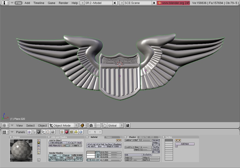
the badge looks awkward. This guy is a patient in the hospital. He should be wearing hospital clothes, not a badge.
What is that green thing behind the kid?
It is toy plane. Should be more visible.
Maybe he’s in coma. There shouldnt be any contraindications agains badge
Change the badge’s material to let us see more details
Excellent work, it really tells a story, just like the bwc guys want. I’m guessing that the dad(?) was injured as he is an airforce pilot, and crashed or something in a war?
thank you! yeah, it’s sort of open for interpretation since i don’t want to tell you what you should notice.
the green thing behind the kid is a single flower still being modeled and not scaled or positioned or multiplied yet.
i agree to the crits, the plane should be more prominent, i think with a lighter material and larger render, it will become easy to see. as for the badge, it’s supposed to be a pin, maybe i’ll make it a little smaller, since it does sort of resemble a badge when it is so big…im going to add some wrinkles in the shirt, and maybe add a texture to the mans scrubs. more details to come.
in the background behind the flowers is a picture frame with nothing in it yet. I decided to fill it with a generic looking water color type painting you would find in any hospital or restaurant…something that possesses a serene quality painting but is actually a mass produced print. I made my own to put in as a texture to symbolize the journey to heaven and your soul passing through the light, since the old man/grandfather is just starting to flatline.
While most of the BWC entries are aiming at humour… this jumps out of no-where.
The expressions are amazing. Composition is good. The picture tells a story. Could the toy aeroplane be made lighter to make it stand out against the background more?
I notice that the change on the badge caused it to lose almost all its tone, so it looks flat now. Also you should perhaps change the back wall, its too dark and as such blends in with all the dark things losing a lotof depth and detail in the picture. Very nice by the way.
Make the plane more prominent…It’s hardly visible. The same goes for the pin, you’ve modelled it well, but you cant make it out. you should definitely go for the wrinkles, thw shirt looks pretty bare. Good work though!