Portfolio : artstation.com/benianus


3 Likes
Hi,
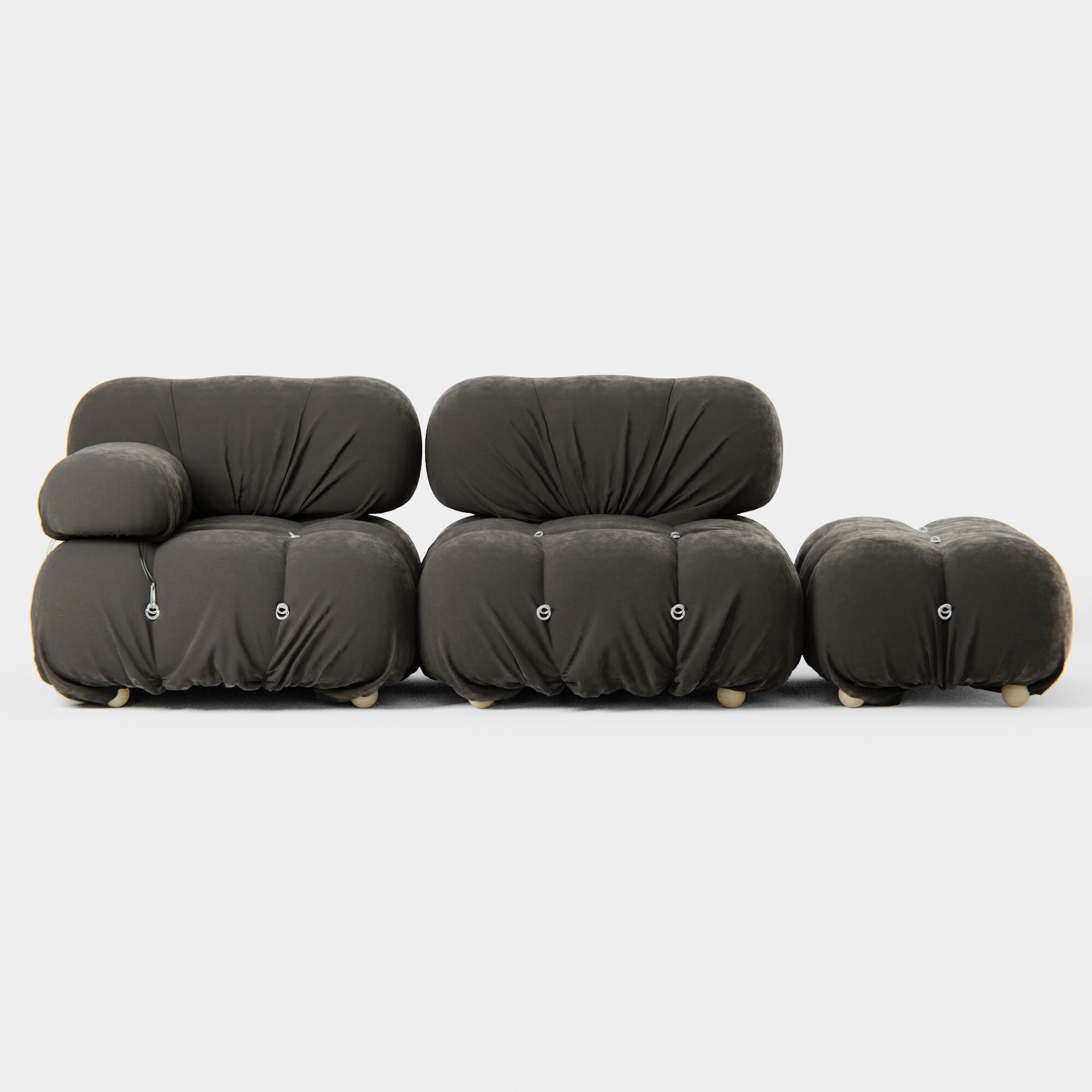
Nice designed furniture 
In general I like this interior shot and I wish to change 3 things:
- White balance of whole image. Now it seems to be very greenish. You can use pick gray point on the wall behind of couch using Curve adjustment in Photoshop.
- Wood texture on the floor is to big for me.
- Wood on the wall needs randomize. You can separate it by lose parts option and use object information node (in material nodes) and put it to UV location coordinates.
Shots with white background are great
1 Like
Wow great feedback, thanks you very much
I want to tweak a little of what @senteria said. Defintiely scale the floor and randomize the boards on the wall a bit. In terms of "green"ness I wouldn’t worry about that as much. It’s a vibe and you will see the same thing in a lot of archviz shots. Not everything needs to be warm or cold or whiter. My bigger concern is with the hotspot. from the light coming in through the window. It doesn’t quite feel like sunlight, even on an overcast day being that dim. You could probably bring it up just a smidge and if it is brightening the scene over all too much you can make a form of gobo to block out random bits and pieces of light so it adds some texture to it and you can keep the brightness without it feeling overwhelming because ultimately there is more interest and it is going to then again block some light out. It should be subtle though. Nothing crazy. Just enough to make the light not feel quite so 2 dimensional. I also feel like the modeling on the ceiling light area is a bit flimsy but you could probably clean that up with some better materials on those lights and nobody would be the wiser.
1 Like
Hi, I liked the name; I didn’t know what it meant… it is an actual brand!
I’m no expert on these interior architecture shots, but I wanted to say I like it. The couch looks very realistic and I like the overall green hue with soft lighting.
I think the floor might be over bright or exposed. It would be better if it was all more like the very right side currently is.
1 Like
Actually this is a good point too. @Benianus_3D, it is good practice to make sure to scale your albedo values to a 0-0.82 space. That number moves around a little bit from engine to engine and how they handle light and white values but it is a pretty good starting point. If something is 0.8 value, make it 0.72. If I am working with color files and not albedo files I usually just use a math node or H/S node after the image and multiply by 0.82 and that does the math for images for me. BTW, that is a good way to tell a true albedo from color map. Albedo will almost never be white because nothing reflects white due to conservation of energy. 99.99999999999999999% of REAL albedos will never be white and if you see wood that has a value point greater than 0.82 it is almost certainly not really albedo. White paper has an albedo around 0.82. I think render engines don’t account for this because of the use of both color and albedo, but you have to do the legwork to tell it the difference.
1 Like
hi
Thanks all for the feedbacks
i do changes on the scene, take a look
thanks