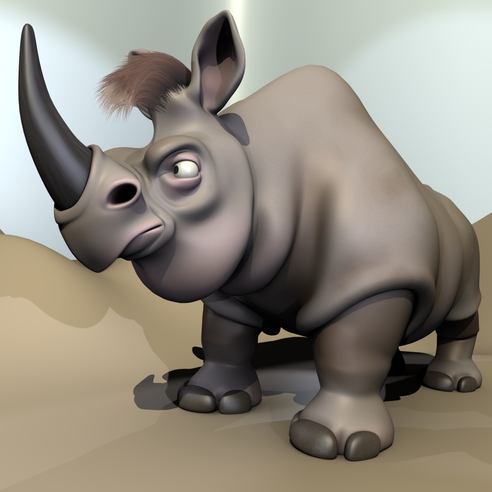
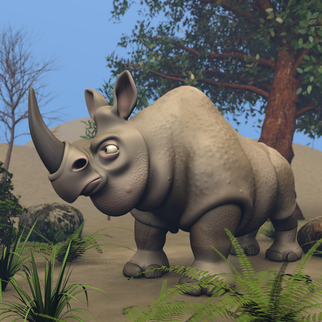
I decided to try a Disney-ish rhino after the camel.
For this one I referenced “Frank and Carl” from Ice Age and a sketch by Jason Seiler.
I struggle to come up with totally original characters but I’m trying to learn that art as well.

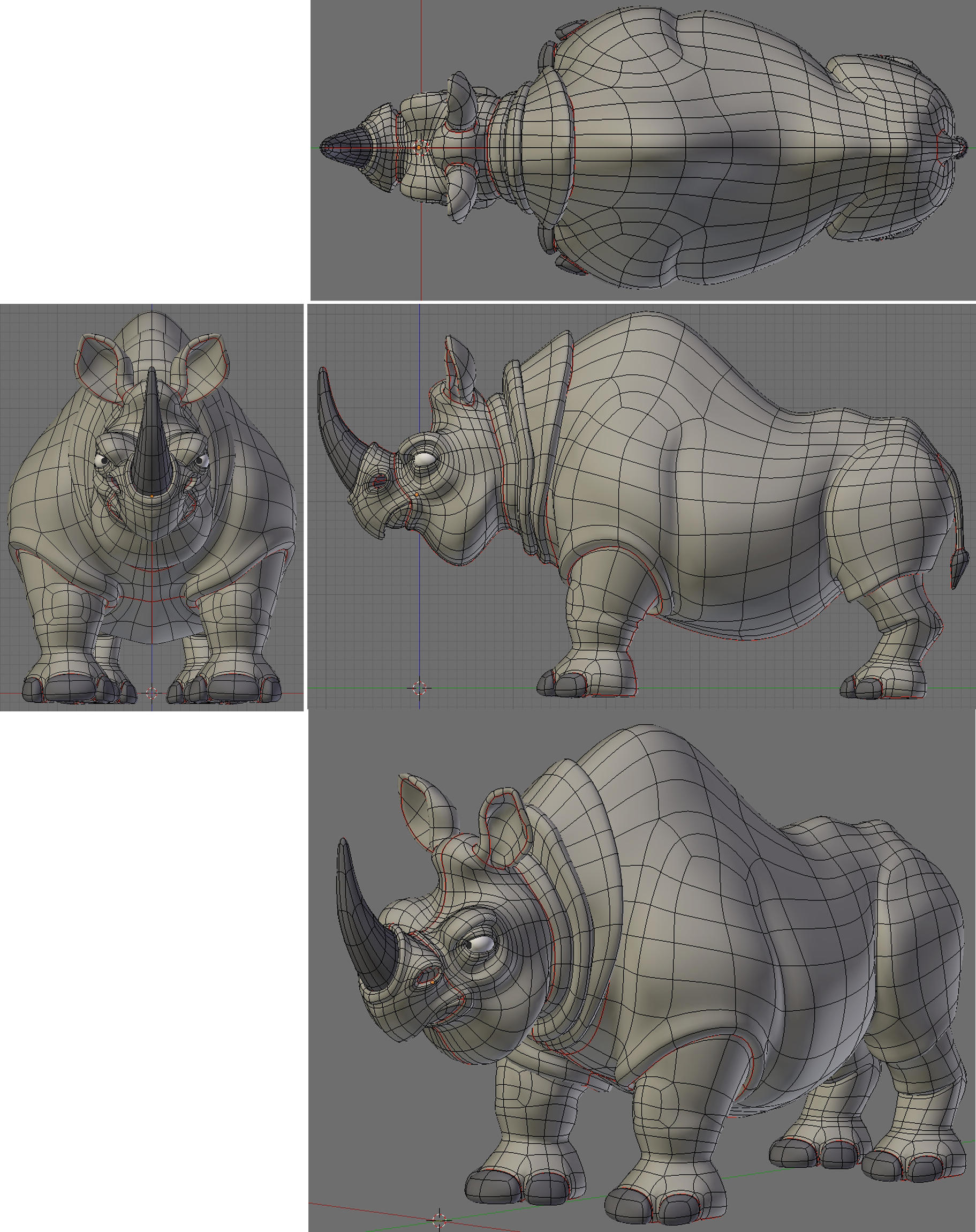
Great job! can you supply the wire frame?
Nice lines and lumps! Needs a more complex skin shader, though.
Nice job, I think the folds and lines could be refined a bit more, they seem very sharp. A little rounding and overlapping would look great.
I like your wires guy… nice… Concept is really cool too… but then I kinda have a soft spot for Cartoony stuff…
Looks like a really mad one 
I took your advise and tried to make a proper skin shader. I made a new one with some skin tone variations and a bit of dirt. I hope this is better.
I decided to remove the heavy wrinkles around the neck and replace them with a good, heavy double chin. I added a little reddish hair to match his attitude. I also plumped up the wrinkles around the knees. I think this makes for a more homogenous design. I hope you agree.
Woah, you’ve taken it up to another level with that last render. Particularly the pinkish and brownish touches on the skin. I wish I knew how you did those skin shaders. They are amazing.
Personally, I preferred him without the hair, but the skin is way better on this one and the original was already excellent.
One slight critique would be that the ground is too reflective, but the model itself is incredibly good. Excellent work.
very nice work, like the style!
I recognized the character from the first image right away!
Although the second version strays from the original, the skin on the head looks better there.
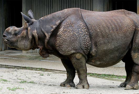
I think the new skin is a definite improvement in terms of modeling the forms and looking less even-toned, but it still seems too smooth for a rhinocerous. While you probably won’t want to go this far, this pic shows the kind of surface detail that might help some:
I think the variations across various parts of the body could lend a very interesting graphic note to the overall look of your character.
The very hard-edged dual shadows aren’t as effective as the softer lighting of the first image, makes it look kind of miniature and very studio.
I made several attempts to improve the skin texture as suggested by Chipmasque.
This is where I ended up. (used 3DCoat and was quite impressed)
I liked it best when over exaggerating the bumps a bit.
As you see, I also tried to give a little better environment even though the plants I had were tropical (sorry) and I had never used DOF before.
I think its better. Thanks for the push Chipmasque.
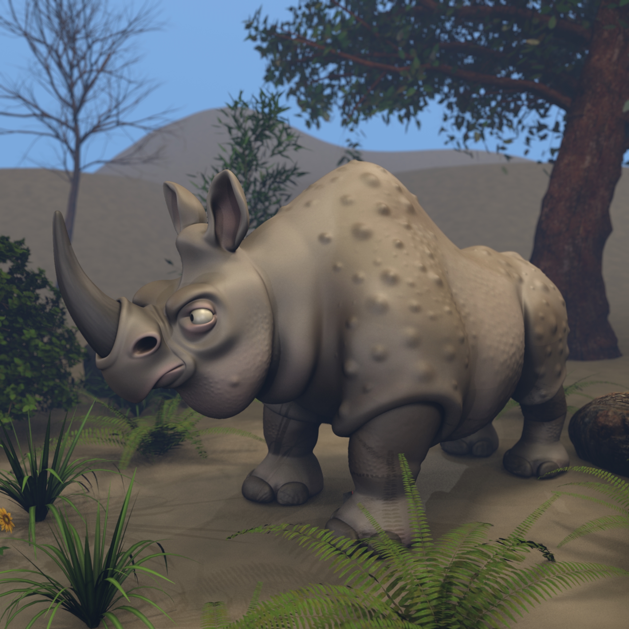
When you say “exaggerated”, you mean it. Lol.
He looks kinda sick with the bumps so huge, but the small ones on the face look great.
Yes that is much better, I like how u simplified the flow of the skin. It feels more natural and balances the form.

When I mentioned the bumps I was thinking more in terms of how they form a graphic pattern on the real rhino, rather than heavy-duty surface relief, so reducing 'em’s a good idea imo. Now a little coloration to complement the bump, maybe?