crits & advice wanted for first scene.
crits & advice wanted for first scene.
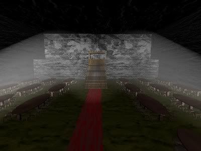
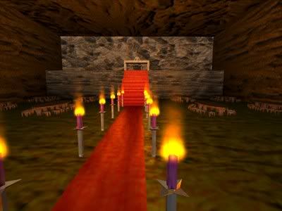
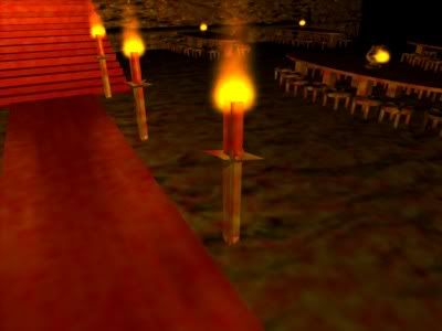
You need to improve the lighting first, I can hardly see anything. Also the textures may be off, its hard to tell from this angle and lighting.
The lighting you have makes it very hard to see
i would change the camera angle first, put it lower to the ground. the lighting would be my second concern. once you have the lighting and camera re–situated, i will be able to get a better look at the textures.
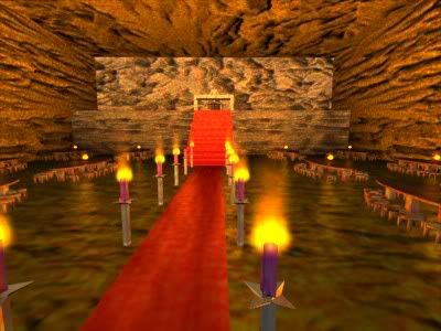
And using the unified render
Edit: Is there a reason why tables are transparent? I didn’t touch alpha.
Any better?
because transparen setting is on in material? check it
you are work much in it.
are you have a clean idea of want make with it? think and work.
see you
CJD :Z
CJD I know english is not your first language, but I could not figure out what it was you just advised him to do, could you perhaps clarify a bit? :-?
Firstly, is this a room inside the castle or in a courtyard, can’t tell. If it’s in a room then perhaps have some sort of hanging candle rack for a light source. Also, in either case of setting, would add in some standing candle holders, or half-dome pits of fire around and add some lamps with a warm yellow-red light coming from them. The stone? texture on the walls looks more like wood grain then stone, and they are some huge slabs, perhaps break it up with some mortar lines, or at the very least some seams between rows of stones.
I’d start with that and then see how it looks. 
the lighting is still a little wierd.
Check the materias settings for your table material. you might have ztransparancy or raytransparamcy on. turn those off, and make sure Alpha is 1.00
also, the walls could do with maybe a mortar texture, you know, somthing like this:
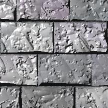
just a thought. a few good textures could really improve this scene.
gj ka dd gl hf
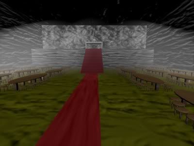
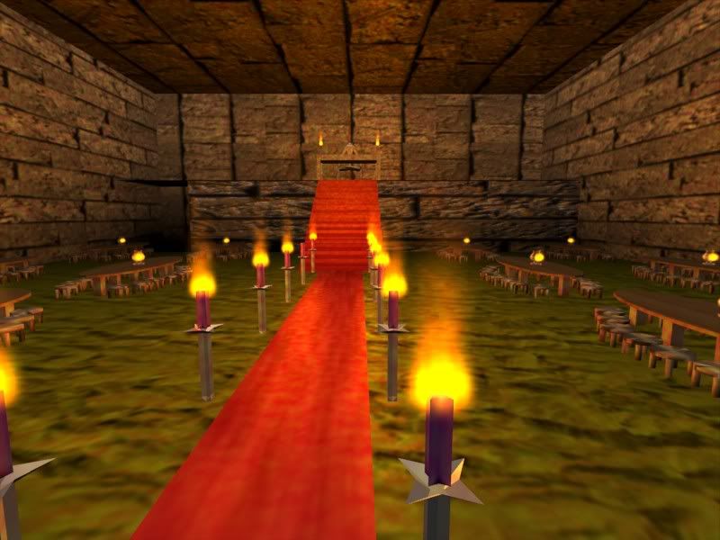
Changed lighting and added candles. I still need to work on the textures, but I’ve got about 5 projects going at the moment.
much much improved. i like this version much better. we can see clearly whats going on. nice work, keep at it! also, a peice of advice. limit yourself to two projects or so at a time, to avoid insanity.
Would it be possible to get some close up shots of the alter area and the tables and candles, etc. Or, a larger scene shot, would help with more specific crits.  Looking really nice though, much better then before!!
Great job on the lighting. The floor texture looks a little funny…maybe some stretching going on.
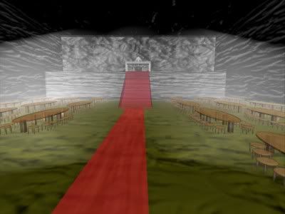
Should I keep the lighting like this, or is it just overkill?
its overkill. make the scene dark, but not so dark you can’t see
Thought so, thanx
I like the newly added candle locations, but perhaps just tone down the light intensity. Keep it up, it’s coming together.
Main change since last time is tuned down lighting (any comments?)
Here is the larger pic requested
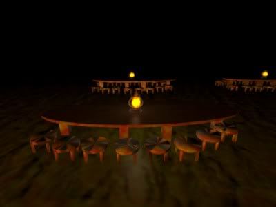
A close up of a lamp on a table
A better view of a candle
And the Altar
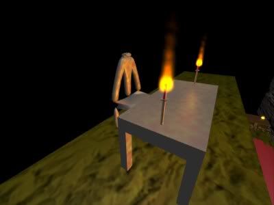
Not really sure where to start 4 the altar! Any suggestions?
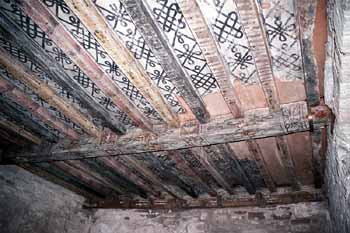

For the ceillings, you might want to add wood rafters, that’s a huge space that those stones are covering and the texture you have would make it look like those stones could come sliding out at any time and fall on the people.
The chair at the alter looks too high, no one would be able to sit there and be able to put there legs under the table.
Personal pref, but, it might be easier, and look more real if the tables below had bench seats instead of a lot of little stools. Most midevil events I’ve been to (live the ren fair) have benchs. But stools would work too, they just seem to be really close, I can see a lot of people bumping elbows.
All the candle stands could use a more supportive base, they look like they could too easily be knocked over. Perhaps a simple disc at the bottom would work, but you could go a bit more ornate with a nice beveled look
link

Thanks 4 the input
Will work on the chair, candle holders & benches over the weekend.
Not really sure how to do the rafters tho ( would I have to model them, or just apply an image texture of rafters to the ceiling? )
Definitely model them, but that’s pretty easy, just a few cubes stretched the length of the ceiling and then a few that go perpendicular to them. Just like the image shows. Then just add a wood texture, I’m sure you can find one online or use a proceedural one.