Hi, this is my proposal for the current theme in CG Boost challenges. Characters are from Maximo, textures from megascan, tree is generated with modular tree addon.
Leave a comment if you can. I would appreciate every feedback.
I never know is it fine to post the link to artstation, I can send you if you want.
I value feedback very high. I look with jealousy at all the doughnuts that got lots of advice on how to improve. With this one, I got only Arethyu comment and sundialsvc4 on WIP (which I am very happy they did), and maybe few on the other places. Not more than 10 in total. I would love to hear where my design is strong and where it’s crap. For grow, even the second is more important (but for mental health, the first one is also good to be reassured).
Well, otherwise what is the point of publishing.
Happy blendeing everyone
I’ve got some critique…tried to focus on pros and cons both.
Pros:
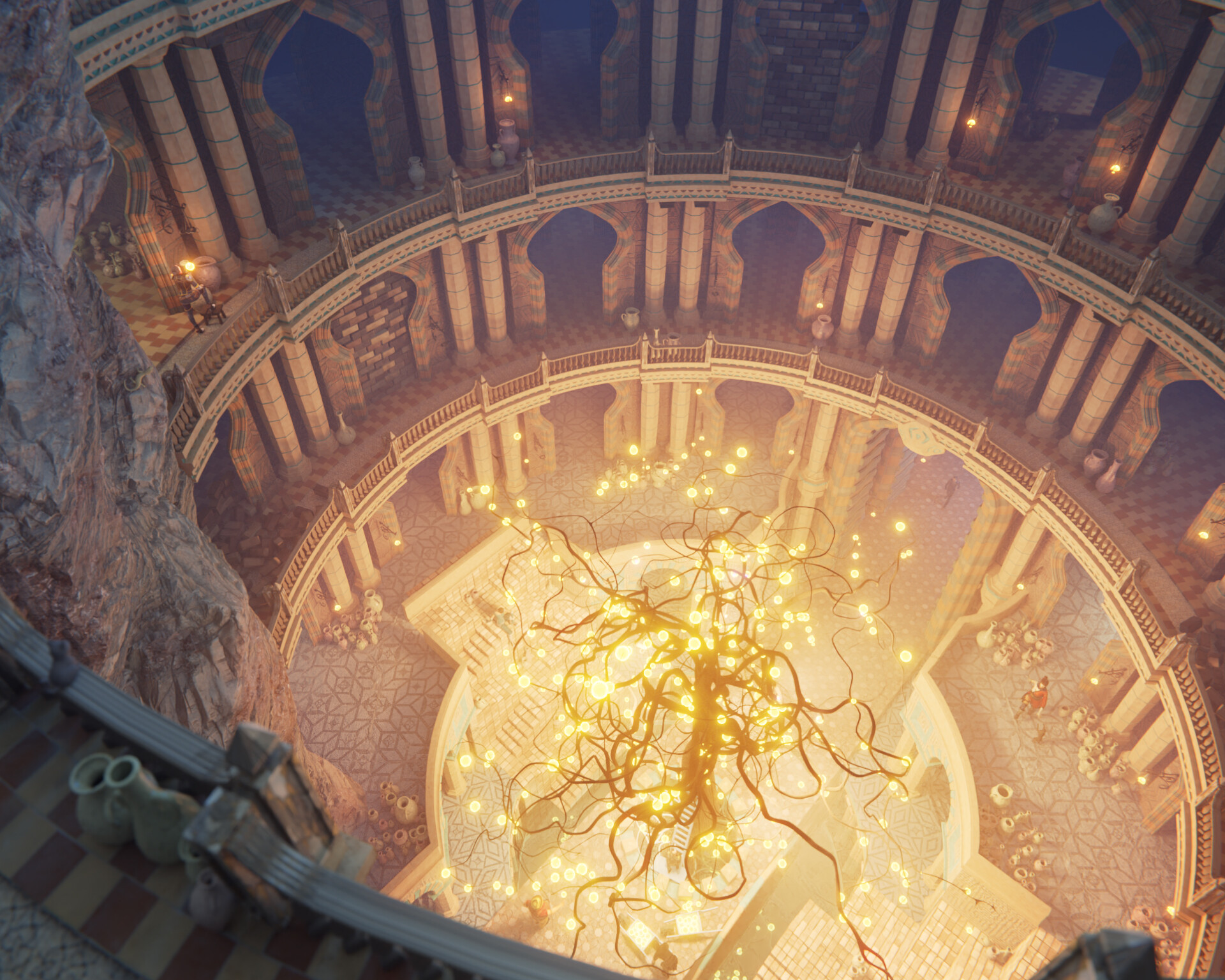
The concept, composition, and lighting are all good. The tree is unmistakably the focus of attention, both through the guiding lines of architecture and, y’know, because it’s glowing
My first impression was of a deep, compelling mystery: what was (is?) this place? Who made this thing? What happened to them? A place where ancient wonders were made…an awe-striking surprise in the mountains. It’s the same sense of discovery I felt while playing Hollow Knight (though practically the opposite aesthetic).
Cons:
Not gonna lie…the architecture kinda feels halfway to a clay render. The shapes and surface patterns are nicely varied, but many of them (the bit beneath the railings) feel as though they’re made from craft foam. Might be there’s no dirt buildup in the cracks and crevasses?
The starburst tiles beside the tree’s pit sort of feel “printed on,” like a pattern of ink that could be soaked off. This might be a side effect of the above mentioned thing.
Halfway in between:
The lighting outside the pit is quite even. It feels like a sky on a cloudy day, which is an aesthetic I personally love. It does feel perhaps too even, though…the rocks and balcony come out as one giant block of middle-gray, which unbalances the image toward the left.
In any case,
I’m glad to have found this image. It makes me happy, and that’s always a good sign
Now you are featured you will have more eyes on this.
SInce you specifically request critique (it is not always assumed thorough critique is desired in the Finished Projects section):
The composition and concept are very strong. The lighting is magical. The architecture is fascinating and detailed and brings everything to life. A story exists here in this magical tree, underground in this city.
First, I’d like to comment on @SiriusBizdness’s “Halfway in between”. The near part of the image (the left and bottom) do become separated by the lighting. This is alright but maybe there could be more of a transition. The rock wall (in the middle) could be a warmer hue, a little more contrasty.
For me, the biggest thing is the tree itself. It is so dark it appears shadeless. It stands out much too much because of this high dark contrast. I like the Clay version because it starts to integrate in the render. I might even think about removing the tree and just having the lights and architecture.
I completely missed the brick wall that had collapsed in the final render, but noticed it in the clay render.
It still feels a bit empty of people. Maybe a character or two along the upper balconies.
The UV map on the bottom floors feels a bit detailed. Maybe scale it so that the pattern is larger.
Thank you very much. I love your critique. This is something that really helps. You have broken it in parts you like and don’t. That’s really great. Helps to understand which of my decisions were good and which only I like. With some elements I was lazy and thought they are good enough. I am happy you like it and you decided to share your thoughts.
Thank you. Thank you for bringing the contrast of the tree. you pointed out few things that didnt went better in clay so or materials or lights or both could be improved there. For point 5: it is the most “crauded” scene I ever made so fare, I will work on this
Thank you for your feedback, its the best thing I could ask for.