Thanks man! I’ve been trying to work on thinking of the bigger picture and broad color patterns and emotion first. I was worried that it might come off as too much rainbow/love and wanted the indirect shape of the heart to be seen which is why I shrunk it down. I went through and read most of Robert T’s image checklist tips, and there’s a ton of great things on his site. Really it’s a bunch of questions you can ask yourself such as:
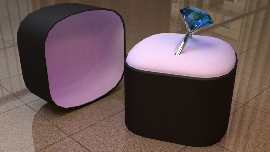
From Robert T: “Are color gradients present? If not, might they help ease the transition between elements and/or enhance the primary focal piece of the image?”
Well, whether you see it or not, there is a color gradient on the floor, from a darker hotter desaturated blue in the foreground to a cooler blue. Great entries all!
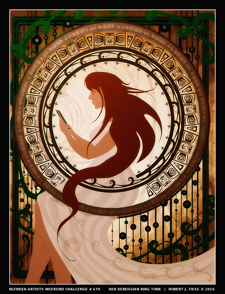
Wonderfully done, Photox, and thank you very much for exploring and mentioning my checklist! I do intend to update it in the future. Always millions of things to consider with art.
Every week I find such enjoyment and inspiration in witnessing the creative works of my fellow Blender artists, and it is great to see participation remaining as healthy and dynamic as ever.