@Dragonfire nice piece, sorry you didn’t get it in on time. The first thread in the entries challenge by Helge has a countdown clock on it as a link you can click and see the countdown to the end of entries.
Who will win: fashion or fibonacci? lol… well, like you said, still early to conclude though. Sometimes I’m wondering if people mistaken it with Arethyu’s entry (though the dividing lines should make it clear enough which is whom), it deserves more votes I think, it looks like a 3D Sierpinski carpet. Btw @robproctor83, if only you had more time, would really like to see a more finished form of your entry. ![]()
Thanks for your vote, looks like there are two other people with the basic idea. I have to admit that seeing others go with geometrical fractal (rather than natural reoccurring patterns) somewhat made me want to try that too, but I also wanted to make just something simpler.
There’s a set date at the first post of the entry thread (where the theme is declared), also there’s countdown timer which should be conforming with your current local time to know how many days/hours you have. Hope you’ll make it in time for the next one!
This is my second contest. My main goal was to get one outside person voting for me. Thanks guys!

@skadoosh,Dragonfire:
It is great that you are still posting the images. They would have made nice competing entries! It is funny that both entries feature one very prominent main color, which is almost the exact opposite (complementary) of the other one (blue/yellow).
@Dragonfire:
I just noticed some kind of structure right behind the stones. Are they floating inside some kind of building?
OT, but u guys definitely want to see this break-down of a winning entry on cgchallange we’ve seen a few weeks ago; http://weeklycgchallenge.com/interview-renan-longatti/
So stunning!
Thanks Robproctor83 for the critique. The blur thing is actually just a motion blur (sometimes the simplest things are the best ;)).
I agree with that it doesn’t really fit the theme. I thought making the blocks repeat themselfes would be enough… :o
Awesome job on the entries you all. Glad to see that everyones cpu/gpu’s made it though it safely and soundly.  Just downloaded the Raedon Pro Render engine for blender after seeing CG Geeks youtube info/tutorial on it and it got me interested. Materials look so much easier to work with through it. If anyone else has tried it please let me know what you think. For those that haven’t here is a link to see what it is and how it works, may help with later projects.
Bonjour VolBanana , je suit sous linux et je ne trouve pas comment installer Pro Render , manque path blender et j’ai beau chercher je ne trouve rien sur le sujet
merci
Very impressive engine, installed it right away! thx!
It keeps giving me errors when I try converting cycles materials.
And when I tried to leave the iron man model rendering it gave me a running out of memory error and I had to close it.
Maybe I could afford a better computer at some point…
EDIT: And does anyone know how I can turn off texture mipmaps and interpolation? For minecraft stuff?
Thanks. I did not know there was a countdown clock, thanks so much for letting me know! I will use that next time I enter to be sure I get it in on time.
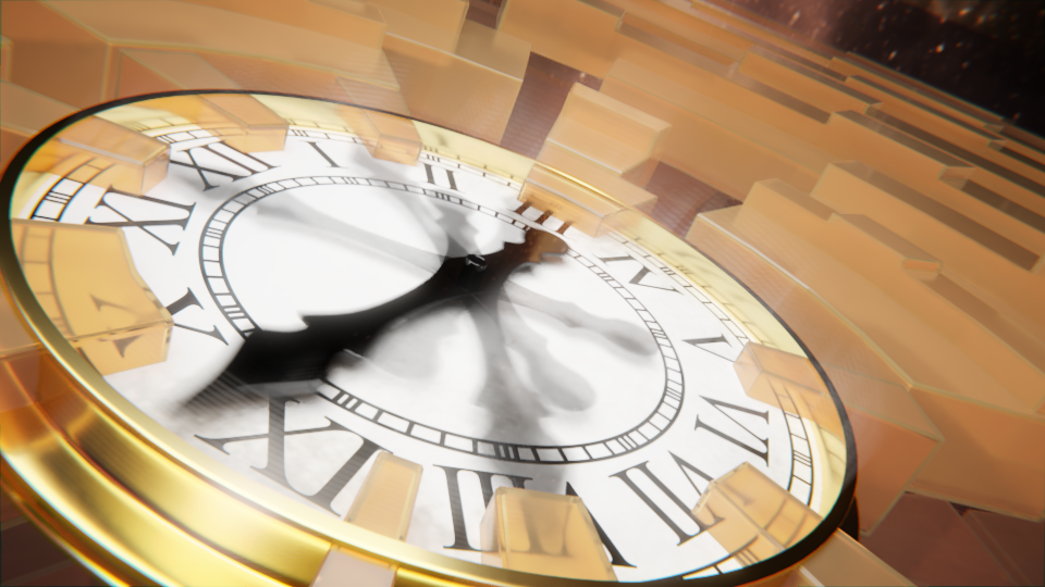
Yes, that looks pretty good! Just FYI, this is totally subjective, but I get more of a sense that the boxes are closing in on the clock, consuming it, rather than it being expelled from the clock. But, it looks good I think regardless. Sometimes it’s just more about what looks good, than conveying a specific idea or message.
I have no idea whether the boxes are moving in or out, I just want the clock to feel “connected” to them.
And, the boxes do look more fractally this time… right? :yes::yes::yes:
Commenting on abstract art is always complicated, but here are my vies on each entry.
GrimZA: You said your entry looks creepy. It reminds me of some kind of hive (I think because of the porosity), and so I would be very afraid of touching this (who knows how many insects live inside).
RayVelcoro: Loved the yellow colour. Those capsules look a bit like almonds. The details and shadows are nice too.
DM9: This looks like an authentic fashion photo (not that I understand anything about fashion, but there is nothing else to read while waiting to see a doctor…). I liked the blue colour. That dress looks pretty crazy!
fcharr: Pretty chaotic, but in an ordered, symmetric way I liked the shape, but there could be some more variation in colour between foreground and background. A bit too pinky for me too, but that’s a question of taste.
Lux: Nice hypercube. I liked the craziness of the water and the contrast between light and dark. The procedural sky looks a bit weird, but skies are always a hard thing. My solution is to make the camera point downwards
Roken: That’s a pretty abstract Suzanne, all right. I liked how it is hard to make out the edges, but this often looks better for a background object. It is hard to concentrate on the head tough, and so the scene lacks a focal element.
beau11: I liked how you made the light look like a real light source (that is, it feels brighter than plan white). The rust vs/ clean light contrast is nice, and the gears are also cool.
didierv: Ha, that was a nice take on the theme! Using mirrors to simulate “recursive” geometry was a nice trick. I might have been a nice touch to make one of the dolls different (for example, another colour).
mirek_snd: Loved the amount of geometry. The two gaps which look like roads are also pretty cool. Those pyramids really look like temples (maybe for the god of recursion?). However, I think the orange one does not look very nice in comparison to the rest. I suppose you used a plain emission shader, which often looks weird in the camera. One trick is to used to “light path” node and show one material (e.g., diffuse) for the camera ray, and the emission for the rest.
fdo: The overall red glow is pretty cool. The flowers look nice, but unfortunately it often happens that the leaves cross each other, which looks a bit weird (specially in the foreground).
BladeManEXE: The neuron network is nice, and the camera angle is good too (with one neuron very close). The image is too dark though, and it is hard to figure out what is happening in the background.
FlyingBanana: Whoa dude, I can see everything! This is pretty crazy (did you drug your computer?). You could’ve used a better shade of blue nonetheless (100% blue is in most cases ugly).
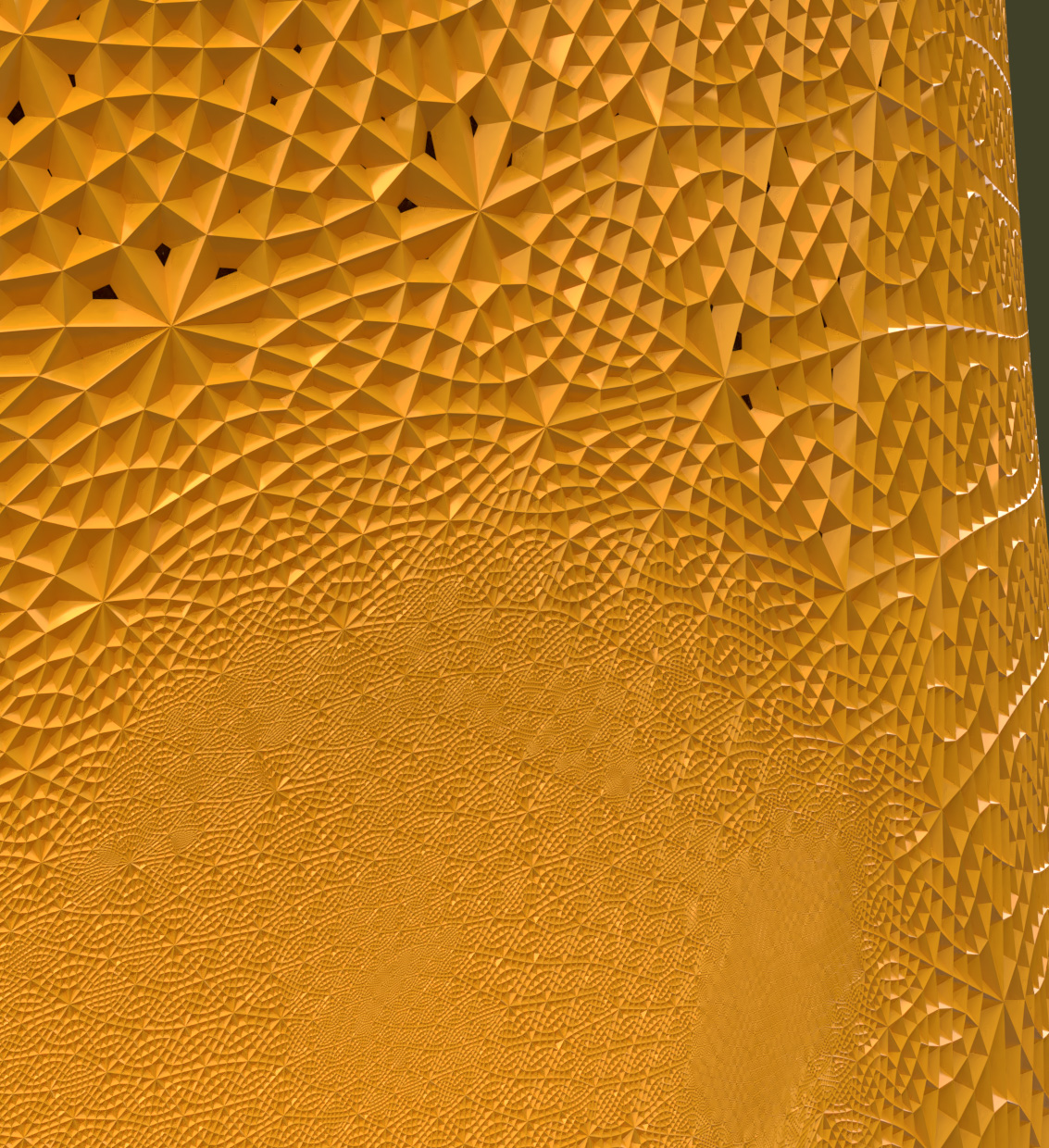
PyBlend: Nice pattern. I also liked the shiny parts. The jagged edges break the smoothness though (did you use adaptive subsurface?).
JerryGraphikos: Very nice and calming. The snowflake is very pretty, and the bokeh was a nice touch. I just think you shouldn’t have cropped the snowflake in the right side.
franck: I liked those letters a lot. The red ones really stand out, and the background is detailed enough.
robproctor83: I loved how you “chewed” those models. It really gives the impression of “infinite” detail that fractals have. The colours are very calming too. The purple backlight was a nice touch too.
DERBENDER: This looks fearsome. I like this style of black metal with red. It gives the impression that the pyramids belong to some evil, industrial, dictatorial entity (aliens? though I suppose those three adjectives unfortunately describe humans too well…).
joshwinkler3d: I loved how you made a “reversed sunset” here: A blue “sun” setting down on a lake reflecting an orange “sky”. The paper boat in the middle was a very nice touch too.
bazevedo: Ahh, a ghost! This looks scary, specially with the light coming from below. I liked the colours. It’s could’ve been a bit better lit (supposing that’s a face, of course).
Photox: I can’t stop watching this! The animation is simple (and a bit jaggy at the end), but cool nevertheless. The change of colours was nice too. But I think blender was not exactly the best tool for the job here…
caz747: Loved the edges and reflections here. The red and yellow colours are nice too.
Miatpi: I liked the motion blur a lot. In a sense, clocks are self similar since they repeat themselves across time. I liked the overall colours and the way that the clock calls a lot of attention, but I think those blocks do not fit very well. They look too “digital”. Maybe if they looked more organic?
str11: I liked those gears a lot. The variation in size and colour is nice. I think you shouldn’t have let the background colour visible (to give an effect of infinite repetition). Also, when looking at full resolution the image looks too blurred (too much compression?).
Bunnyhog27: I liked the clean reflections. It is a bit hard to make out where one ring starts and the other ends, but I suppose this is intentional. For some reason, the background image has a lot of seams (up right or down right, for example).
dudecon: Pretty crazy! The colour variation is nice.
purbosky: Really amazing painterly render. The natural fractal was also a nice choice. I loved the smoothness of the scene and how the spirals nicely come out of each other. It took me a while to realize why this piece is called nine 
Arethyu: Looks very reallistic. Triangle meets carpet it seems The shadows are pretty too.
OLG: The kind of image that breaks my brain. This looks like vegetation and water, yet I know it was supposed to be abstract!
Fulip: Warp speed, Mr Sulu! (I hope this is right, I’m not a trekky). Really looks like a wormhole (well, not that I know how a wormhole looks like…). I loved the details and the colours.
Helge: Ha! Chamaeleo Automimus is a nice name for a species. Brilliant lighting as usual. I loved how its mouth is made of two chamaleons and how it is sitting over its own tail. And how the tail looks like and infinity sign. And… well and basically everything else, this looks really good!
RobertT: I loved how it looks like a cross, without really looking like a cross (how did you do that?). It has a certain church feeling to it (church windows maybe?). Really nice colours.
@Millani Thanks again for the critique ![]() always appreciated and never going to get a complaint from me for giving it.
always appreciated and never going to get a complaint from me for giving it.
FlyingBanana: Whoa dude, I can see everything! This is pretty crazy (did you drug your computer?). You could’ve used a better shade of blue nonetheless (100% blue is in most cases ugly).
Hahahaha No but it did get a little dizzy when I viewed it in render viewport and rotated the end piece around. This was mainly just to see how well blender would handle an actual modeling of a kaleidoscope and I was rather impressed. Hardest part though was figuring out the lighting so I had to make the end piece clear where the gem stones were located in order for enough light to get through to be able to see the result in all its glory. Yeah I wasn’t too happy with the blue but when I tried a lighter shade it ended up blending in to the background too much and they just looked like distorted blobs rather than gem stones. But I completely agree I should have ditched the blue and went with a different shade of another color.
It keeps giving me errors when I try converting cycles materials.
And when I tried to leave the iron man model rendering it gave me a running out of memory error and I had to close it.
I haven’t played around with it much other than the built in textures, I might mess around with it some more later on. Going to put it on my desktop that actually has a decent GPU and processor to see how well it works utilizing them together instead of one vs the other and I will see about how to bring cycles materials into it as well. If I find out how I will post it here.
I am not sure on the iron man but I know I did a basic glossy cycles materials with two emission materials setup and render on my other laptop without a gpu and without the Raedon Render Pro installed and just rendering it at 128 samples and no denoise it was actually a pretty huge memory render if I remember correctly it was a shade over 2 gig so depending if you were rendering on gpu and it only has 2 gig of ram then that could be why the out of memory error came up.
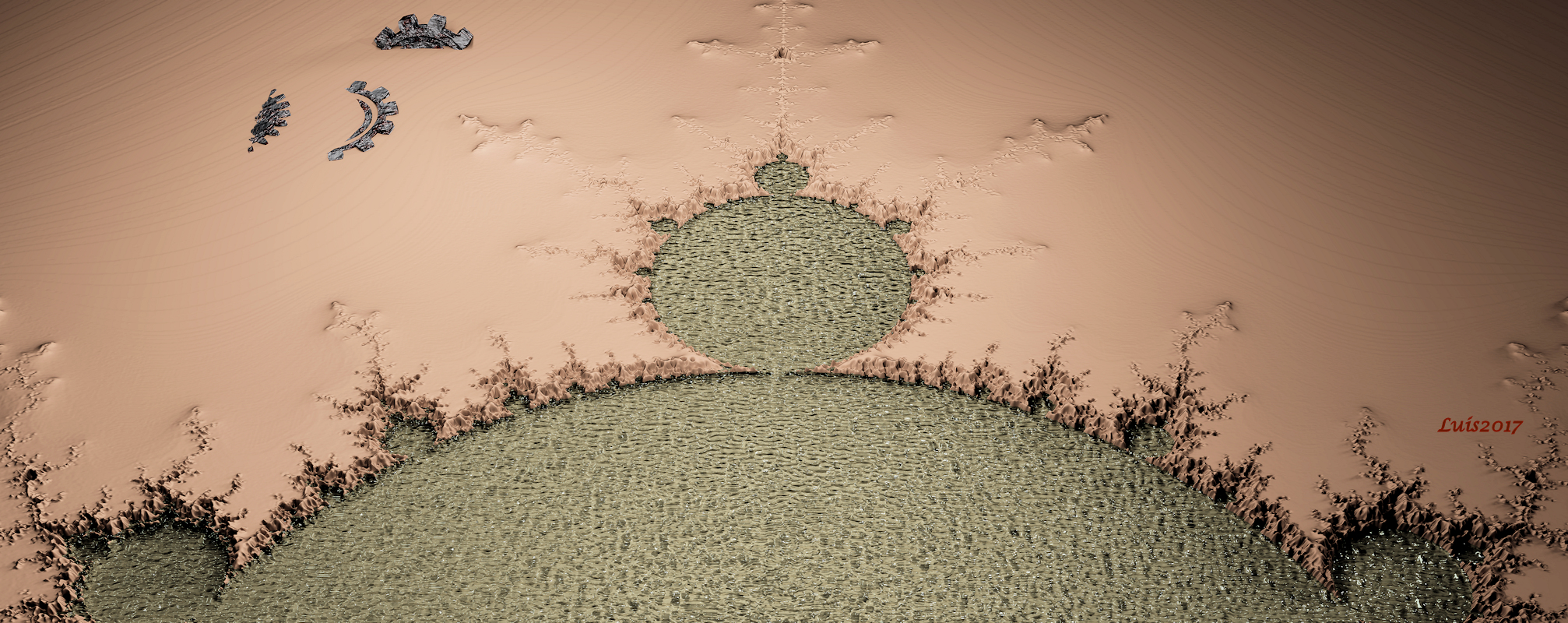
@Millani, thank you for the feedback. I was trying for a little of both (abstract and real). It is an oasis with a pool in the shape of a Mendalbrot fractal. Below is my fiinal render on the subject. It does not show it but it got up to 7M verts. I had to render in cpu mode and had to reduce samples way down. It only crashed blender a couple of times. 
@Miatpi, I like your second version better but the first was good as well. There is such a thing as fractal time in quantum physics that is separate from the recursive geometry that we have been using. Fractured space/time.

Thanks for the critique!