That’s one of my favorite things about these challenges. I only have a few hours on Saturdays to spend on my “art hobby” so if I want to participate in one of these, it means I have to be very picky in what elements I want to include. It forces me to focus very tightly on just a small number of elements.
Thank you so much for your vote Rob!
I’m really appreciate it ,that among lots of cool entries you’re voted for my entry
Ok, take a deep breath, I can do this. It is only half a hundred entries…
I’ll be giving comments to half of you now, and the other half comes later (if I don’t forget ;))
bazevedo: Amazing movie-like atmosphere and colours. Those voids are also really impressive.
Lux: Funny movie-poster. I liked the harmony between smooth areas (ground, cube surface) and highly-detailed areas (steel bars inside the cube).
CartoJary: I liked the material on the cube and the usage of DOF: Everything except the cube is blurred.
RC12: Good thing no one is aboard that paper boat! I liked that you wrote “titanic” by hand on the boat, making it more authentic.
FlyingBanana: Poor cubes living in such harsh conditions! They must also have a hard time drinking water. I liked how you managed to make the place feel over-crowded and in poor shape.
DM9: I never found Suzanne to be very useful, but that doesn’t mean she should be turned into a cube! Nice creepy industrial look, and the red background makes the whole image feel more “evil”.
mckeephoto: Maybe one day we will have museums like this, when we live inside a computer simulation. The young people will learn that everything started with a cube  I liked the glass material and the signs with the names.
purbosky: I liked the monochromatic scheme. The water pool also looks nice. Little do the ice cubes know that the ice sphere was, one day, also a cube. If they stayed together, they would survive longer.
RayVelcoro: I really liked the emotion in this image. Even though you used simple shapes and silhouettes, the story is very clear. The orange colour also made the picture feel “warmer”, in both senses.
By the way, it is a bit funny (and sad) that this image comes right after the one titled “Rejected”. Maybe this is a prequel? 
skadoosh: The dust on the camera looks really cool. The cubes look like some sort of alien artefact, very mysterious. The lights are preyty.
MDO2010: It is really amazing how you used 2D tools to simulate 3D effects, like lighting and perspective. The textures are awesome.
Advent Crown: I had no idea the devs were so creepy :P! I really liked the bright/dark contrast and the cage in the centre. The light is also very cool. The fingers look a bit cheesy, but I know that they can be quite complicated to make (I must’ve spent hours doing them in my entry).
Photox: Poor cubes need to do all the hard work while the spheres just sit down and watch. I liked the line-art style. Did you do it with the compositor or with some fancy material? Also, I loved who the hair of the cubes look like french fries.
g60: It is impressive how much you can achieve with a cube and modifiers. Simple, yet eye-pleasing. The colours are nice.
fdo: I really liked the material on the rocks, it looks very realistic. I suppose excavating a perfect cube out of solid rock must require quite some work! The details with instruments and lamps are really nice (I’m just not sure what a gardening spade is doing there, but anyway). Also, the shadow on the right is pretty interesting. Is that a person digging? oO
Fulip: That has to be one of the creepiest and most evil-looking Suzanne I’ve ever seen! Her eyes are really awesome. Also the colours make the wholel image feel burning hot.
YAFU: That would be a funny April fools’ joke: As soon as you delete the cube, this clown pops out :D. I liked how you made the clown with Suzanne, I didn’t recognize her at first. The spring looks pretty nice too.
didierv: Aah! The meshes are rebelling, it is the second protest in 7 days! I liked the puns on the signs and also how the text is hand-written. The way you changed the floor and the background improved the image quite a bit.
usernew: That’s very photo-reallistic. The stone material is really awesome, and the top of the cubes also look very nice. But there doesn’t seem to be any imperfections on the sides of the cubes (at least the reflections look flawless).
Evivivi: I liked the colours and the atmosphere. The contrast between black cubes and bright lights is also pretty nice, and the blue shadows are really cool.
fcharr: And that’s how blender is going to look like when VR glasses replace monitors. The buttons look nice (it makes me want to press them). I also liked how you hinted about deleting the cube.
caz747: When the cube repairman is not around, you need the cube repairmonkey! I liked the reference to Space Odyssey. The monkey also looks nice, specially with the rim light. There is also a nice feeling of an excavation site.
Ryeath: It is impressive that you made this just by extruding and manipulating one cube. The building is very nicely detailed. I just think the image lacks somewhere where I can “rest my eyes”, if you know what I mean.
Thanks Millani  Didn’t think you were going to do this one
I thought there would be more cube deletion entries. I really liked the ones that explored the basic cube and plane. Then there were the ones that were about the cube as a foundation for other meshes. Great entries everyone!
@Millani thanks as always for the response. You are awesome, thank you for taking our time out of your day to go through all these entries and respond to them. I think you deserve some kind of award, especially with this many entries like this challenge.
Many thanks to you Millani, very much appreciated.
Thanks for the critique, Millani! Yes, I didn’t add imperfections on the sides of all cubes. But this object is very interesting. Some are super clean, some angles gives deep black reflections. Whew!
I will critique every single art here tomorrow.
Thanks for the feedback Millani. Actually, the text is made with the Comic Book font (https://www.dafont.com/comic-book.font).
But I played a bit with the UV Mapping to make it less regular.
Cheers for the critique, Millani. It’s the first time I have used Suzanne, and tried to make fur. You learn something new every challenge!
Great entries everyone. Who would have thought the default cube would bring to the fore such creativity.
Here are the comments for the remaining entries. Hope you guys did not suffer from anxiety while waiting 
Munno101: Nice and simple. It looks like vector-graphics. The shading on the cube is very eye-pleasing.
Bunnyhog27: Really liked the wax material on the text. The 3d though balloon is also nice, though it looks more like a talk bubble (thoughts use dots normally).
Dragonfire: I also liked the wax-like material here. The colours are pretty, but I think it might be a bit disturbing for a cube to live in a city made of cubes (how would you feel living in a building made of people?).
FuzzyPeachApple: Funny follow-up to another entry. I liked the style, which looks a bit like painting, specially the jeans. The sparks were also a nice touch.
PyBlend: I liked the stone material of the cube, specially the little cracks. The marble looks ok, though it is often very complicated to achieve a authentic effect just using nodes. The tiles on the floor look pretty cool.
finalbarrage: I must confess, the first time I watched the video I did not notice the cube was 3d Watching again I could see that it was indeed 3d, but the effect was pretty good.
unyxium: I liked the green lighting. Makes it look pretty mysterious. It is also a mystery why the word “titled” appears on the title
amirkh195: This looks so happy! I really liked the faces on the… faces of the cube.
joshwinkler3d: I liked the material of the cube, it feels like the cube has been there for a long time.
david.speer: This week, the cube got the spotlight (quite literally here). Not sure if it is intentional or not, but the colourful cubes in the background are actually calling more attention (I guess that’s the default cube’s curse).
Duddits: It is amazing what you did with a cube and some modifiers. The colours are nice, and something in the light is pretty cool, though I’m not sure what.
str11: I really liked the details with bolts, plates and circuit components. The (hyper)cube in the centre looks very hi-tech!
oJB: Interesting room. It feels like an spaceship. The glare effect looks nice, but I think the light should have more impact on the room.
FriZan: The horses make the scene feel really surreal. I keep asking myself what are they doing there. Also, another nice use of modifiers on a cube.
Gordi: This cube has potential as a mysterious object, as the texture is pretty cool. But it is lacking a bit of context here.
Unicornaphobist: This week’s theme wouldn’t be complete without somebody making the obvious joke
robproctor83: I really loved the grass and that house. The smoke looks pretty nice too, but it seems to be going up too fast (i.e., there seems to be a lot of pressure inside the house). The little telescope was a nice touch.
OLG: Funny play on words. Very abstract, but somehow intriguing.
beau11: Cool idea making the cube barely noticeable and out of focus. I liked the black-and-white with a tint of red colours.
Helge: Nice pun! I really liked how you make the face of the cube look like a baby (somehow). The heart-shape was pretty cute too. I’m really impressed with the material of liquid where the cube is in. It doesn’t seem to have homogeneous density, but the effect is very subtle. Also, the colours are very warm and beautiful.
RobertT: I suppose that’s how 4d shapes look like in 2d Pretty crazy, looks a bit like that feedback-loop effect.
3dmad: I liked that ship, it looks pretty complicated. Also the purple light inside the sphere looks nice. I just have no idea how the ship will fit inside!
DaN_: Interesting way of keeping a beer cool. Also funny how the beer has your username one it. The fossil is pretty funny too. Poor duck though.
I’m really happy someone voted for my image. In 55 votes even one vote is a lot.
And… the winner of Weekend Challenge 752 with 12.73% of the votes is… bazevedo!
Here’s to all the great participators…
bazevedo : 7 : 12.73%
Lux : 5 : 9.09%
CartoJary : 0 : 0%
RC12 : 0 : 0%
FlyingBanana : 3 : 5.45%
DM9 : 0 : 0%
mckeephoto : 1 : 1.82%
purbosky : 0 : 0%
RayVelcoro : 1 : 1.82%
skadoosh : 1 : 1.82%
MDO2010 : 1 : 1.82%
Advent Crown : 2 : 3.64%
Photox : 3 : 5.45%
g60 : 0 : 0%
fdo : 5 : 9.09%
Fulip : 0 : 0%
YAFU : 1 : 1.82%
didierv : 0 : 0%
usernew : 6 : 10.91%
Evivivi : 1 : 1.82%
Millani : 2 : 3.64%
fcharr : 0 : 0%
caz747 : 0 : 0%
Ryeath : 0 : 0%
Munno101 : 2 : 3.64%
Bunnyhog27 : 0 : 0%
Dragonfire : 0 : 0%
FuzzyPeachApple : 6 : 10.91%
PyBlend : 0 : 0%
finalbarrage : 2 : 3.64%
unyxium : 0 : 0%
amirkh195 : 1 : 1.82%
joshwinkler3d : 1 : 1.82%
david.speer : 0 : 0%
Duddits : 0 : 0%
str11 : 4 : 7.27%
oJB : 0 : 0%
FriZan : 0 : 0%
Gordi : 0 : 0%
Blender Purgatory
@bazevedo Congratulations on winning this one, an all round well executed entry.
Also @beau11, well done on choosing such a popular theme.
@Millani Thanks for the feedback, procedural textures can do the job a lot of the time.
I actually got a vote this time, been a while thanks
Congratulations bazevedo! Great job!
It has been some time since the first submitted entry actually won the challenge. ![]()
@Millani: Thanks for your comment - and for working your way through the biggest list of entries that has been seen for ages.
Actually, this is just a (homogeneous) volume shader and a little play with the depth of field settings + low samples with strong denoising. I probably could have achieved the same with a non homogeneous volume shader and a lot more samples - but that would have taken ages to render. ![]()
@joshwinkler3d:
One thing I wanted to mention before: I’m sorry your laptop wasn’t too happy about the dust/sand experiments. Did you try adding it in the compositor after rendering? Using the depth data for this can be a very cheap (in terms of render times) way of adding some atmospheric dust/fog/mist/sand/whatever:
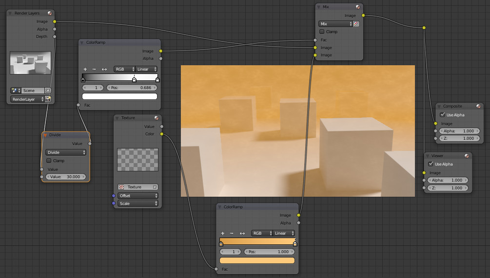
(compositor setup)
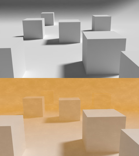
(before/after)
@Helge My laptop can handle most things in Blender, however, I think with smoke and volumetrics I have reached it’s limits.
I did have a look at the mist pass to add it but didn’t get much out of it, I haven’t had much success in the past rendering a useful depth pass either. I will have a look, thanks.
Thanks for the comments, Millani. I found that the painting effect was caused by the denoiser. At first I tried rendering with ~200 samples which left a lot of fireflies in the picture before denoising, and ended up looking much more painted after.
It’s my first time using the denoiser so I don’t know, but I wonder if the effect became more prominent due to the use of volumetric fog in the scene, because I didn’t notice it happening in other renders that used the denoiser.
Also, great job to everyone who submitted an entry and thank you to everyone who voted for me. I certainly didn’t expect to get that many votes but I guess it means I should continue entering these challenges.
And, of course, congratulations to bazevedo for the win!
@joshwinkler3d you should look into the mist pass some more. It’s really useful at times, but you have to set up a few things in the properties window for it to work properly
@FuzzyPeachApple If you want to get good results with the denoiser and volumetrics, you sometimes need to turn your samples WAY up
There is something that I have always been curious about. Are the participants who didn’t win the weekend challenge allowed to post their entry in the Finished Projects section?
That’s right. What you can do if you use a Volume Cube, you can put it in a different Render Layer and configure it with their own sample rate and denoiser settings. Also if your volume has no texture, you can use compositor and Blur node for volumetric. If you use volume in World, Blender 2.79 from master/buildbot now has Volume passes (I’m not sure how to work with volume in World really) If you see my entry, it also has volumetric patches that denoiser produces. I did not have time to experience different configurations and with compositor.
@Advent Crown, Yes, why not? ![]() in Work in progress, Finished projects, etc. Where you want.
in Work in progress, Finished projects, etc. Where you want.
@Millani, you had a hard work this week ![]() . Thanks for the comment!
. Thanks for the comment!