This week’s theme:
Grease Pencil Story Art
After 2 days of voting, a winner is declared: The voting will close on Wednesday.
The winner picks the theme for next week.
[ If the winner doesn’t supply a theme before Thursday 22:30 GMT, the organizer will select the theme. In this case, the winner’s theme will be used the next time we are lacking a theme on Thursday 22:30 GMT.  ]
]
Having selected the theme, the winner will not be eligible to enter that week. They may however still submit an image, but it won’t be included in the voting.
Pure Entries
-
beau11
[post=3298114]Would you like a balloon?[/post]
-
RC12
[post=3298281]Delete CUBE[/post]
-
dat boi
[post=3298586]The Future of the Grease Pencil[/post]
-
FlyingBanana
[post=3298791]The Primordial Grease Pencil Soup[/post]
-
Millani
[post=3298864]The not so Perfect Plan[/post]
-
DoriNori
[post=3298677]I Honestly Don’t Know Anymore[/post]
Open Entries
-
didierv
[post=3298525]Perfect plan[/post]
(I reused the mouse and the grease pencil.
Blender’s grease pencil tool was used for the plan. )
-
caz747
[post=3298632]V3[/post]
(
Open entry as I used a previously built model for the arch doorway. Everything else is new and with the exceptions of the crosses and moon was made using the grease pencil. )
-
fcharr
[post=3298501]Blender Nights[/post]
(Objects and materials borrowed from Victimless Crime (very appropriate for the theme), and Stationery.)
Non-competing Entries
-
Iridesium
[post=3297799]Giant Monkey[/post]
-
Helge
[post=3297925]Don’t Lose Your Grease Pencils![/post]
-
Photox
[post=3298097]Eye[/post]
-
purbosky
[post=3298193]Rubi[/post]
-
OLG
[post=3298219]Fire fighter[/post]
-
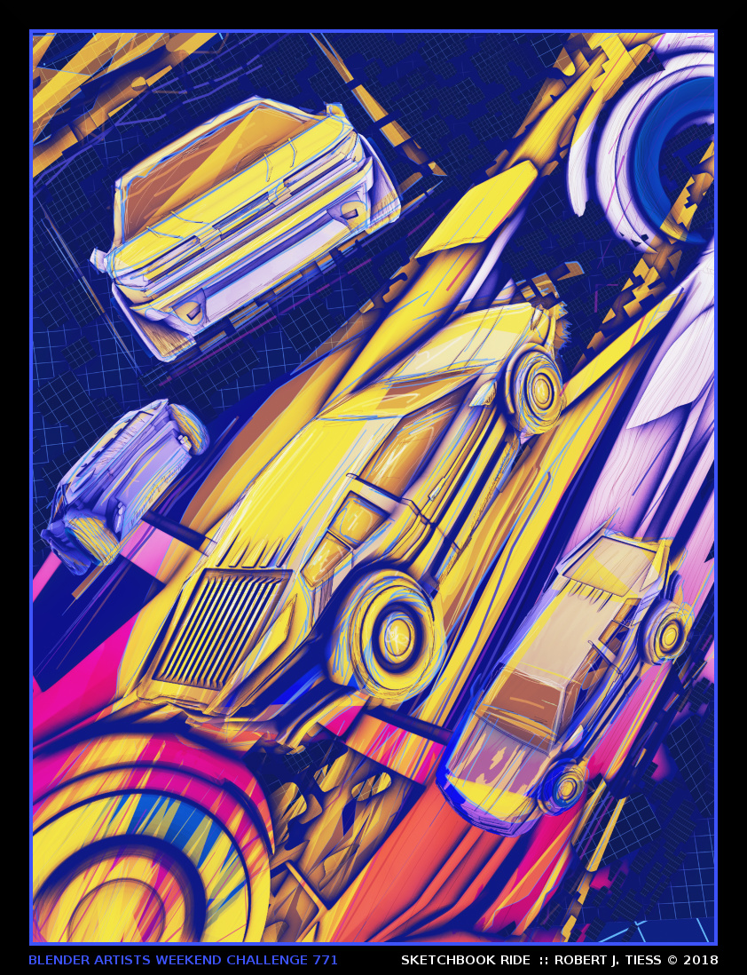
RobertT
[post=3298576]SKETCHBOOK RIDE[/post]