Hello!
Please review, i need information, feedback. Thank you!
Your render looks so perfect! dont need to work more on progressive… love it…
Thank you tux. But i think i forgot something, but i don’t know what
I think you forgot reflections:) Thats whats missing…soft shadows to match the spec hardness. You’ll need and environment texture or a sky dome for the piecies to reflect:)
Good luck and Happy Blending:P
Thanks Derek
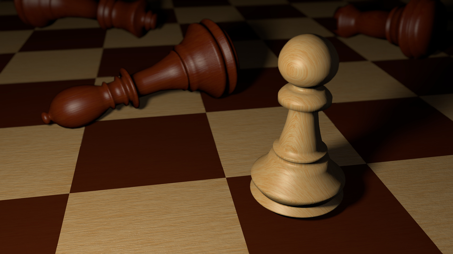
I added mirrored HDRI to all chess pieces and to table
Added mirror to the table
Now i don’t know if it’s better. Sorry, but i didn’t understand you when you said ‘‘soft shadows to match the spec hardness’’ so i added more light, with sharper spec and softer shadows.
Or you think it’s now worser?
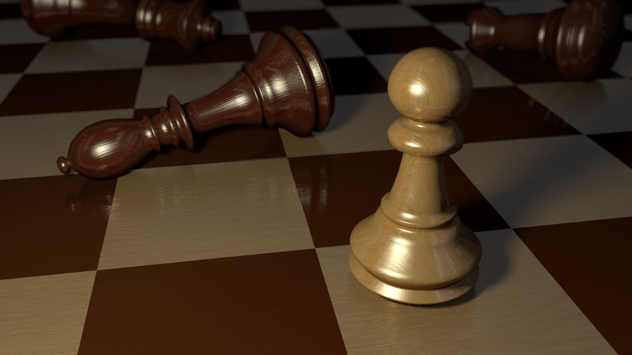
indeed, it is alot better than one. on the floor looks good but one part on the floor below the cream chess need more reflective like as other ones. I think it would be maybe would look better. It’s up to you.
Ah sorry about that I ment soft reflections hehe sorry:) There is a glossy setting (I’m assuming your not using cycles) where the mirror material settings are. Change that to like 0.97 and samples to 30 and then bring down your spec intensity a bit and soften it too. Matching the spec and the mirror is kinda an art form:) The mirror reflectivity should be like 0.2 and dont forget freshnel and blend both should be like 1.5…and if you bring blend down you get more reflection straigh on which for this type of wood I dont think you want:)
Same goes for the floor 0.2 reflectivity and softer glossy value like 0.95.
It is looking better to me:P Good work!
Give that a shot:)
Happy Blending
I changed the reflection to softer, added Glossy reflection and softened the specular and changed the old HRD image.
Now i can’t decide what is better: to be realistic, or to be fine : because sometimes the real life is ugly.
Sorry Derek, and thank you for helping me, and thank you tux too!
I hear what your saying:) it is always the decision of the artists. My final two cents:) The floor is still way too glossy…I’d like to think the floor or board would be half as reflective as the piecies due to wear that means softer reflection too:) Finally I liked your lighting better in the first render:( I think the HDR is too strong or could be removed all together and a black environment used. This would be the more artistic approach with the board and piecies leeding off into the dark shadows in the distance like you first render:) Maybe even shorten the distance of you light source and allow for more darkness in the background. Is this BI or cycles? HDR’s can be used in both thats why I ask. If BI I would change AO to multiply and set it to like 0.4:)
Good Luck:) Happy Blending!
Looking good! I like the glossy floor, looks like a very expensive polished chess board 
Personally, I’d try to use a cooler light temperature and maybe a larger light source to imitate window light. Something like this: http://board-games.helium.com/spresources/summarypage_images/00/19/82/250px-ChessSet198257_small.jpg
You could also experiment with less depth of field to make the two figures in the back blur out more.
I really dig the wood texture on the pawn and the board, looks very realistic!
Oh no… so glassy means clear? i checked google translate - uh, i tought it means grainy…
Sorry me.
I used your suggestions.
Now i think the balance is good, but i want an artists opinion. What do you think?
And sorry for me being noob. Thank you 1000x!
EDIT: Or maybe i can add more light
( yes, thank you too LiMuBei, i will make that too and post it here  )
)

