The top Enterprise is what we’re getting, the middle has the Matt Jefferies proportions restored, and the bottom has both the Matt Jefferies proportions and colors.

The top Enterprise is what we’re getting, the middle has the Matt Jefferies proportions restored, and the bottom has both the Matt Jefferies proportions and colors.
Oh, get a life (not you, the person who made this). They are all the same.
The middle one looks great. The first has the engines too close to main body.
Hmm, yes, they’re way too close, and the middle one does look best. I don’t think the old colors work with the new materials.
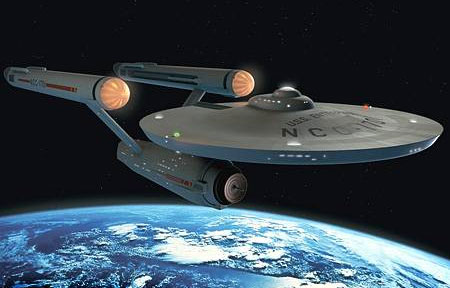
I suspect the front end of the engines are expected to act as ramscoops, but it’s a little weird that they made them look like ramjets (a design meant for supersonic combustion).
(Cue in the lengthy technobabble excuse nobody needs.)
Well, count me in the ‘I likes em all’ camp.
At this point I’m just hoping the movie is of a high calibre and restores a bit of life into a dying, but potentially exciting franchise.
It’s been going down a slippery slope since the next generation imo.
well, they’re meant to look like big glass domes with lights in them… Didn’t you see the “original” star trek?
I love how often in star trek they introduce style cues from the original series…like the weird audio sonar “ping” from the bridge in the original series was used as audio at the end of star trek4 “voyage home” when the crew get the new enterprise NCC 1701D…
Most new Star trek takes too long to find its feet… If they make it to 4 series worth then they get some really good stuff going…
Next generaton, Voyager, Deep space 9… all average IMHO Until series 4 starts then it’s all gravy 'till they get axed.
Voyagers sham of an ending is still risable now with its " and they all got home in time for jelly and ice creamfor tea"
well, they’re meant to look like big glass domes with lights in them…
Which probably made for more eye-catching toys. That’s a reason I can understand!
Ah, the more innocent times.
Nowadays, though, we demand ‘harder’ sci-fi; the ubiquitous technobabble is seen by an ever-growing number of Trek fans (excuse me if I omit their ‘proper’ name) as something to be avoided.
Maybe that’s why I find an Enterprise with ramjets so amusing. It’ll probably make a cool-looking toy though.
Now, can anyone tell me why when I think of ‘ramjet’, I immediately think of Jay Ward and the name of Brendan Frasier lurks around the thought like a threat? XD
Most new Star trek takes too long to find its feet…
I generally agree, except when it comes to the TNG. I liked most of seasons 1 and 2.
still, the techno-babble does actually convince on occasion… the holodec was a particularly crazy idea… especially when they buried Tasha Yar on the holodec… what the?
Ahh ha ha ha, but it’s all ok, cause it’s the matter transporters pattern buffer… do you see it?do you see it? you have to love those “heisenburg compensators” don’t you?
I made it, they are not all the same. I’ve done design work for movies and games, and I’m coming from a designer’s perspective as well as a Trek nerd’s perspective.
CubOfJudahsLion - I didn’t put much time into the version with the old color ram scoops and deflector. I’m sure it could be done better.
looks up the compensators
Ah, I remember them now. “Yo, quanta, say cheese.” He he, love them or leave them  True, the babble does sway; it may be just that the Trek babble is passé now. It’s not about theoretical rigor but picking the right buzzwords. In fact, make a character say “they aren’t really ‘Heisenberg’ compensators; that’s just a nickname; they’re actually quantum p-brane something” and it’d ‘cease’ to be technobabble.
(Note: there is such a thing as quantum teleportation, but it’s about teleporting information, not matter [at least for now].)
Jeremy: I have to concede that. Still, the reds suit the “hot reaction” in the nacelles, while the ramjet intake invites the metallic look. In the absence of the copper dish, I guess they preferred to borrow from the version from the films. googles for images:
NCC1701 refit:

NCC1701-A

Y’know, I like the ‘A’ version better than all others.
Okay, perhaps I should been a little less hostile, you actually did it nicely ![]()
But I still think there’s no point. Yes, there are differences, but to me (not being a fan of Star Trek) they do all look "the same’, and I could care less if the back parts were to be closer to the body part or not (and whatever else I could find that made a difference).
I guess it’s the nerd’s perspective that explains why I’m reacting like this ![]()
(like I said, I’m not a fan of the show, no ST-nerdness here)
It actually looks really good with the crimson bussard collector, but the yellow deflector dish on the last one is just UGLY! Ick!
And yeah, I think its nice that they’re trying to update it, but the engineering hull is just too short and lumpy.
And wow I had no idea they had moved the nacelles so close to the saucer, even MORE ugly! And I really how the pylons themselves curve ineward, ewwwww…
BUT, other than that :P, I actually like the redesign; I like that the saucer is pretty close to the TMP version, and the neck is pretty similar, but the rest of it is just too curvy.
I’m excited to see it on the big screen though, maybe it will actually look good. Who knows. But I guess I’m not as die hard trekkie as I thought I was compared to some people, I guess I’ll find out when I see the movie. 
CubOfJudahsLion - I’m a big fan of the 1701-A as well, but I find it odd that Trek brought back the orange bussard ram scoops of the TOS Enterprise for the Next Gen era ships, and the NX-01 Enterprise has them, but Trek 11 is going back to the black collector look. I don’t see the need for changing the color palette of the TOS ship.
BTW it’s strange to see the 1701-A lit so dark when it was almost always glowing white in the movies.
oogsnoepje - but, proportions are a very important and basic part of art. Completely leaving out the original TOS ship, what I see in the proportions of the Trek 11 Enterprise is plain old bad art.
Laughing cheese - I could have done a better job with the yellow deflector dish - but I’m not getting paid for this 
Nacelles - If you see it from the front, they’re also too close together. It looks prissy instead of tough.
Curvy - Yep, the organic curves make it look like a Next Gen ship. I’d rather have seen them stick with the machined look of the TOS ship. But who knows, perhaps there will prove to be a story reason for the look? Spock came back in time with Next Gen technology, and in this new timeline the 1701 was built with Next Gen technology? Sort of like the Voyager of the last episode which had been modified with future Federation technology. Hey, maybe the new 1701 will even have the armor plating that beams out. Gawd that’d be gay.