There used to be a little widget in the corner of each panel that made closing them easy. Is there some trick I’m missing here in 2.8?
Thanks!
Glenn
There used to be a little widget in the corner of each panel that made closing them easy. Is there some trick I’m missing here in 2.8?
Thanks!
Glenn
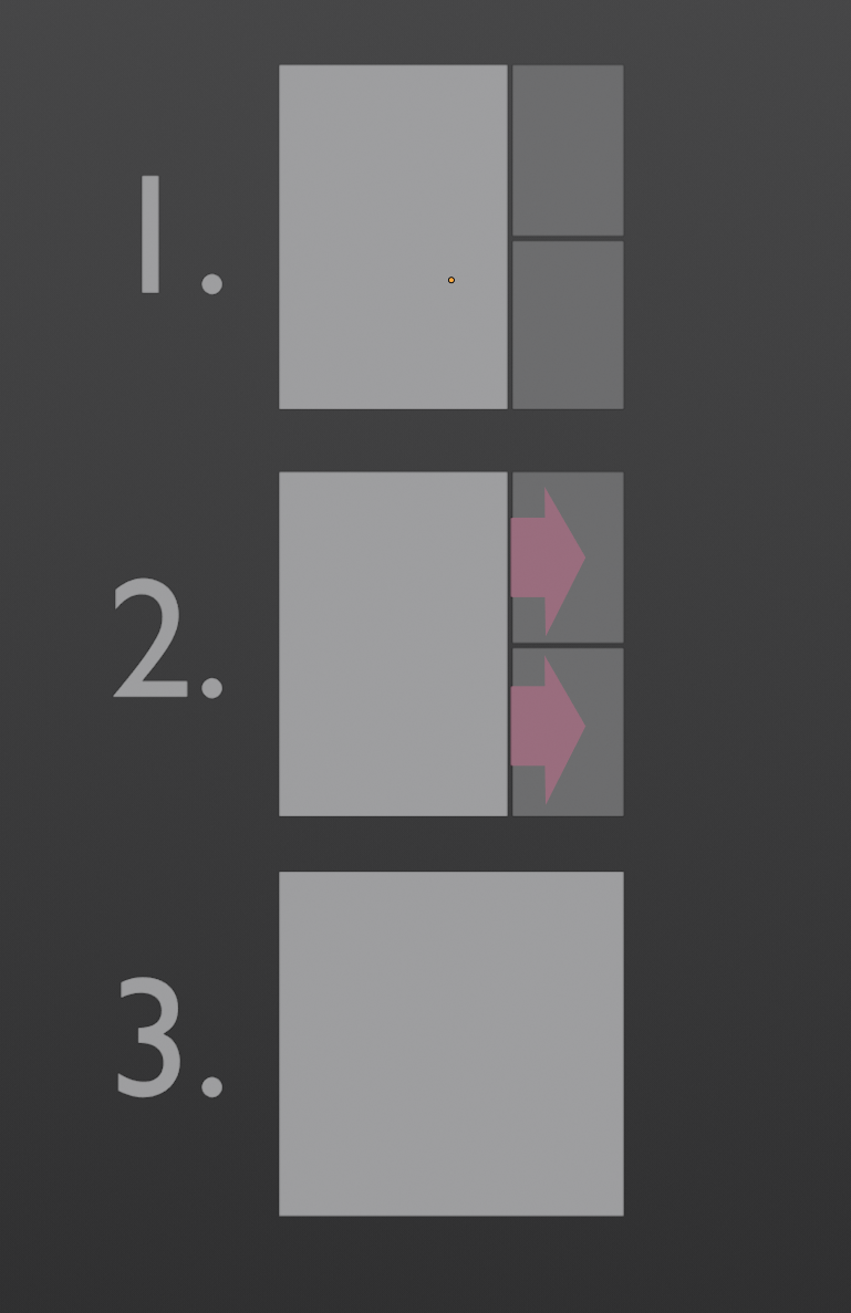
Man, I am really hoping they give us the option of having some sort of visual indicator like in 2.5-2.7. They said that when they tested this new bidirectional design with widgets, all the different types looked bad.
Personally I feel that it would work fine with just two widgets per window. The widgets don’t have to line up with all the hotspots. They are just visual indicators that you can do something with the corners.
I think that we are pushed to use the alternative right click menu to have Area Options (Split area/Join area).
But I have a ridicously tiny problem with this menu. It does not work if you give a try at boundary of an editor with status bar or Topbar.
Solution is just to use opposite side of editor. But each time, I try the side closer to mouse pointer and it is not the one on middle of screen…
I was hoping they’d finally fix the case where you drag one bigger panel into two or more smaller ones which currently just flat out refuses to work. Just close both of them dammit instead of forcing the user to collapse them one at a time…
This patch (which needs to be reviewed) lets you merge smaller areas into bigger areas. Maybe after that gets added, they could see if they can extend it to work the other way around. This is probably a harder task though.
That patch looks good, though it seems to me that what the author did is quite a bit harder than what I illustrated 
I miss that little widget, the current method makes it very easy to click on items below the corner now. If the shading panel is below that corner, you will open the shading meny almsot 70-80% the time instead of dragging a new window area.
Also all lines are to thin, its like the area where you can click is like 2 px wide orso? The standard line width setting is thin, but is to narrow. Normally it was auto but that looks much wider now?
The difference between thin and auto use quite big. why not add an normal or manual setting.
I honestly don’t think an always visible widget is the right solution, but very clear visual feedback when the mouse is moved over the corner is absolutely necessary. Currently, the cursor changes to a small cross, but you can’t easily tell which windows the cursor will split. It definitely needs improvement, and as far as I am concerned, the main thing it needs is a couple of cursor designs to show how the split will work when the user drags the corner.
Thank you soooo much <3
This is such a Bulls^t method, I close one window or area, then open 4 more!
It is most definitely obscure and tricky at first, but quick and easy once you know the tricks and get the hang of it. This might help illustrate where to start clicking:
https://docs.blender.org/manual/en/dev/interface/window_system/areas.html
Thanks harley, I finally understand how it works with this link
You’re very welcome. It really is a perplexing and terrible feature for new users. But once you know how it works - especially that you click in an area corner and not between areas - it is powerful, fast, and simple.
I would prefer if a ‘corner’ graphic appeared as you mouse near them so it was clear the corner could be split. Having the functionality obscure like this is counterintuative and is not immediately clear, particularly to new users. I tell anyone new to Blender to right click on an edge and use the popup to control what happens.
Glenn
I would also tell new users the same thing: to right-click edges and select from the menus.
I love the “advanced” corner behavior but doubt that it could be made more intuitive for new users. I’m not sure what could be shown at the corner that would indicate what can happen there in a way that could guide new people. We used to have those “stripped triangle” things there but they weren’t any more instructive and new users were still mystified on how to work them.
Any ideas on what it could look like? We could show something at the corner and/or change the cursor to something better. But the question is still what those things would look like.
I’ve also made my edge white so I can spot it easier.