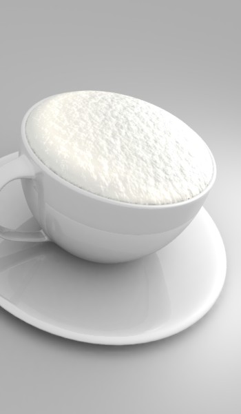
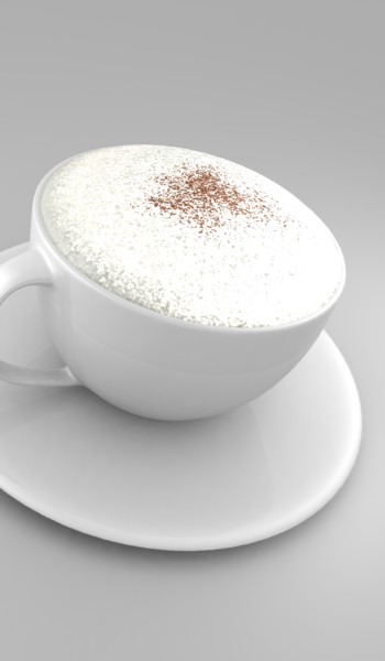
Ok, i’m not sure whether i’ve already posted this. But its been bugging me! I’m trying to put some sprinkles on top. At the moment, i’ve tried dupliverts and particles. The particles are the best so far, except i’m using YafRay to render the cup. And the particles dont show up. Anyone know anything about that? I’m using GI, so it could have something to do with that. Not sure.
Any ideas on how to do the sprinkles would be great, and comments on the coffe mug. Materials etc. Thats the finished model. Just materialing now. Its for a logo, so it can’t be to complex.
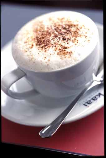
‘Coffeemug 4’ is the current render. And the other is an exapmle of what i want. Especially the sprinkles.
Can’t you just use a texture map and a normal map?
Hmm i have already tried it, it didn’t turn out to well. But i ought to have another go at it. I’ll see what i can do. The ‘froth’ is an object, and to put anything more on that will probably make things a little odd. Thats why i’m trying to do it with another object. I’ll see what i can make of it though, thanks.
I don’t know about anyone else but this looks great! I am very impressed by the realism of the cup and the froth! Of course, the saucer could use a bit of work but I can see that’s not what your main focus is on. Please put this in finished works so I can be jealous! Great job…BRAVO!
“please put this in finished works…” = whenever you get done adding the topping and the spoon and everything else. Again, brilliant job on achieving realism!
Thanks Cloud. After that statement, i might just keep on and make a little scene out of it…because i can. It was originall only that, so it could be used for a logo. (thats the second pic, the sepia one)
I’ve been having a bit of trouble with the material for the cup. I need it to be whighter. So it looks like a proper white coffee mug that you get in the coffee shops. I’m thinking its just because of the ambient colour, which is a light grey. But i’m using yafRay with GI, and if i go and change the colour it renders with a different colour. Anyone know if you can bake the GI for yafRay, then be able to change the background colour?
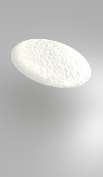
Also the ‘froth’ went off a bit, with the way i did the cocoa on top. Its a different object thats been alpha mapped, and its killed some of the colour so i’ll be tweaking that too. Any suggestions are welcome!
Attachments
Nice froth, particularly in your first image.
A quick comment, for now.
I need it to be whighter.
I think the problem is largely the surroundings. They are grey, no matter how white the cup (unless flourescent) it will look grey. Have some bright surroundings, something bluish. Light bright blue looks more white than white, because your eye adjusts to the colours, making everything else seem less white.
Also, it’s about comparison. Light grey against black looks bright white yet looks dirtys against white. Fading colours gives the impression that something is shining. This is why blurred highlights can make an image seem much deeper. Your froth in the last images looks so bright it tones down everything else.
Look at the reference, on the whole the cup is actually darker than yours. There are highlights though. You need the contrast.
Look forward to updates,
Ian
Aaaah i see what you mean. I’m going to make some other simple objects for the scene, like a spoon, maybe some of those little packets of sugar or something. I need to give some shape to the saucer too. Its to flat. Thanks for the ideas Ian, i’ll see what i can do.
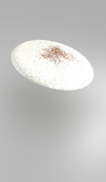
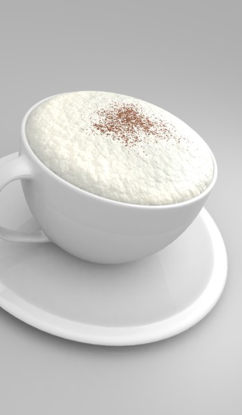
ok, well, this is a comparison, the first one is obviously just the plain ‘froth’. The one that you all like. I do to. The other brighter one, is with the cocoa sprinkling. It is a different object, as in i’ve just copied the froth and then moved it up wards a little, then put the texture for the cocoa onto it with an alpha map. The alpha is zero for everything except the sprinkles, so it should be ‘catching’ the light like it is. But it seems like it is just getting the light rays caught between the two objects. Would making the faces on the top object (the sprinkles object) one way help this? so the light can escape? Any other ideas would be appreciated.
Attachments
No worries, sorry for the disjointed message!
Maybe the problem is the specular highlights. Despite the alpha being 0, are you still getting the highlights? Render the froth layer on its own to check. Not much of a yafray man so I don’t know how to change that but I think it’s worth a shot.
Why do you have 2 objects? Can you not just have the sprinkles as a colour map on the froth? (sorry if the answer is obvious)
EDIT - if particles work the best, maybe try rendering the particles on their own in blender internal then pasting that image over the yafray render?
Ian
Hmm the reason i’m using to images is because if i put the sprinkles texture on the froth it kills all the colour from the froth, and just makes it white. I can’t stop it either. Thats why there is two objects. The froth is just a bump map thats been turned up so it deforms the froth mesh a lot. If i try and put the sprinklesd on top it covers the bump map for the froth, theres still releifs but they aren’t as obvious. I might try turning the lights down or somthing. I’ve tried rendering the object with one sided and it didn’t work. So i’m going to try making the object smaller so the light can escape out the side. thats the idea anyway.
Well i found the problem with the froth. I had a photon lamp in it, that was all getting caught and over lighting the froth. I’ve deleted that and now its alright. I need to work on the lighting a little more as the sprinkles look like they’re floating at the moment. I’ve changed the saucer so it looks like a saucer. Just need to work on the lighting, stay tuned!
Attachments
The froth looks exceptionally good. I think that you need more contrast between the subject and the background, the whole composition needs more depth.
yeah, i’m working on that, modelling some extra objects and i’ll work on a bit of a background. Dont quite know what it is going to be…but a background none the less.
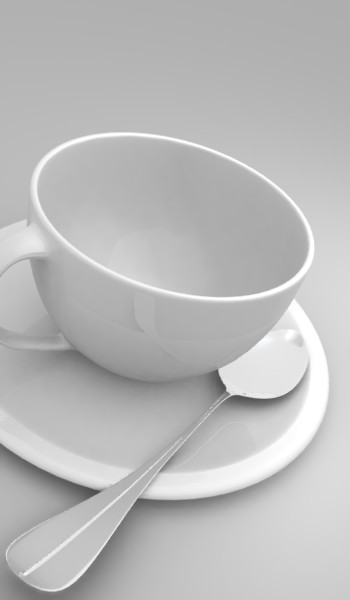
Heres a bit of an update, i’ve added another light, low intensity, to lighten up the top of the froth. Looks a lot better now. Still, not quite right, but better. Also a render of the spoon. I’m still wondering what kind of ‘‘table top’’ i should use though. Thinking something wood, maybe some really dark wood to bring the coffee mug out. Not sure, i’m also going to model one of the sugar packet things that you get from restaurants. put it somewhere. I’m going to have use some environment maps, so i can get some good reflections too. Comments are welcome!
Attachments
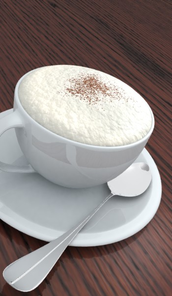
Another update, i’ve worked a bit on the materials and used the fact that blue is looks whiter than white. I’ve also added a wood texture. I know its dodgy looking near the front. But i might try and go with a sort of artificial look wood. One of the types you’d expect in a ‘fashionable’ restuarant. Still working on that though. Any ideas on how to get the spoon looking…more…metalic would be very welcome too. Stay tuned.
Attachments
Well after a little while and 3hrs 51 mins for rendering. I’ve come up with this. Comments are welcome. It is a fairly simple scene but i thought i’d keep it like that. The simplicity of the morning Coffee. Think that!
 < click link for full size obviously.
Tried rendering in indigo? It has nk files for realistic metals.
Nice pic, I’ll post some c&c a bit later.
How did you make the foam?
The only thing that doesn’t make sense to me is the torn sugar packet. If the sugar has been mixed into the coffee already, wouldn’t the foam have been disturbed, and the spoon wet now?
