I’m a bit rusty to compositing. Sometimes I’ll see someone post a model with a color chart next to it. Why do they do this? A cg model with a color chart can help match it to a real world environment right?
How do I get this cg color chart?
The color chart is called a Macbeth chart. Photographers and videographers often use them to color balance their footage when processing for color grading or VFX. Many software packages, notably DaVinci Resolve, have tools that use this color chart to properly manage your footage.
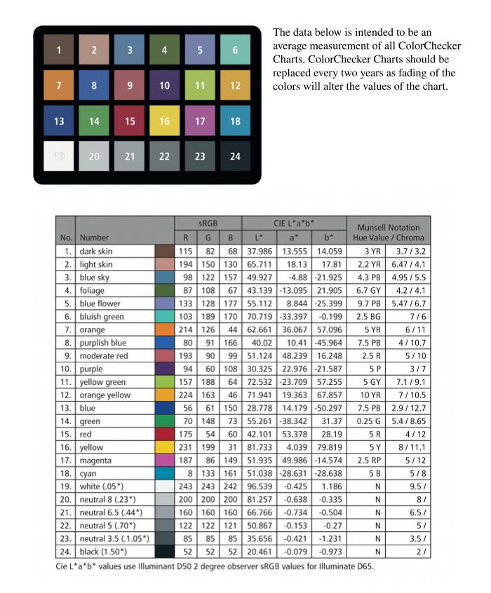
A quick and dirty way to do this is to find a texture image of a Macbeth chart online. It will “look” right, but might not be 100% accurate. I modeled my own Macbeth chart in Blender and made simple materials with color values based on the ColorChecker chart’s published RGB values (https://babelcolor.com/index_htm_files/RGB%20Coordinates%20of%20the%20Macbeth%20ColorChecker.pdf). It’s in a library folder with other commonly used assets and I link it in whenever I want to use it.
Why use it? Mainly, I’ve seen it used in look development, particularly for VFX, alongside a chrome sphere and matte sphere. It helps give you an idea of what the lighting of your scene is like when you’re building materials so you can gauge if something looks the way it’s supposed to. If a color looks wrong, you can just look at the Macbeth chart and sphere to see if there’s a strong hue shift or something that might be contributing to it.
Awesome thank you for that thorough reply. Nice, yeah I gotta get me one of those Macbeth charts. When you import the chart into Blender, what are the material settings? Just a straight up 50 percent diffuse material?
Most of them are either 100+ dollars or super cheap printed paper (and also super inaccurate). I found one on Amazon for 45ish. Look up “Andoer 24 ColorChecker”
Any objective color reference in a real-world set is better than no reference at all. You will also find real photographers using a “gray card.” You can then compare the captured color of the image against the known characteristics of what was photographed. They’ll also use a cloth measuring tape (or these days, a laser rangefinder) to capture the exact distance from the camera lens.
Yess, I think getting rid of specular /glossy is better.
You can also use two chart, one is with a diffuse, and the other use emission shader. So you can check on a render what hue/value shift is happening depending on lighting by comparing the two.
I’ve looked into it but never really used it professionally.
Of course, when filming something , adding CG, grading, so much things can append to colors that having such a chart could be quite helpful. But then you should make sure that it’s accurate so you don’t induce errors among the chain.
One thing that is great to have is a neutral light rig, it’s a lighting setup that tries to give the rendered chart the closest colors of the reference. It’s not something great for final lighting but helpful when looking for color in an asset so you have less errors induced by lighting.
This can be quite useful when you have several assets modeled/shaded separately that should react well together in different situations.
If you look into it , you’ll see that’s quite hard to get, and generally it’s only working for certain camera angles , and it won’t match perfectly the whole black/white range. But that could give a good basis.
But again, all these solutions are helpful if they solve an actual issue you’re having.
Most of the time when doing personal work I only have one final lighting so I adjust colors according to that. I think it gets really helpful when lots of people are working together with different softwares.
Would be great to hear someone who use it on a regular basis.
If you’re just importing a texture map, a lambert material should be good enough.
These gray cards are most often printed with an “18% gray”, also known as “middle gray”. The exact RGB values of this vary a little depending on the color space you’re using, but it equates to a LAB L value of 50. Further reading for the interested:
Gray ball is for light intensity and shadows, chrome ball is a reference for HDRi orientation and colorchart for color tones and saturation. Normally there’s a photo with real ones and a 3D scene with same objects, them you try to match with your light setup and further refining in compositing. If it’s done properly you will have a pretty accurate CG integration. Some artists have a 3D scene to see how their work will behave for a given shot. In Poly Haven there’s some HDRI’s with photos (search for backplates) and a real colorchart photo with same HDR light conditions for reference. Use fSpy to match camera perspective and position. Colorchecker file is avaiable at Colour Science github, calibrated for X-Rite products.
Here’s some examples of how those reference are used for HDRI creation:
Jorgen HDRI: https://www.jorgenhdri.com/explained
Toodee Refine and Render: https://www.toodee.de/?page_id=3878
Cave Academy have some free look development scenes, but you have to export for Blender from others DCC’s. And this portfolio has some good free HDRI’s and backplates to make a lookdev scene.
Also you will obtain far better results if your Blender is set to ACES.
If anyone is interested, I uploaded a version of the color chart asset I use at work to BlendSwap. It says it’s still pending approval, but it appears to be available publicly.
Thank You(!) very much, wayland! ![]()
This is very useful, thanks. I opened the chart in Blender, and noticed that the base color values are somewhat different to the ones published by Calibrite. Is this correct? I am not so familiar with Blender, and am keen to know if I need to make any changes to comply with the Macbeth checker I purchased
Here is a good explanation how to use grey ball,chrome ball and macbeth chart for look dev and lighting
https://caveacademy.com/wiki/onset-production/data-acquisition/data-acquisition-training/the-grey-the-chrome-and-the-macbeth-chart/
I just looked myself and I see what you mean. I don’t have a great explanation for that. I’ll find some time this week to fix the values and reupload. ![]()