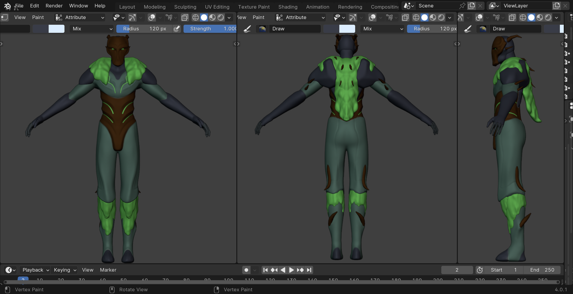
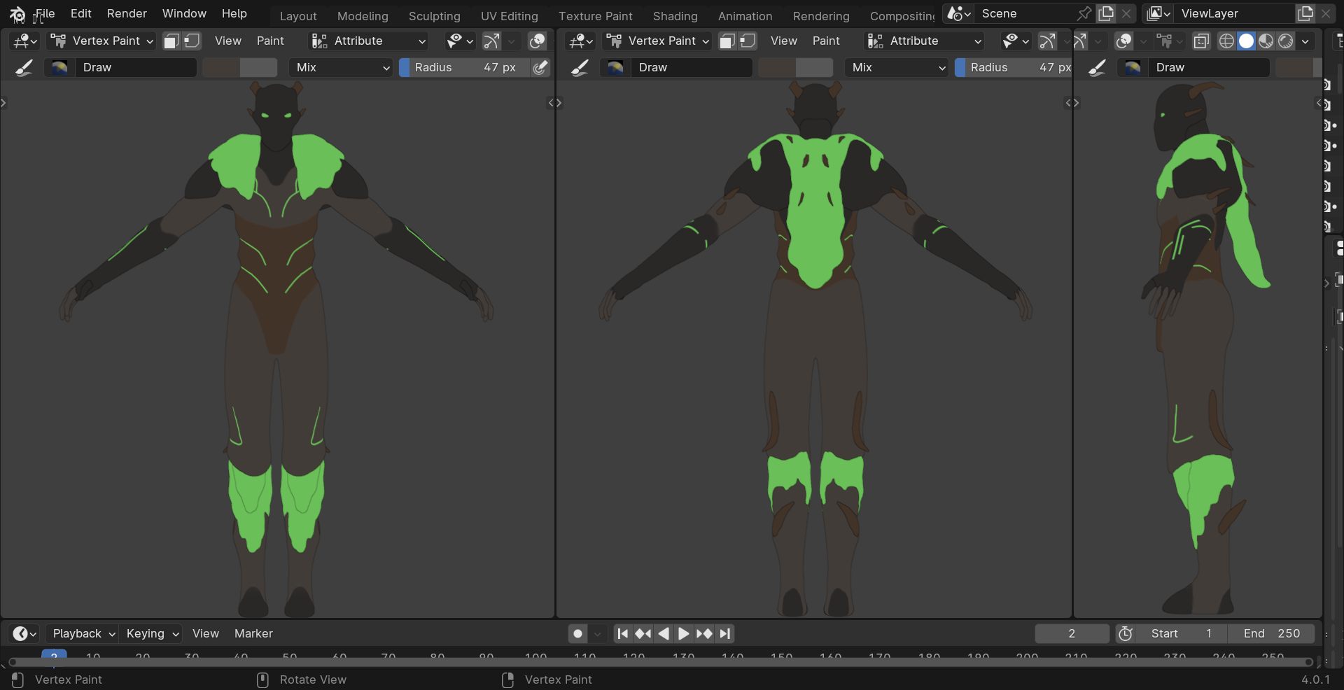
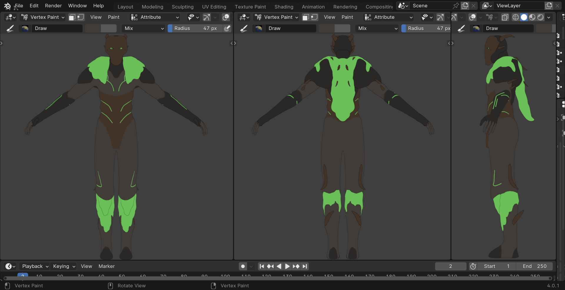
I’m picking out the colors I want to use for my character. The character is supposed to have some sort of relation to the earth so I’m mainly using colors that can easily covey that. So far I know that I’m using bright green colors for the eyes, moss cape, and some areas on the body, and brown for the mask and spikes. I’m still undecided on the dark blue I used for the head and arms. My end goal is to use cell shading to give it a more stylized look.
So far this is what I came up with. I’m happy with the overall vibe of it, the dark and toxic looking colors. But I feel like something looks off and I can’t tell what it is. So I want to see what someone else’s opinion is on the colors.
The teal being the main color with the blue-grey accents makes me think more of water than earth. And the brown to me looks a bit too bright for the color scheme.
Probably, especially if it’s a little more on the warm side, I think. Do you have photoshop, or some equivalent? If you do, you could try popping your pics in there and fiddling around with the colors before committing to anything.
IMO, you should also consider the story of the character. Representing earth = soil or earth = planet? Earth is like 70% water, so the main body being blue, the arms, legs can act like “continents”.
what may also look “off” is the lack of contrast. The colours are nice but maybe not as matchy IMO. Too much for bi-chromatic, not enough contrast for more colours.
you may check a lighter gray palette with pastel shades of green. The main body being gray, the pastel green acts like a ghillie suit kinda armor. A matchy, lighter green can be used as contrast for example.
But again, there are many great solutions here. What matters is the story you want to tell, and what you like
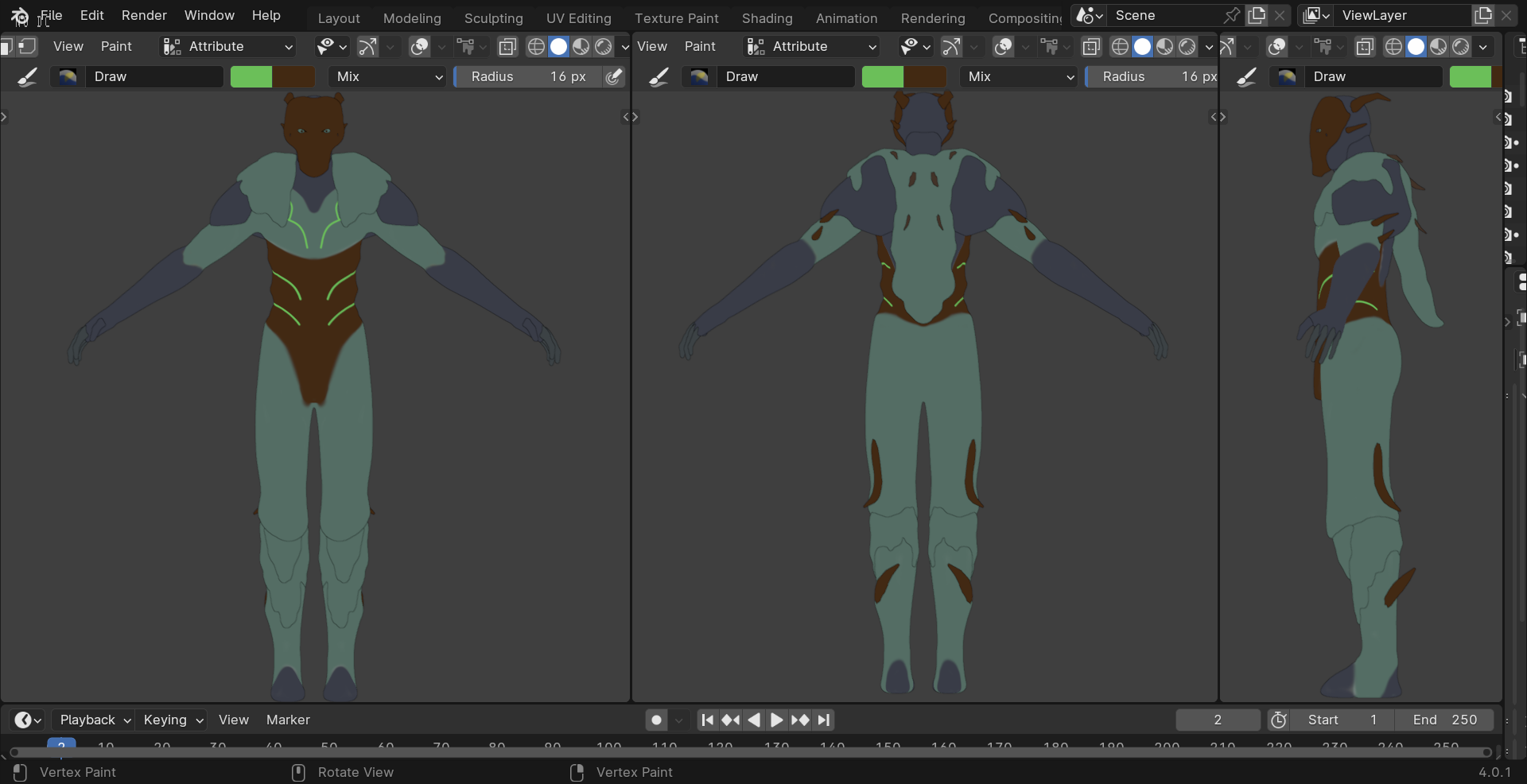
If you’re planning on cel shading this, you’re not doing yourself any favors with this shaded preview. Switch to Flat viewport preview so you have flat base colors, which is how cel shading is done, then you’ll have a better idea of what you’re looking at. I can’t really comment on the colors without seeing them flat
Your brown, you’ll notice, is a significant outlier. It’s far more saturated and far more warm than your other colors. IMO, It clashes with your gray, which is really a dark purple.
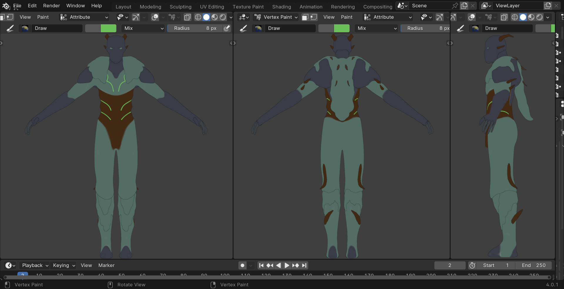
Another thing to test is grayscale contrast. Let’s see what your grayscale contrast is:
Well… you don’t really have any You have a difference of just 17% lightness between your lightest and darkest color. That’s barely anything, you’ll probably want to up your grayscale contrast.
Your gray and your green work; they’re similar in saturation and lightness, and they’re about triad distance from each other, so they complement really well. Your brown isn’t working for me, though.
Overall, I’d say add more lightness contrast and more contrast generally, and pick either cool or warm as your main tone
What you can do is to first work in grayscale to work solely on contrast and readability.
For instance, there is a lot of contrast in the center, but the face which is very likely to be the most important part attract less the eye.
In front view the legs could use some more shape separation.
On top of that you can use a few extra values, so even if you use 4 colors you can add a few different values of blue to help separation. That way maybe two main colors and one accent could be enough.
Once the values are ok ( in grayscale) and the character reads well, choosing colors become much simpler and it’s easier to test different stuff !
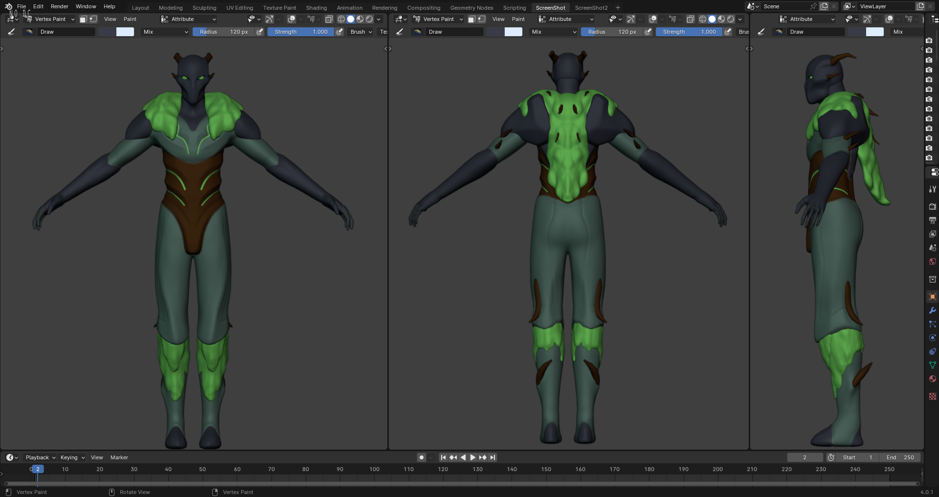
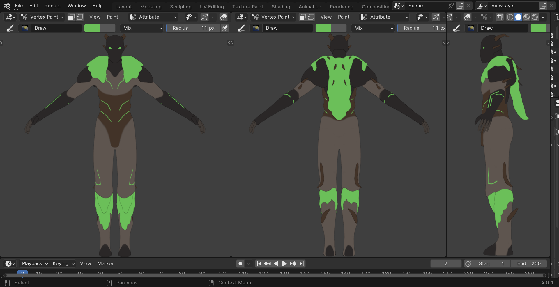
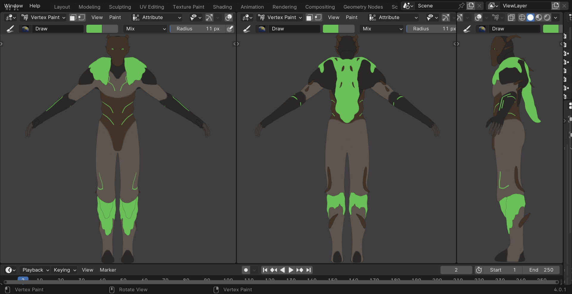
I took a screenshot of the two designs I’m trying to decide between. I changed some of the colors to push it more towards the warmer side. Also in the last two screenshots I made the grayish brown color brighter.