I’m currently struggling with the way Blender mixes colors. Painting pure red on a green background makes the transition fade from red to some sort of murky dark color to green. The same thing in photoshop does not add any dark colors in between.
Anyone know if there’s a workaround for this?
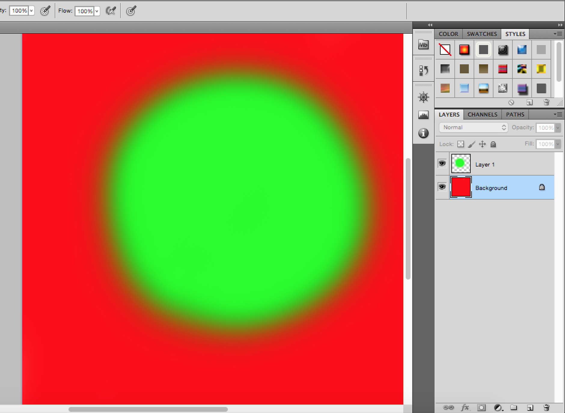
This is how the transitions look in Blender. Note the dark color between the different colors.
Normal blend mode in photoshop. Did you just paint on top with a soft brush? Additive colors shouldn’t make it darker like Blender does. The falloff seems to make the colors darker instead of just applying less of the color.
The transition is a mix of the colors as in the green is faded at the edges as the opacity is lower and more of the red shows through. This makes sense.
Blender
Red background. Painted green on top with 100% strength.
Here the strength fades at the edges but for some reason blender makes the transition color darker than either of these colors which is very odd.
This completely ruins any kind of splatmap painting where you have black set as a separate texture as that texture will blend in the transitions. Splatmaps painted in photoshop won’t have this problem.
But if you take out your physical paint, and mix green and red you will get a brown. Painting into the same layer seems to me to require that mixing, whereas painting onto different layers eliminates it.
And yeah I noticed having different colors on different layers does avoid that problem but it is quite a pain to paint the splatmaps like that. Oh welp I guess I’m out of options.
How does Krita handle it? I haven’t really worked much with color there - I paint greyscale first for value, and then use Color, Overlay, Softlight, etc. to misx the colors into the value painting in a more Flemish style. When I use mix mode, I generally expect the darkening to happen there as if I am working with wet paint.
If you need just solid splats, paint them in black and white and use that as a stencil if you are using them in your material - much better result I think.
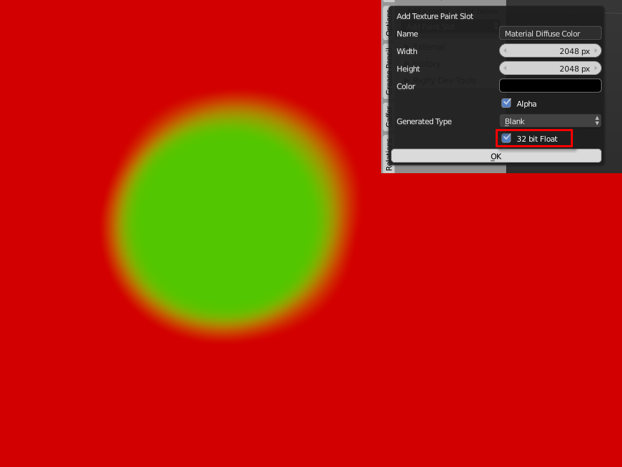
What I get from the video JA12 linked to is that this is a linear workflow/gamma correction issue. Did you try “forcing” Blender into staying linear by painting into a texture with 32 bit color depth?
And btw, what you’re showing in your Photoshop screenshots is afaik not Photoshop’s default behaviour (at least not in CS6). To get the result you want, you’d need to go to Color Settings > Advanced and check Blend RGB Colors Using Gamma 1.0, otherwise it will look exactly as in Blender.
Krita has the same behavior. Create an image in 8-bit RGB color and paint a red background with soft green over it. It’ll darken in the blend. Convert the image to 32-bit and paint with the same brush and it behaves like Blender’s 32-bit image. However, converting to 32-bit will not fix the dark blend from a single-layer blend. Converting down during saving keeps the proper mixing colors from both layered and single-layer blending. I was looking for a setting in Krita similar to the gamma blend setting in Photoshop, but I couldn’t find one. I guess I’ll be painting in 32-bit linear images, then.