Regarding the filling:
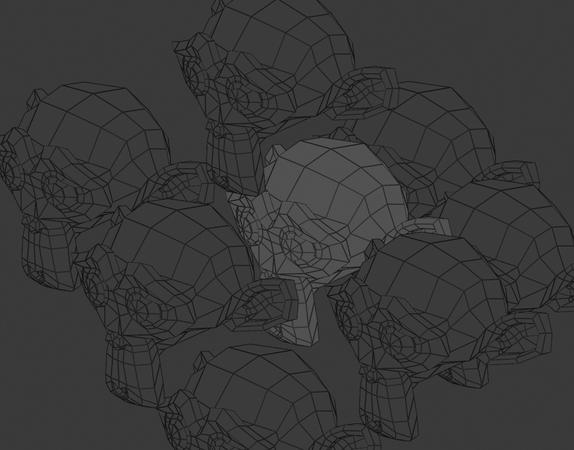
Now, put at least 20 objects bahind each other and randomly select 10 of them. Zoom in so that you can not see the contrours of the object anymore and check if you can still see which object is selected. It won´t work.
Here is an example of a moderately populated scene. As you can see there are plenty of objects inside each other, overlapping objects and in general it is a mess. But you can still easily distinguish the objects from each other because of the color. And if we assume that “blue” means “selected” then we can easily distunguish selected objects from non selected objects. Now, imagine all objects were the same color but the blue objects were shaded in transparent gray. It would not be readible.
Well, here in your example I can’t see what is selected, no. Even though you told me that selected = blue, I see many variants of blue and none of them stand out particularly. And if you need to make something blue for a specific reason, you can’t because it is used for selection.
To me that’s a good demo of why we need something smarter than that.
I think probably the hue/saturation-only colors, with brightness reserved for selection state, could be the best overall solution.
There are like only 3 shades of blue in the scene, and I’d guess pure blue was what he meant by the selected ones.
This colored wireframe discussion has been going on for years and it seems devs are more worried about finding a possible better (?) solution for what already works and that not only has been used for more than a decade in other programs but has also been implemented in some branch of Blender than to push it to the main repository already and think about a possible better solution later.
Well, you agree that the variants of blue are distinguishable. So, assume that the dark blue is reseved for selection. You can easily distinguish them from light blue objects.
As for needing to make something blue, well perhaps there are instances but I´ve never needed it and can´t think of a good reason because wireframe mode is there to make objects distinguishable and not for rendering a final product. So if your grass can not be light green because light green is reserved for selection you can simply use dark green. Or pink. Or brown or yellow.
In 3ds Max I can not make objects white because white is reserved for selections. It doesn´t matter.
You run into the same “problem” here. If you need something to be bright for a specific reason you can not make it bright because bright is reserved for selections.
The above solutions probably aren’t very hard technically. Probably they are simpler than doing all sorts of smart math to make it so there isn’t a collision between selection colors and other wire colors.
I’m certainly not against wire colors. I know users have wanted this for a long time, especially in certain fields like architecture.
With the new viewport and the Solid mode object colors already in, I think now is a good time to add colored wires too.
Some old principles have been lifted or loosened for 2.8. You see you can now hide the 3D Cursor, left click select is the default, there are tentative plans to get rid of the destructive auto-purge of unused datablocks and we have things like the random color feature. So I don’t think this is too far fetched.
I don’t know, but it would have to be recoded anyway with the new viewport, and also to be consistent with the new Solid view, so that they work similarly.
Also, it happens sometimes that ‘useful’ features are added for open movie projects - but in a hacky or band-aid type of way, where the quality of the code, or the user interface, or the way it integrates is too poor to include in Blender proper.
So sometimes there are quick and dirty hacks that can be added for a project, which fail in all sorts of corner cases, which are best not to include in Blender.
Over time, the code standards in Blender have gotten higher, which is a good thing, making Blender more maintainable as a whole.
That makes sense, I was mostly wondering about the selectability concerns. The logistics of executing it will certainly be different, but I’m just wondering if we can re-use some of the concepts of that implementation, rather than trying to reinvent the wheel.
Since we’re now discussing this, it’s probably important to make sure nothing’s missed. Has there been any discussion of edit mode, and the various edge colours that signify seams/sharps/bevel weights etc?
It’s something I struggle with in 2.7 and earlier as Blender can not display multiple edge colours at once, and if coloured wireframes are added that will be another thing to compete for visibility.
I think wireframes should probably always have the default colours in edit mode (overriding any colouring that was done in object mode), but: can we think of a better way to display multiple edge tags?
And somewhat related, but really more in the realm of a feature request: visualising other vertex/edge/face data as well, such as UV islands, vertex groups, weights (this is already possible). Can we make all of these compatible, or can we make a clear set of rules as to which can be visible at the same time? Another solution is presets for visualisation. One that’s displayed in your unwrapping Screen layout that displays only seams and colours faces randomly according to uv island. One that sets wires only and xray for retopology, one that displays weights in your weightpainting layout…
Yes - in Edit Mode we should just disregard the wire colors for the active mesh, otherwise it clashes with the edge flags. But Edit Mode drawing is already handled separately, so this will essentially come for free.
I did posted something like this on the rightclick website a while ago:
It was more for empty objects and such to help out rigging, but wireframe colors will also help tremendously for organizing a scene.
I do like Blender, but some functionality NEEDS to be added in 2.8 before the final release. This is one of them
colors for the wireframe, icons etc … as use of more visual information that help to better distinguish the elements, will make Blender a better place more accessible to anyone …
Colors have a secret alchemical combination that will free everyone…
Most software overrides the custom wireframe colour, with the default, when you select an object, so the highlight brightness level shouldn’t be a problem, I also don’t think locking certain colours from being chosen would be a problem, just trust the user in not selecting some colour too similar to the default selection one, and if they want to have a visually cluttered scene, it’s in their right to do so.
If this is a problem, though, just set a palette of 8 (or more) colours (indexed) per Theme (every theme has different colour schemes, right?) so that the “right” one is easily selected.
Meh… tetris music is okay, but some kind of fast hardcore rave music would be better suited… 6/10
Yes this has been ridiculous for decades… All we really need is object property called “wire color” and a theme setting with HSV (the S and V) limits of min selected value/sat and max deselected value/sat. Active object has thick outline and/or dedicated color. Done.
Can’t get more simple than that. All this mumbo-jumbo about color overrides and collections and types and special conditions is a waste of time. Get the most basic functionality working first.