Here is a cycles render of a kid toy a colour tower.
There a many things that I would like to see different, but this is it for now.
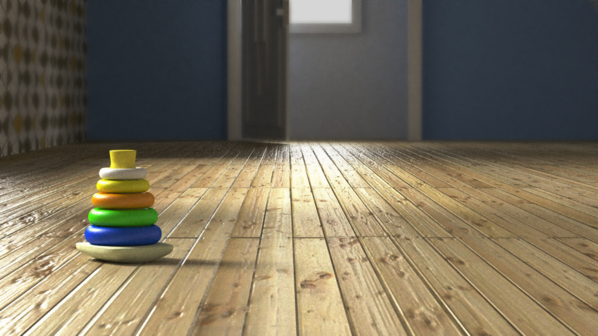
Hi people,
Please let me know what you think.
I think it kinda looks photo realistic.
Well…
the floorboard texture looks really bad. I can’t tell exactly why, but I think it’s because you used too much bump, with too low-resolution of an image… hard to say.
There is no molding between the floor and the wall, which is unrealistic.
There’s so much noise reduction (it seems) on the render that a lot of the details are lost in artifacts.
Really, the only thing that has an opportunity to approach an interesting level of photorealism here is the floor, and to be quite honest it’s not even close.
The child’s toy is not really worth commenting on.
It’s not at all photo realistic. Sorry. I would suggest that you hold yourself to higher standards in modeling, shading, and rendering.
The lighting is halfway decent.
It’s looking pretty good, but it would help bring attention to the subject if you were to zoom in some on the toy and add some depth of field to it (there’s some good tutorials at blenderguru.com) I think that that might help the photo realism