Picture on czech weekend chalenge on theme Long way. 
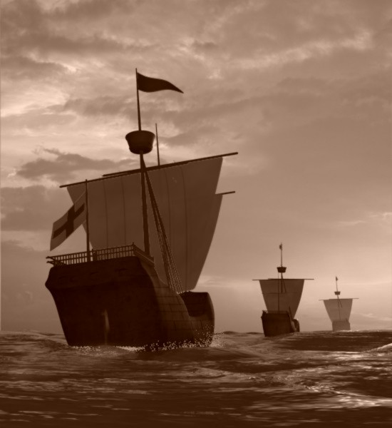
Picture on czech weekend chalenge on theme Long way.
Very nice image. I can almost hear the wind blowing.
It’s nice, but now you should just add and pack in lots of detail. Maybe you should make some windows, or model some interior cabins. Also I noticed that the deck (is it called the poop deck?) has a quite smoothed edge, with no railing, maybe you should chamfer that edge for a crisper line and put some railing on it so the crew doesn’t fall off. Anyways, I really like the color and the compisition of it, keep going!
That is a pretty image. Are the clouds and water just textures or did you model a part of them?
I have two suggestions:
Antialias the wake foam. The particles you have there look like sprite explosions right now, and not quite like the boat skimming the water. Either antialiasing or motion blur would probably cure this; they could also use a bit more opacity.
The boats themselves lack bump mapping to show the separations between the planks that make them up. Bump mapping would go a long way towards making the boats more believable. You’ll need bumps that go deep in the grooves between the planks as well as general wood-texture bumps (remember that those old ships didn’t have as nice sealant and as such the wood had a more rough, mottled feel to it).
Keep going!
Those ships didnt have many (any?) windows.
I know, model ship is terrible(and texture), but for me was important idea(composition and atmosphere(feeling)). For me is this scene unfinished, for contest is complete, but I will improve it. Current problem is find good blueprints of Columbus galeons.
kattkieru: sky is texture, sea is model and procedural material. 
Sea model is modified object Plane.

and screen of procedural material is here
http://www.g-taurus.ic.cz/materialy/mat/more.jpg
3 procedural textures for bumpmaps, first is for small waves, second if for bigger waves and third is for anomalous small waves.
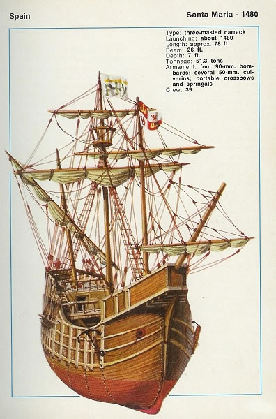
Ya… actually you were right the first time. It was not proper in the 1500’s to have windows on the hull. However there is a lot of detail missing.
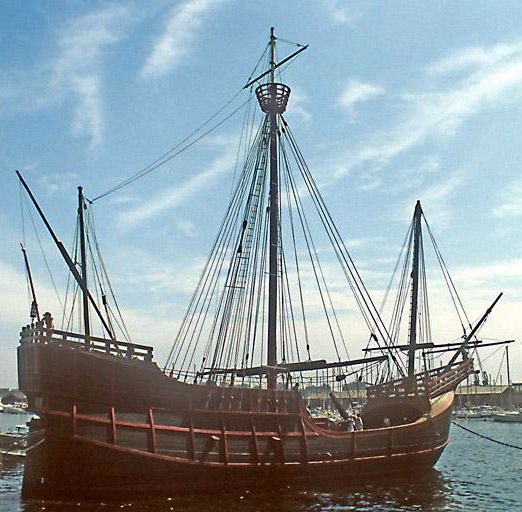
Here’s just one pic of the actual. But there are a ton more out there…
Hi G_Taurus,
i don´t have blueprints from a Columbus galeon, but maybe some May-
flower blueprints can help you?
Here an example (if you need more PM me):
The Santa Maria is much smaller and older than the Mayflower.
You can purchase a very detailed set of plans for about $50CAD form All-Model.com. You may be able to use the preview .gifs just to get the rough shape (if you have eagle eyes and you are not in need of much detail).
I’m in the middle of modeling a small Dutch frigate similar to the Mayflower and I got to tell you, it’s hell…
<edit> …and a bit of reference material I had in my files…</edit>
Bussman, olaf, deathguppie:Very much thank you for help, but I know than blueprints of Columbus ships are expensive items. Maybe I will go to library for some references.
dammit, pallete is nice and scene looks nice, but something in there looks too much like ingame cinematics to me …
G_Taurus
Hey… I am actually a shiprwight in the real world… what you are looking for if you go to to the library is a set of “lines drawings” with a table of offsets. The offsets give you exact point in space where the waterlines, frames, and butt lines converge.
The best part about using the table of offsets is that there is no guessing. You can litterally use them to create a mesh that is exact using nurbs and then just face it. No need to even trace anything.
Very nice composition, good point-of-view. Nice lens-selection. Nice clouds and water; the fact that the ships show some different left-to-right tilt (as if caused by variations in the sea) is good. Nice, sparing use of spray. Good use of depth-of-field and mist to suggest depth.
I’d like to see a little more detail on the stern of the closest ship. In general, I don’t like to see “detail-less opaque blacks” nor “detail-less blown-out whites.” Just a little bit more brightness there.
But these are quibbles. Good, strong image and composition, well executed. Pleasing. Very well done.