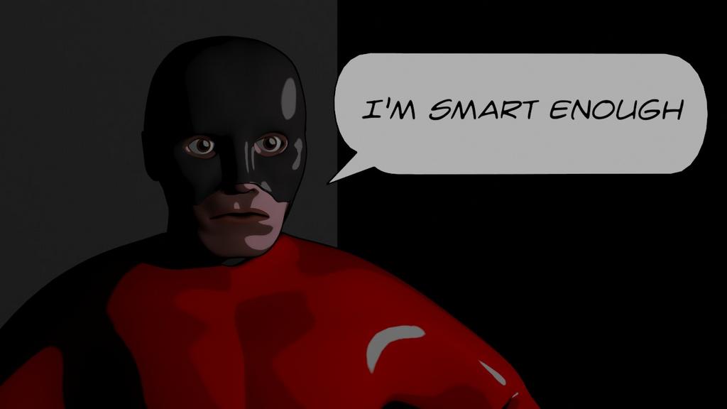
Coming up in about a month here I have a project that I’m going to be involved with that requires some comic book style artwork. I decided to try doing this from Blender using the internal renderer. After working on this for about a week or two I’ve got some proof of concept art. Gotta say, learning how to do NPR rendering from Blender has been something of a pain in the butt, since the information I’ve found on it has been very basic, and mostly unhelpful. At any rate, I’m getting happier with the result. The long shots are closer to the style I’m trying to achieve than the close ups, but I didn’t really spend as much time on it as the long shots. The pose is obviously more basic than I’d do for the real project, but I don’t really want to spend much more time on this till I get more information on the real project. At any rate, I’d love to hear your comments on what I’ve got going so far. 


Good to see the effort, however, did you do a search?? on NPR and Cel shading?? as others have traveled this road, and found paths that are not “that hard” with good results. There is a very long development thread of the “Freestyle Branch” which is available on Graphicall.org, and is currently very stable and functional, for NPR line quality. Cel shading, a variety of approaches, straight materials, through node work.
I recently cited the following page, within the “monster thread” which demonstrates some of the variations of line quality available. http://blenderartists.org/forum/showthread.php?t=89986&highlight=Freestyle-examples.jpg&page=12
And some of the renders by blendman are excellent.
http://blenderartists.org/forum/showthread.php?t=89986&highlight=Freestyle-examples.jpg&page=28
Best to you.
Wow, did not expect the hostility there, frankly I don’t feel it was called for. Yes I did search for it, quite extensively in fact, and I had seen both of those links you posted. The first link offers some decent basic information about it but in a completely different style than I was shooting for. The second link provides some very nice renders but not much information on how the shading was achieved. I apologize if I came off as complaining, or berating the community, I had not intended it to be that way. What I should have said is that I had trouble finding information on the shading aspect of it. For me personally the mega-posts are a less than ideal way to find information as I frankly don’t have the time to sift through hundreds of posts containing in large part unhelpful information for the few tidbits of helpful info that may help me (I did however sift through these fyi). At any rate, I appreciate the reply, however I do not appreciate the tone.
I re-read my post, did not find it as harsh as you took it. Way sorry, my apologies for how you read it or how I came across, next time I will put “smiley” faces all over it. But being the only one who responded, and with my attempts at helpful information, if all you heard was hostile, I feel miss-heard. Your renders were a bit dark, it was hard to tell the effect that you were going for, so I wasn’t inclined to comment on that aspect. I deeply appreciate NPR related efforts and try to “encourage” any development that is going on, so, I saw your thread, and wanted to make sure that someone responded. I have been building Blender Win32 and Linux64 for Graphicall.org, since the Freestyle SOC branch began, would also like to see others contribute, and would welcome a dedicated thread on shading for NPR like styles. There are other examples on the “monster thread” but as you stated, you don’t have time to look around, my suggestions are miss-placed. Maybe by bumping this thread someone else will chime in and help you out better than I have. Sorry again if my “tone” did not feel right.
Paul
Another victim of the shortcomings of written text. After re-reading your post I can see how it could be taken either way. I was in the midst of working through some frustrating issues at work when I read the post so that probably influenced my perception. I apologize if I came off rudely in my reply, and I appreciate the work that you have done to contribute to the community. As for the renders, the darkness is mostly intended, I was going for a dark alley feel with very harsh shadows, however it may have gone a little too far. I might tweak it a bit, these are merely proof of concept renders so I’m not deeply concerned about it at this point.
Tweaked the lighting a bit so it’s not so dark. I have a tendency to push images to dingy and bad looking when I try to go nighttime. You’d think I would have learned by now… I really need to put together an actual scene for this as what I have going now is rubbish.
Attachments

Messed with some background stuff and tweaked the lighting a little more. It’s still really sparse and unimpressive, but I think I’ll probably call it good for a bit until I get more information on what they are actually wanting to do with this.
Attachments

Hey CMonson,
I’m guessing this is going to be a static comic book? (Not animated). If that’s the case I would do some tests using different renders from blender (toon, ambient occlussion etc) and playing around in photoshop/gimp overlaying them with different layer styles.
I’m not saying this is how it should be done buts here’s bit of a comic style test I did not so long ago.
http://blenderartists.org/forum/showthread.php?t=186742
Like you I’m planning on doing my own comic and I’m going to use blender as the starting point for my artwork.
I’ve also given the comic book type a go - you can see some of my works in the traditional section of this forum. My approach is quite heavily post-processing, and still in need of dire editing before I submit the whole item to the world.
Your work is quite superb - would love to see it completed. While at first it doesn’t seem original, you have chosen a format/theme that just can’t wrong if it hits the bookshelves, although it will be quite labour intensive. All the best & please ignore this post if I present a tone not suitable to your liking.
(Lots of smiley faces and flowery peace symbol all around).
There was a relatively recent post here where someone posted a node setup used to get toon-look shading (no edges) out of a node-based texture. I can’t remember the thread title, but searching things like “2d girl” or “2d woman” might get you there. It was a great little setup…
To define the style, the compositor is your friend.
Try toning down the speculars, and if it is night time, the red color should be less saturated, perhaps even slightly darker…
Here is a recent test example using simple materials, no ramp shaders or complicated setups for materials, Freestyle lines on one pass, and all of the color and “look” worked out in the compositor. Great tool to play with. I put a “Viewer” node at each interval, then set the display window to Viewer Node. After a pre-render, play with the setting along the way while picking different Views to check the work. Great way to tweak the settings. Not done yet, but thought to send this up as an example. It is intentionally “light” in tone, composited on to a white background. The scene is just to test the different shapes, surfaces, distant, close, overlapped, etc.
Thats pretty cool.
Did you mean to put a node screenshot in here somewhere?(you where starting to explain your setup without screenshot…)
With some reluctance, I am posting the “screen” shot and a blend file to download with the Compositor node setup. PLEASE, be aware, this is not final, it is just a test bed, so it has extra nodes that aren’t used and a bunch of extra nodes to tweak. Screen shots of node setups are usually a bit frightening to the un-initiated, but download the Blend and pull it apart, and it is not so bad. There are Viewer nodes all along the way, so you can click on each in turn, after the initial render, to see what is happening at each step. The “background” is just a 16:9 white .jpg image on a plane if you want to re-create that node step, but it is just tossed in at the end. I tend to like to setup a color pass, a shadow pass, and a line pass. I am only using one line style on this one, but will use this as a test of the other line styles like I did before. This was done with Freestyle_r30418_Win32, but also works on Freestyle_r30418_Linux64, the two builds I currently have posted on Graphicall.org. Sorry, the image is a bit large, but sooo much to see. Enjoy. (Blend file HERE) (Alert, this is not intended as a hijack of CMonson’s thread, so direct your efforts back to his questions) |;>)
Paul

I really like this! I’m pretty impressed by the cartoon renders, well done.
Hey everyone, sorry for the lack of replies. I’ve been out of town for a couple days with no computer.
@chrisskinner78 yes this is going to be static (sort of) it’s going to be an animation of static pages so the images themselves are static, however there will be camera moves across the pages. I will be trying to refine this a little with post production outside of blender, at this point I’m trying to go as far as I can possibly go inside of blender. I liked your artwork btw, very nice.
@kbot thanks for the comments, the lack of orginality is intentional as this is supposed to be extremely stereotypical of traditional comics. Basically the idea is to hijack the style to present a message in a comedic somewhat irreverant fashion. It’s tied in to a live stage production using a specially built projection surface to present the story.
@paulhart2 wow, thank you for the post. I’m interested to take a closer look at that. At the moment I’m using almost entirely ramp shading, and am not entirely happy with the result so I look forward to playing around with this when I get back to work.
and finally @Keith M thank you very much for the comments!
Well, sadly, those in charge of making the decisions have decided to push this project off until another time when they feel they will have the time to devote to making this as good as it can be. Our timeframe was pretty short on this and it was going to be a rush job so I am not too upset.
At any rate I thought I’d post some additional work I’d done on it just for fun. First image is my character after some high res sculpting to give better muscle definition (left is the actual hi-res, right is the low-res version normal mapped).
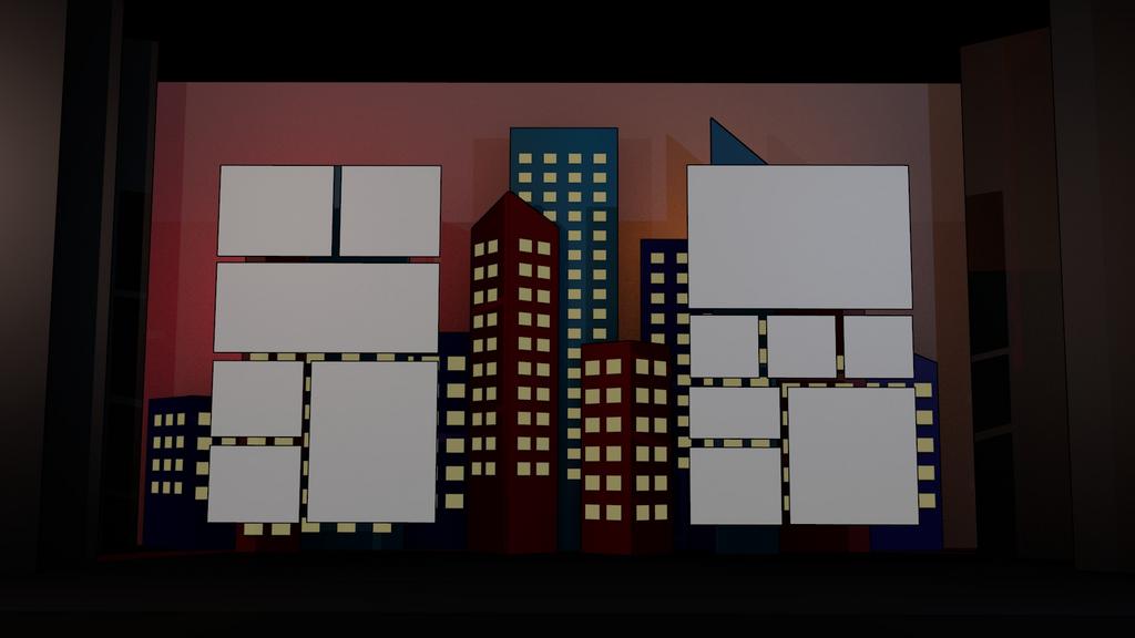
And just for kicks, here is the initial concept for the stage set design (sorry it’s pretty rough, we were still early in development when this got canned). The stage is about 60 ft across, the cityscape was going to undercut that by a few feet. Our set designers went a lot further with the cityscape design after I handed it off to them, but sadly I don’t have that version at the moment. The comic book frames on this were going to be custom built high def rear-projection screens, and the comic book would take place in video form on these screens. Dimensions of the screens were about 22 ft tall by 12 ft wide, city scape windows were going to be lit in conjunction with a lit backdrop to allow us to create day,night, sunrise, sunset, and whatever other feel we wanted to get out of it.
Anyway, this all goes on the shelf to be used at another point hopefully later this year. We’ll see when we can fit it in. It’s been fun to delve into NPR rendering and I look forward to getting to come back and finish this one.
