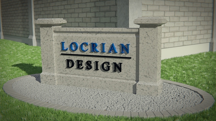
Decided to redo an old project of mine in Cycles. Pretty happy with the result but was curious to see what others thought. No need to go easy on me. LOL.
Wow this was a while ago. So, were you going for realism? Or just something that looks neat and orderly? That’s what the grass reflects, something that is neat and orderly.
Thanks for taking a look.
Ultimately I was shooting for something in between. I’ve done a few renders for a client but they have been interiors and I was looking to expand my skillset. Most of my work is in the museum exhibit industry, but I have clients that also do exterior signage and was hoping to offer rendering services there too. Most projects need to be turned around in a couple of days so I don’t always have the luxury of making a scene as realistic as possible.
With that said and since this is just a personal project, is there anything you’d recommend I change to make the piece more realistic? And if this were for a client presentation, is there anything you’d recommend I change to make the piece more presentable?
Thanks!
The rocks look kind of fake. They are too flat, it looks like just a texture with a normal map. They need to be more random too. Also the texture on the sign looks pretty tiled. The lighting is pretty nice.
First off, everything is very grey. Your image could also use a level adjust in photoshop for more contrast. I just picture driving by this sign. It’s a grey sign in front of the same grey building. What makes it jump out at you?
Personally, if this were me I would try to make a nicer sign. Although I do work in the sign industry. try Google’ing “Outdoor dimensional sign” lots of really great examples of what the pro’s do.
One way to improve your sign would be to break it up. Right now, it looks as if the sign is one piece. Which more than likely isn’t how it would be constructed IRL. What if you kept the back face where your logo is as is. Then made the rest out of another material or a couple different materials?
Thanks for the feedback. I’ll play around with it some more to see what kind of color and material variation I can come up with. Breaking it up into different pieces shouldn’t be difficult.
i think you should add more spec to the black text. it looks way to black next to the nice blue text. also, the pebbles look like 1 piece and the posts around the building look like orgami.
but i guess its all texturing except for chopping up the pebbles :D:)
Add some random color to the pebbles/rocks, you can use the same method this guy uses for leaves. http://www.3dtotal.com/index_tutorial_detailed.php?id=1792&catDisplay=1&roPos=1&page=2#.Uwq5316YSes
i agree with webhead… some variation would be nice 
