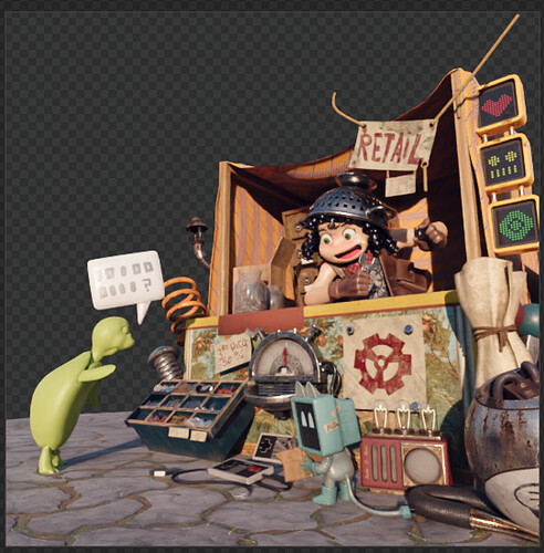
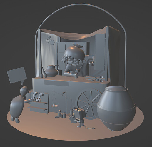
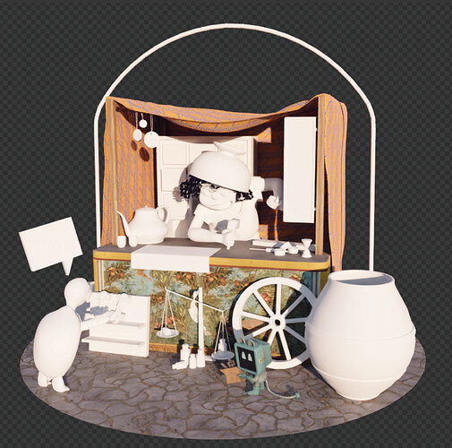
[Completed] WIP: Her Ancestor (Make a Splash in Amsterdam)

Hello!
Hope you had a good weekend! I’m going back to this project, and I have a few new things to show.

The counter of the little shop is fundamental - and in fact it constitutes the main structure of the scene itself. Thus, it is important to “crack it”, as we might say.

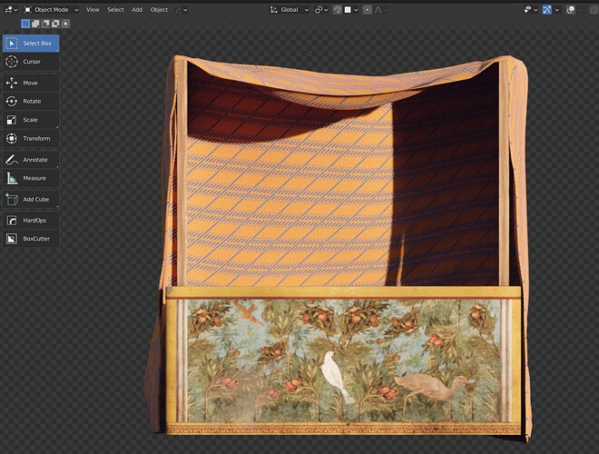
As I have shown above, ancient streets were colorful and very decorated. I have decided to follow that style for the counter and give it a series of colorful frescos.
For the leitmotifs, after some pondering, I have decided to go for a collage-style and mix a series of real Roman frescos which portray nature and birds. I’ve mixed them using Substance Painter. I have used pictures found as public domain here: https://it.wikipedia.org/wiki/Pittura_romana_di_giardino


Aren’t these wonderful?


The final result


(in the context, which is still very messy)

Now, I have been thinking about how to transpose in an ancient fashion the signs of the shop. I’ve created a marble stone with an inscription of the ancient Greek word for shop (πωλητήριον), but I wasn’t happy with that at all. Now, I’ve decided to create some wooden shapes that I will hang from one of the sticks that hold up the tent. I’ll keep the shapes the same (heart-face-wheel/gear), but recreate them in an old style.

For the “retail” sign, I’ll come up with a better replacement further on. Perhaps I’ll paint the text itself on the fresco?

For the rest, this evening I’ve been reducing the vertex count of some assets, and thinking more about what to do. I’ve also added the mesh of the turtle to the scene - but it is still not textured.

From tomorrow on, I’ll proceed at faster speed.

5 Likes

As promised, I am now proceeding again at full speed. Today I have spent my time modeling and modeling.

I have replaced almost every asset with new, low poly ones. I don’t care about having detailed meshes, as I’ll take care of that through texturing. But I care to have nice, light and orderly meshes :slight_smile:

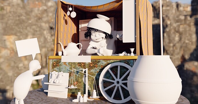
Through the Cycles viewport you can perhaps see better what has changed:

Everything! :slight_smile:

In particular, I have modeled the following assets:

  • a clessidra
  • a hammer
  • wheels
  • a piece of wood
  • the main character’s clothes
  • hands for the main character (by rescaling and adjusting her gloves and reattaching them to her arm mesh)
  • a sign (the will be made out of wood and resemble the original one)
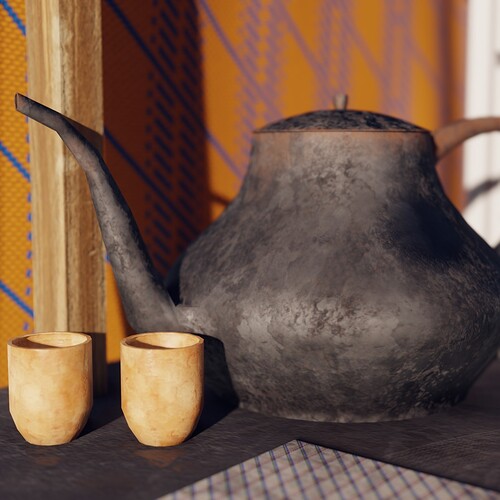
  • a kettle
  • two cups
  • a scale weighting a crystal
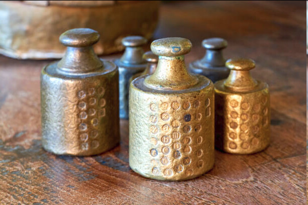
  • a series of weights modeled after the ones used at the time:
    image
  • a big wheel (a reference to the paper sign that used to take that place)
  • the pot-hat of the main character. It will be textured in the classic style of Greek pots
  • a big olive oil jar. It replaced the similarly-shaped broken robot head on the ground. I actually have such a jar at home, now sadly used as a pot to keep umbrella. As they said in Latin: sic transit gloria mundi (so passes the glory of the world)
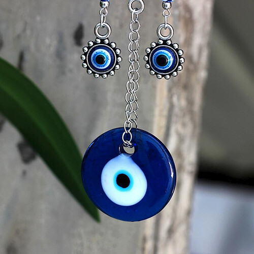
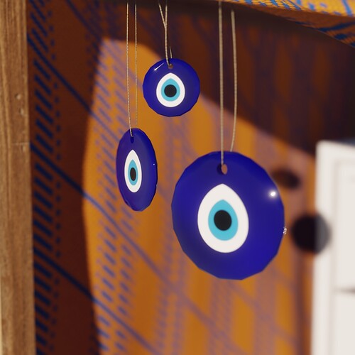
  • a series of nazar pendants, inspired by the ones commonly found nowadays in Turkey:

    You might object that these are Turkish. While you’re right, it is also true that the idea of the evil eye is commonly found in so many cultures and with very similar symbolism. Similar objects were found in Mesopotamia, and in Greece the “mati” eye is exactly the same thing. So, I think it is not too much of a stretch to include it here. Moreover, there was actually one amulet that Romans used for this: the phallus. I did not deem it appropriate, or aesthetic, to include a series of swinging phalli on the tent of the character. Sorry! Nazar it is.
  • a structure for vining flowers to grow on, and two pots. I’ve decided that since the final result will look a bit like a sweet, beautiful and colorful modeline, I could add some more color and structure by surrounding it with a plant. The choice of such plant will be the topic of one my of next posts (spoiler: ancient Mediterreans had access to such a little variety of flowers and plants! Oh my God! All flowers come from America, Africa o Asia)
  • a piece of furniture to hold the…
  • roller skates! :smiley: it is an anachronism, but I love the idea that the turtle is pointing at them, perhaps already savoring the defeat of her friend-enemy, the hare…

Speaking of the devil… the hare! It will be modeled soon, and so the last piece of the old file shall be replaced.

I’d like to add more details, but I feel that now I have (or I will have, once the hare is done), a sort of “minimum viable version”.

I’d like to highlight a few changes that are happening along the way. Like the ship of Theseus, the file along the way is losing all its pieces, as I work on remaking them. Is it the same scene? How can we tell? As I look at it, I do feel that I am looking at the ancestor of our cyberpunk junk shop dealer… and yet, so much has changed along the way. What does it even mean to be an ancestor of someone? Oh my. :face_with_spiral_eyes:

We’ve gone from having 1.6mil verts to 60k. The part that are in white in the render above are going to be textured by me. Yes, that means that everything will have new textures. I feel that is necessary for a cohesive and good look.

5 Likes

Excellent, you are in the modeling part! I have to start my part of modeling now.

1 Like

Yeah! I haven’t followed until now a very linear process, as in the first steps I like to do some lookdev… but now it was time to get all the shapes there.

May your modeling be fun and swift!

2 Likes

I really like the fresco angle!

As far as whether it has the sense of being the same scene (in a good way), I think it does! I will say, though, that to me right now it feels more like the same girl transposed to a different time period than an ancestor. I think it would bring the concept together if there was something that suggested a concrete passage of time in a familial way, like an heirloom that has degraded some. Though, obviously you are limited by the objects in the original scene that would have existed. Or maybe a drawing of a future technology idea that exists in the new scene?

Of course these are only my thoughts and not everything is even textured. I could very well be speaking too soon!

It’s a shame the shop does not have a name in the original splash screen.

Thank you :slight_smile:

And in regards to what you write, I see you what you mean! On one hand, this is about the idea of remix itself: what does it mean to remix something? Is it just a reference, a nod, or a faithful transposition? I’ve often wondered the same in music: some remixes amplify and highlight the source without altering it radically, while others are almost unrecognizable.
Part of my idea, I have thought, is to show change through the objects and the context, while keeping the human element relatively the same. Her appearance, once textured will be slightly different, and so will her clothes… but humans in the end are the same, even if the context is radically altered. Same needs, same business, same “destiny”.
And so, the only thing that can reveal the passage of time is the fashion of the objects, their usage, their nature. For the rest, it could be a dark cyberpunk world, it could be a warm, Mediterranean little shop.

But this is just my rumination - or conceptual justification - of what I am doing :smiley:

2 Likes

May I post this on Blendernation and elsewhere as a WIP spotlight?

Absolutely, I’d be honored :slight_smile:

2 Likes

Can you post a 1275x672 WIP image, for ideal BlenderNation dimensions?

Or just big and kinda rectangular, and I can crop it for ya :stuck_out_tongue:

Here it is!

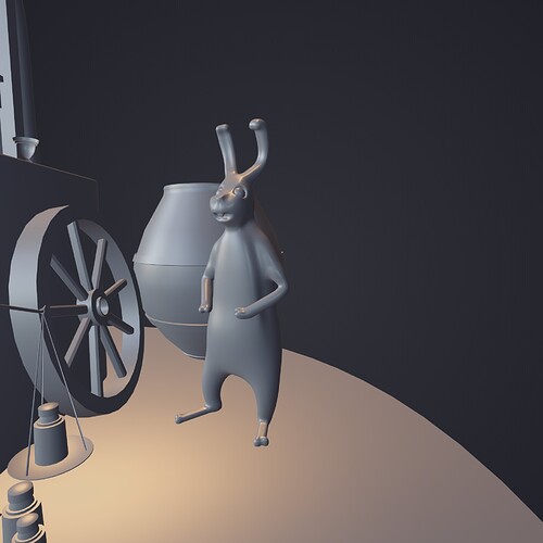
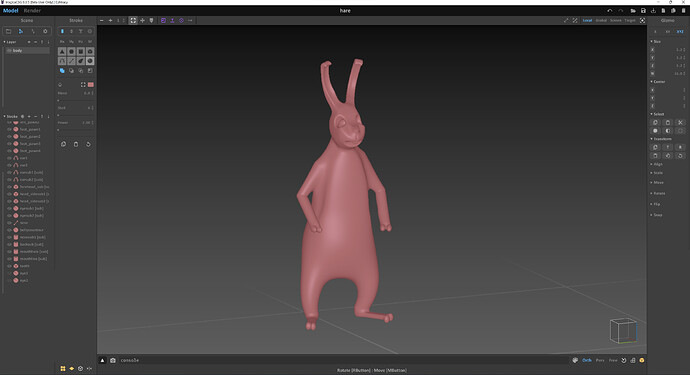
Meet the hare:

Influenced by the enthusiasm of some blenderartists fellows here: MagicaCSG ─ Signed Distance Fields editor by the MagicaVoxel dev 🧊 , I have decided to experiment with MagicaCSG. The idea of sculpting using SDF and thus without worrying about topology and meshes sounds too much like fun. And I’ll tell it to you: it was and I can’t wait to do more :slight_smile:

Here is a screen out of MagicaCSG:

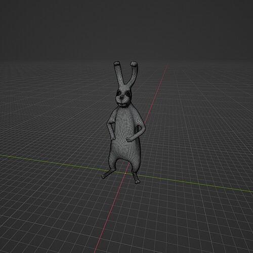
Not bad for a first tentative, I think! I’ve then exported the mesh and imported it in Blender. I’ve remeshed it using Quad Remesher, and then I have refined and smoothed a few details here and there, and of course added a pair of eyes.

Love this tool and I will definitely use it more.

And so the second robot is replaced by another tiny creature!

2 Likes

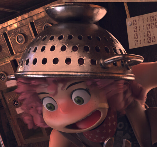
This is the story of a girl who used to wear a colander on her head.


Yeah, I know, it’s weird.

But who are we to judge the choices of a cyberpunk junk dealer in a far away future?

And so, this is the story of how I came to create a… erm… worthy replacement for her ancestor’s hat. But let’s begin from the beginning.

After creating the hare I mention above, I have spent most of my day UV unwrapping (we all love that, right?) and organizing my meshes so that they could be joined together in groups of single objects and that they could share a common UV map, while keeping a uniform texel density, and assigning to each mesh or detail a unique vertex color, according to my future texturing needs. This is to say: the boring but necessary part.

Once that was done, I switched to texturing things. So, I’ve focused on the first object-that-includes-many-meshes-and-a-single-material, called: clothes_accessories.

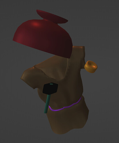
I began from the pot-hat. Of course, there was no such thing as a scolapasta (so we call it in Italian: pasta drainer) in the ancient world. The most obvious and iconic thing to use for a replacement was a classic clay Greek pot. Why would anyone wear one on the head? Well, why would anyone wear an iron scolapasta on their head?

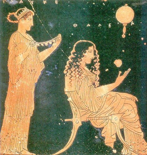
I’ve looked for high-resolution, public domain pictures of Greek vases and pots. Wikimedia Commons came to my rescue, as it usually does: https://commons.wikimedia.org/wiki/Category:Ancient_Greek_pottery

In particular, I was striken by this drawing:

How wonderful, detailed and simple. Look at that chair! Look at their hair, their clothes! Fantastic.

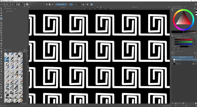
I’ve opened Krita, which is my go-to tool for this kind of things, I’ve prepared a black and white mask to be used in Substance Painter.

I’ve worked on two more masks. Also, using Krita’s Wrap Around mode, which allows you to hand paint tiling textures, I’ve created the classic Greek meander .

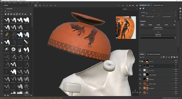
All good. Finally, I’ve prepared the material in Substance Painter:

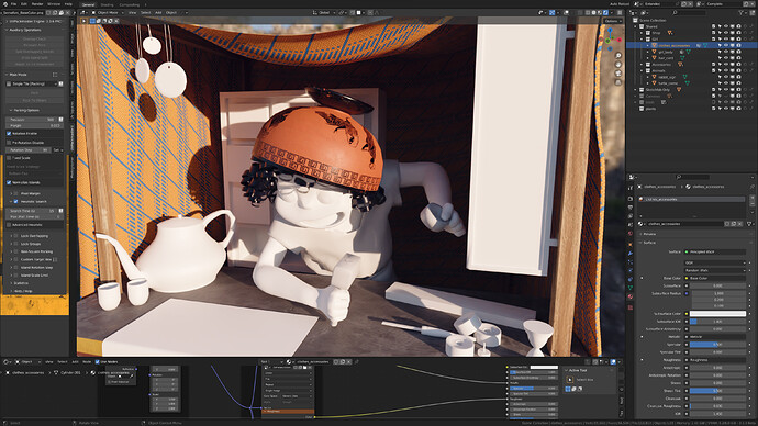
And the view from Blender:

4 Likes

I love your inspiration with antique paintings :heart:
By the way, everything has an explanation

PS: Yes, we do love unwrapping, but not as much as low poly baking :wink:

1 Like

Thank you so much :slight_smile: I confess that I love the research into the history and background as much as the actual 3d creation!

We love low poly baking

1 Like

Oh, this is fun, keep on doing!

1 Like

Thank you very much! :slight_smile:

Slowly but steadily, those colorless, generic, undefined and even slightly menacing voids are replaced by colorful textures, shapes and details. Life is returning!

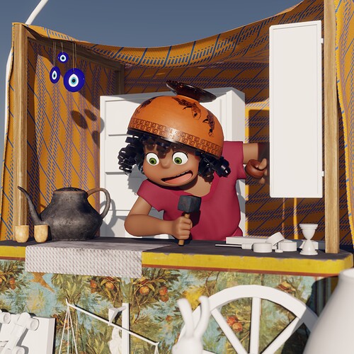
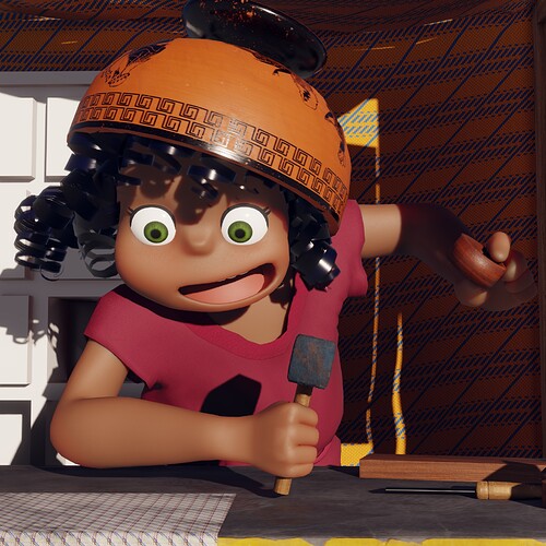
Finally, the girl has emerged. Happy as ever, but with a new palette. Initially I planned on having her clothes be white, as they were more common that way and the red color was really expensive at the time… however, I’ve realized that that shade of red was fitting the palette so much better.

Not only history, but also the eye rules humans’ lives. And so be it, her dress is red.

3 Likes

A little bracket to talk about this bug. It is really annoying, as I’ve realized it brought me to create normal maps that were too strong, because Cycles displays them very weakly and in a washed out way. Cycles and Eevee don’t match (and Eevee is the actual correct one).

So, in order to have proper shading and normals that will look fine on Sketchfab, from now on I will just use Eevee for working on this. And it’s fine, because Eevee looks lovely in the end:

I was also using AgX for color management, previously, but I’ve switched back to Filmic in order to have a look that is very close to what I’ll see in Sketchfab.

Closing today, I’ve done some more work on fundamentals, and I’ve mostly proceeded with the texturing, which is advancing swiftly.
I’ve made some very quick renders (thanks to Eevee :cupid:) of some things I’ve worked on today!

Nazar, as anticipated above!

Would you drink from this?

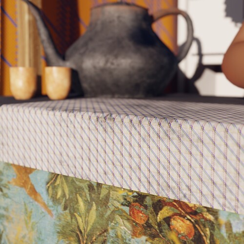
New cloth pattern. It’s a bit dirty! Realized with the same method I’ve used for the fabric of the roofing!

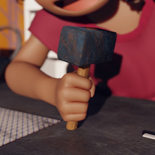
A closeup of her hammer.

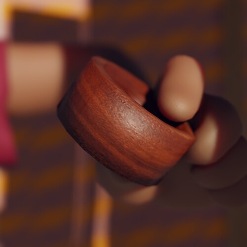
Her other hand is holding a freshly-created wheel!

3 Likes

This morning I’ve refined the subsurface scattering map for her skin, taking into account the thickness of the various parts, while, like in the original, highlighting her cheeks and elbows. I find the result nice, particularly on the fingers and edges of the mouth.

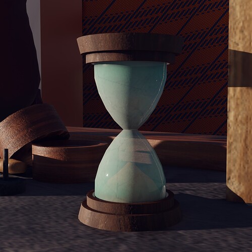
I’ve also worked on the hourglass. My idea is to convey, within the limits of using alpha transparency, the feeling of the splendid, opaque glass that was very common in those times:

1 Like