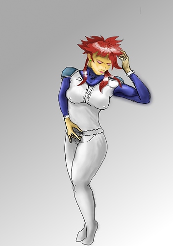
First of all, this is a great attempt!  for the life of me i cannot even begin to comprehend the works of GIMP, so props to you for that , regarding the drawing itself, well i don’t like to give critique without being asked for ti, but you seem to be requesting and rather open about it so i’ll try my best to describe what i “see” against what i “know” (which is the basic understanding one has to grasp with drawing)
Let’s talk first about anatomy and proportion, which in here are related to the posture that Xiva is taking.
Her pose is rather nice, i like the thoughtfulness of it; first you must use as a guide the basic natural or ideal proportions, that is when you measure the body according to the height of the head. The natural proportion is about 7 1/2 heads for the human figure, whilst the ideal figure is about 8 heads tall. Right now your drawing of her is using roughly 6 heads, which is okay if you intend to maintain that cartoony vibe they have while trying to make her more “realistic”. Using the proportion “template” or “cannon” to compare our drawings can help a lot to save ourselves from future corrections, now her anatomical proportion is slightly off but we will get there in a second.
Now what pops first on my eyes is the lenght difference of her right arm (the one that is resting on her side) as opposed to her left arm, it is needed that when you draw any humanoid arm, their measurements match, unless it is deliberate.
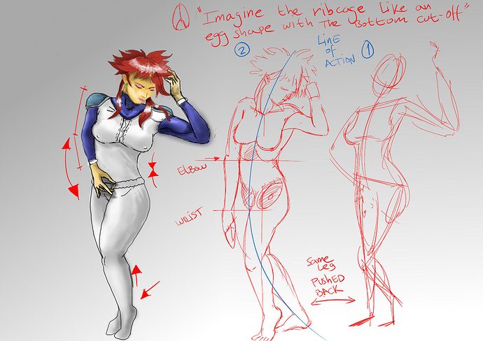
Usually the elbow would be roughly matched with the bottom of the ribcage, and using the shoulder as a pivot you can see how arcs of motion can be projected from the elbow and the wrist to be used as reference for maintaining the arm’s proportion when you draw it in any position. The wrist then would be about the pubic arch’s height as well.
Men and women have different proportions between them but for now try to ingrain into your mind that for a drawing to be believable we need to maintain the concept of proportion for the human figure, unless it is a deliberate stylization like the one we see on a cartoon.
Try to also bear in mind the planes of the body, that is, imagine the body is constructed with geometric volumes, spheres boxes, etc. Now the torso, would be easily inscribed inside a box, the sternum would be front, the spine would be back and the place where both arms rest would be at the sides of said box. Now imagine that box twists, you can experiment with that thought taking a bit of putty or a kneaded eraser, making a small rectangular box that simulates the torso and the twist it a bit, imagining the torso would be bending towards said side. Now when our body bends there is always one side squashing and the other one is stretching, that alongside with the twist. In here i see some squash and stretch on her torso but it looks like the front side of her torso is taking up all the space we see of it; in this pose we might see a bit of her left side
Ok, now i like her subtle chubby legs, but again proportion hits a soft spot in the legs, also let’s look at the calf, muscles have this kind of action-reaction system going on our bodies. Let’s say when you raise your heel like she is, our calf is “pulling” the heel up, so the muscle is squashing upwards, hence the part near the heel would be thinner.
It’s good that you included the hands, usually people like to leave them behind, they need a bit of work but they serve the purpose of the pose which is rather nice .
Now let’s touch a bit of the concept of weight and balance. She looks solid, and that’s great, but for that very reason her balance looks a bit off, like if she’s going to fall. In order for you to check this, try to draw a straight, perpendicular line from the sternoclavicular joint (that is where the clavicle bones join with the sternum or breastbone below your neck) to the ground, and try to see if there is more mass of her body at either side. In this case a lot of her body is leaning to the right of the guideline and the foot using the toes to counter balance the weight of it isnt helping that much as a stable support point.
Well, i perhaps could go on and on about these kind of things but it wouldnt be nice because reading text sucks when youre trying to understand these subjects. I can tell you that right now you’re doing great, but you need to include more thought on the proportion of an anatomically correct figure, don’t be fooled by the “contour” of the body, or it’s “silhouette” muscles and fat all over the place in the human body. Try to stablish first a strong foundation, youre not required to draw bones or anything, but even with a stick figure, plan the proportion and the pose to help build believability. Then solve out (in another layer if you want) the volumes of the body, trying to maintain a consistent flow between them. Afterwads then flesh out the volumes, which would be like putting wrapping paper on an object, imagine how your skin and tight clothes would fit the volumes of her body, the calves, the breasts, the arms, etc.
The color too will become easier if you pre-solved the volumes of your body and when you aply the light source, it will be far easier to shade it. I would suggest not to shade with pure black, or to do highlights with pure white, rather try to apply the base color and use the opposite color or another color that tunes well with it, or one that is mixed with it’s opposite to give more richness to the concept. Usually black only dirties the illustration unless it is very specific.
For example, if youre doing white try some deep blues for the shadows, not too saturated either, it would be almost like if the sky is filling the shadows of the white dress. For the red color you can use a bit of green (but just a bit!) and a burnt orange color. There are tons of combos, but you get the idea.
I’ll attach some diagramatic drawings i did to convey my ideas, it’s nothing fancy as i dont have much free time to do this, but i hope i was able to enlight you a bit more, perhaps. I apologize as well if by any chance i offended you with these corrections, drawing progress is a hard pillow to swallow and by no means i am a professional tutor on these subjects, i can only speak from experience and some knowledge i’ve acquired through the some years of reading, practice and conscious analysis thereof.
Anyway take care and have fun, keep drawing, the betterment of your skills depend on how much time you spend on it, so keep at it!

 for the life of me i cannot even begin to comprehend the works of GIMP, so props to you for that , regarding the drawing itself, well i don’t like to give critique without being asked for ti, but you seem to be requesting and rather open about it so i’ll try my best to describe what i “see” against what i “know” (which is the basic understanding one has to grasp with drawing)