I submitted an asset to the Unity Asset Store about 2 months ago and it was rejected with overall quality cited as the main reason for rejection. So I decided to go back to the basics and try to improve my skill set. Feedback appreciated.

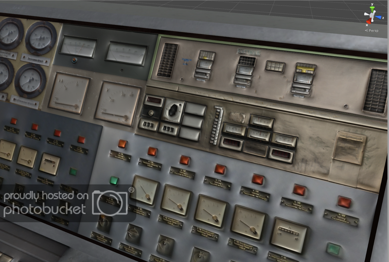

Looks like you have the control panel set to smooth shading so you lose all definition of the controls (buttons are supposed to look like buttons) or are using a low res blurry / smudgy textures.
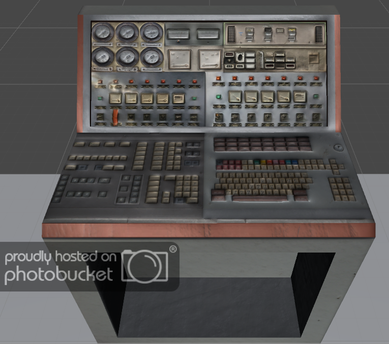
Also what’s the point in having a keyboard if there is nowhere to see what you have typed.
My uv maps (one for the control panel and one for the screen) are 4096 x 4096. Each are made up of other vector images ranging from 1024 x 700 to 2850 x 1250. I don’t totally agree that they look blurry as you say. I’ve had a dilemma with this fact… having spent time checking out other games they appear to have the same sort of texturing. For example, Call of Duty: Black Ops (which is where I got my inspiration from) have control panels and servers with blurry-ish unreadable text.
Regarding the buttons… although I do somewhat agree with the point you are making I forgot to include some information that may explain this choice. The Screen is separate from the console. This would allow players to replace the screen with their own custom screen and, therefore, maybe make use of the buttons.
I appreciate the feedback as I am always trying to improve my work. However, as I mentioned before with blockbuster games having blurry text/buttons… I believe this is due to performance issues? I could use 4k resolution images for each console for a crystal clear, snappy image but would that not produce resource-heavy assets?

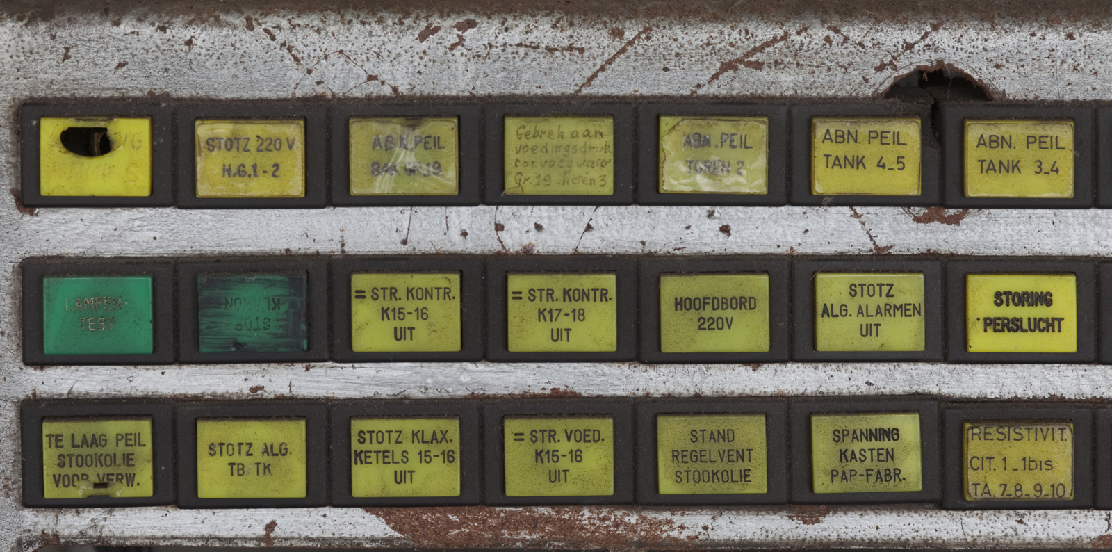
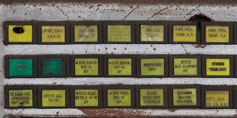
An image I used for the control panel. Maybe it is how I have textured the console considering the image dimensions.
1600 x 794