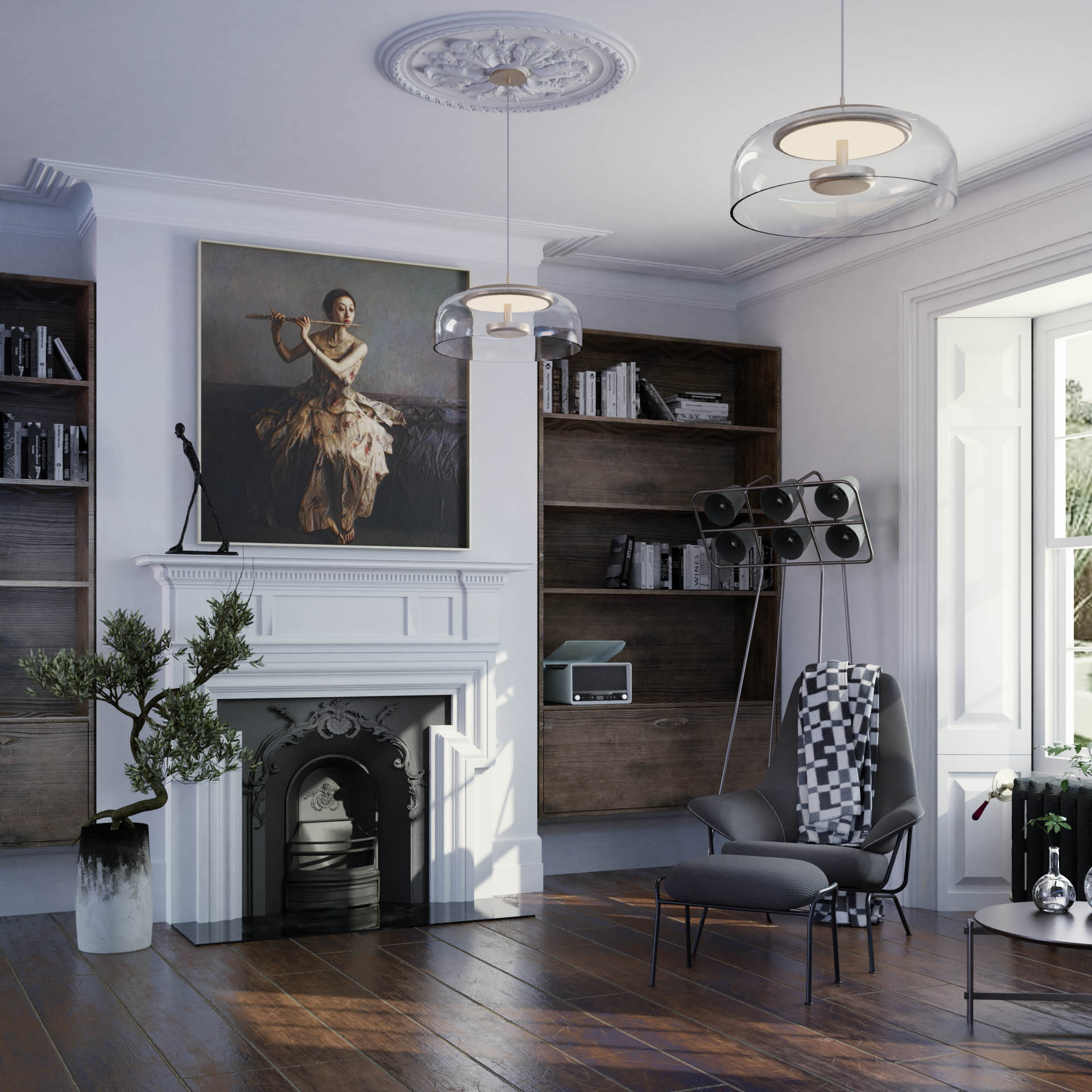
Wow! Put in some work next time. the lighting from outdoors looks great.
Another object or two on the fireplace mantle maybe? A throw rug on the floor?
Very very nice anyway… 
Hi thanks, it took me ages to get that floor to look nice with just textures, but you are right a rug could improve the image.Will repost this.
Or even just something in front of the fireplace.
That IS a really nice floor that needs to be shown off.
Yes it does! I didn’t even notice it because the entire scene looks so real.
thank you for the advice! I keep putting stuff in and then it look cluttered. I think your original suggestion of the carpet (only little a corner) is looking good. thanks!
Just working on the geometry to get it looking real.
I’m against putting a rug down. Because the wood floors shows the lighting to better effect.
thank you for the feedback.
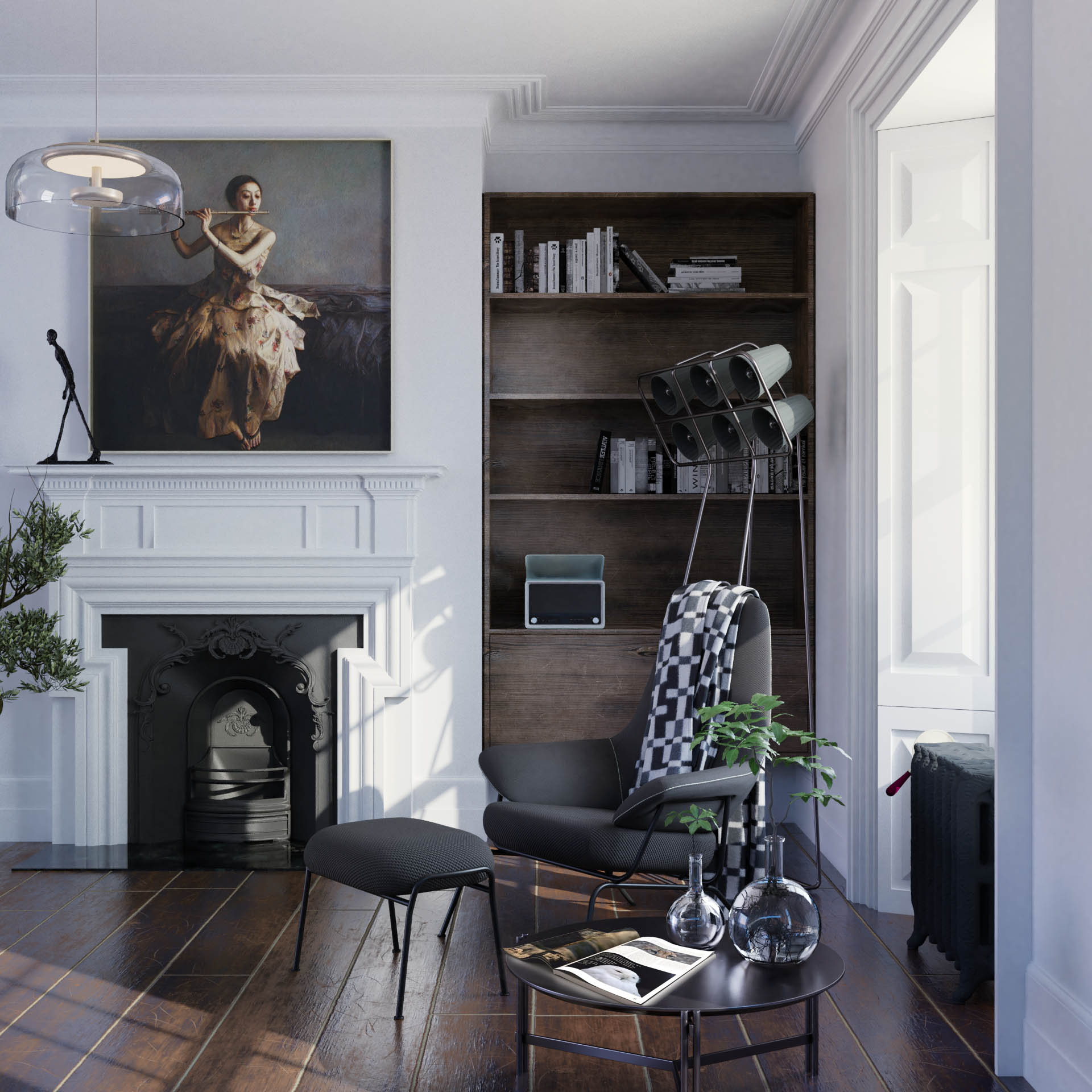
I will post it with revisions. It might just work if I show only a corner of the rug in picture 1 to get the idea that there is something behind the camera.
that will work
Holy cow! Very nice, the only thing I find a wee bit off is the floor seems to just vanish into the wall, corners have their own eco-system (Ian Hubert).
This is great! I like color scheme and the combination of new and old styles.
Other than empty shelves there are only small improvements. Mostly already mentioned.
- Just a few more objects on shelves so none are empty. Avoid clutter.
- Black stains on the planter are too dark. It is a silhouette at the top.
- Set your view or place objects to balance some visual elements. Internal, the second picture, does this with the glass and the green of the plants.
- I would make the hearth (? the panel in front of the fireplace) less reflective.
- Agree with you, “…and then it look cluttered”. The simplicity of the room is appealing.
Welcome to Blender Artists @SamSmith!
first of all: very cool 
here are a few, mostly material related, things that pop out for me:
- there’s something off with the glossiness/roughness of the floor. In the first picture I thought you had no weathering for the floor, but in the second one, I could see better that there was plenty of it. So (see big white reflection on floor in front of the fireplace): in the first pic, the scratched areas (brighter wood) are too glossy, maybe try lowering their glossiness and increase roughness
- the metal tubing of the chairs and table looks like dark anodized metal (higher roughness), while a fancy material in real life, kinda takes me out of it a bit. Maybe try going for matte paint or shiny lacquer
- I like the composition, maybe just one or 3 mementos on the mantle piece. Or maybe not

- the surface of the table looks too perfect. Not sure what real material that should be. Maybe try varying the surface roughness with a painted texture to simulate traces of skin grease
Cheers guys thank you very much on the comments. Very usefull
I am working on the scene again and looking again at some materials that I have overlooked
Cheers